Previously, I have written a fair bit of text on defining the market segment for the Carrypad and also trying to establish which applications sit in which mobile computing market segment.
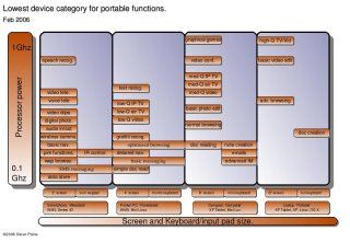
To summarise and simplify a lot of my thinking, I have created a diagramatical view of the portable computing segments and the applications that sit within them. I’m really pleased with the way this diagram has turned out as it shows a lot of info in a very simple way. I’m sure Nokia, MS and others have similar diagrams in on their filesystems. I’d love to see one for a comparison!!
Click on the image to see the pdf version.
At this point its important to state that i’m talking about consumer markets and not specialised industry segments. Using a tablet to aid airline checkins is not included!!
The diagram shows the four main segments that I see in the portable computing market. Each device segment has a screen and keyboard that largely defines the size of the device. In addition, the higher in the segment the application is, the more processing power it requires and obviously, the more expensive the device gets. I’ve migrated applications as far to the left as I think is possible. That is, on to the smallest device possible.
One of the most obvious things about this diagram is that, assuming i’ve done the optimum migration of applications to the smallest device as is possible, there is no consolidation. Every device still has a use and therefore a certain number of consumers. Take for example, Advanced Navigation. The Pocket PC sits in the perfect position to be used for that and in fact, we’ve already seen this year, extra sales of PPC’s purely on the back of Navigation software.
Of course, this is a generalised diagram and you will immediately see that some devices that dont slot into the segments i’ve defined. You might even disagree that certain applications are in the wrong place. One device that I find hard to place is the ‘handtop’ PC. The general definition of a handtop is that its a full -power pc in a size just bigger than a PPC. I beleive its a specialised market right now because the costs of minaturising a full PC makes the devices very expensive.
Some of the terms in the diagram, I have defined further below.
- Data storage = 4GB
- Basic navigation = graphical directions and speech
- Advanced navigation = map-based directions and speech
- PIM = Calendar, Reminders, Tasks, Addresses, Tel numbers.
- audio in/out = Audio recording and playback using advanced codecs (mp3 etc.)
- Wireless comms = 2G, 3G, Wifi, Bluetooth
- Low Q video = 320×240, 760kbps rate using advanced codec.
- Med Q video = 480×320, 1.2Mbps rate using advanced codec.
- High Q video = 640×480, 1.8Mbps
- Video clips = 300kbps rate and under.
- optimised browsing = 320×240 no plugins.
- Normal browsing = 800×640 including plugins. (flash etc)
- Advanced browsing = 1024×768 including plugins.
Feel free to comment on the diagram. I’ll optimise it if I think it needs it and keep it updated here. I dont know how to make this officialy an open source diagram, but if you credit and link this blog, i’ll be happy.
Keywords: origami, carrypad, mobile+computing, convergence, lifestyle+pc, umpc
