I recently received the Vye S41 for review courtesy of Dynamism. I’ll be testing it over the next week or so but I wanted to share my unboxing photos and first impressions. The full gallery of unboxing pictures can be seen in a slideshow over at flickr.
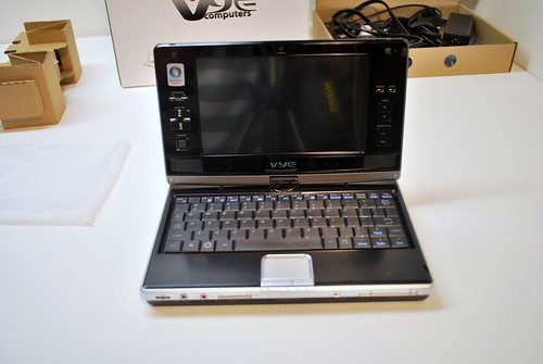
The box that the unit came packed in was solid, just like the unit itself. There was a surprisingly useful plastic handle at the top, and while the packaging might not be formal, it served it purpose well enough. Opening the box revealed two modules, one housing the S41, and the other containing documentation, power cables, external GPS antenna, and a soft slip case. As I mentioned the unit feels very solid, when closed it feels like a single piece. There is not even the slightest wiggle from the battery which is nice. Pulling the S41 out for the first time, I was surprising to see how small it was knowing full well that this tiny computer managed to fit a full sized DVD burner inside. The hinge that holds the screen closed is firm and consistent, adding to the solid feeling of the device. The vertical hinge that spins the screen around into tablet mode feels firm as well.
Click the ‘Full article and comments’ link to read more.
The trackpad and mouse buttons are miniature but function well. The left mouse button is a bit longer than the right mouse button making it easier to press. Both buttons have a nice click to them, I was glad to find that they weren’t ‘squishy’ at all. I need to spend some more time typing with the S41 before I can give a good assessment of the keyboard. For the time being I can tell you that it is quite small but the keys have a good travel distance; they feel just like a mini version of a full sized laptop. Most of the keys are intact in the S41’s keyboard. There is a shift key on both sides (however the one on the right is single key sized as opposed to 1.5 keys like the one on the left), but no Fn or Ctrl on the right. Arrow keys are there as well as a full row of number and function keys. Arrow keys are double bound to manage the Home, End, Page Up, and Page Down buttons via the Fn modifier. All of the function keys are also double bound with Fn to control many of the hardware functions of the computer, such as BT, GPS, Wifi, camera and more. My unit came with 2GB of RAM which helps the 800MHz run Vista surprisingly well. My expectations weren’t high considering the very low powered CPU, but general performance while navigating around the OS was fine.
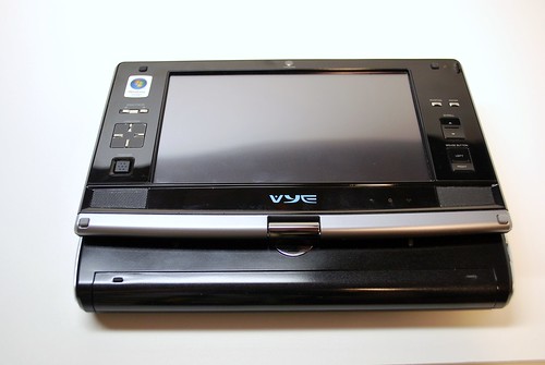
Attention gamers! The S41 has a nice arsenal of buttons around the screen bezel; if you fold the screen into tablet mode an grab the sides with your hands you have a decent amount of buttons for gaming. Take a look at the picture below, there is a d-pad and mouse pointer on the left, and on the right there is left and right click, as well as a scroll up and scroll down hardware keys which could be bound to an action. I’m looking for suggestions as to what games could be played well with this assortment of buttons. I’m thinking some sort of simple emulated N64 or Super Nintendo game, but if anyone has any suggestions feel free to let me know in the comments.




Too much space wasted on the screen hinge.
Totally agree
Too much space wasted? What do you mean, the overhang on the back? Part of it is the battery, and the rest of the space was made out of necessity of fitting the DVD drive in there on the right. Luckily it works well as a handle when using the screen in tablet mode and rotated.
Why is it so difficult for manufacturers to understand that designing ultra-mobile devices is an optimization problem: given the size of your device, maximize your screen and your keyboard. The size of the screen compared to the size of the device is obviously not optimal. Also, it is too thick! If the Air is around 0.7 inches thick, an ultra mobile PC should not be over 0.8 max…
Not mentioning the price :)
John, think about how large the Macbook Air is compared to this 7″ screen device. There is no way they could make this thing that thin and still fit everything it in. I suppose they could have gone with another .5″ on the screen instead of the extra buttons, but they are actually rather nice to have when you want to use it in tablet mode.
2/3’s of the Air’s volume is taken by its battery. The technology is there, but what is lacking is a clear understanding of the tradeoffs and the priorities that have to be set when designing under such severe constraints (in the ultra-mobile category).
As far as all those buttons go, sorry but I don’t agree. Buttons cannot replace screen. Screen, however, can replace buttons with the appropriate software (take a look at the iphone in the pictures you posted. It makes the point clear…)
I agree with you on some points John, but also remember that this is a relatively old UMPC, the design ideas where much different only a year ago than they are now. They are actually readying a newer version, check out the SX3 on the right side of the UMPCP front page under Latest UMPCs
never under estimate the power of hardwaare buttons..
.. from design aspect, screen should fill the whole lid, but usability on these Kohjis are really nice due the frame buttons and mouse pointer.. try to hover over some menus without mouse..
You are right Ben, SX3 is much better. However, it should make you wonder how come the SX3 has almost the same volume as the MBA, while the latter gives you way better screen and way better keyboard. As a designer you decided to cut the size of the screen and keyboard – at least make it worthwhile!
@jkkmobile, you are right to ask for buttons. The truth is that if you have a touchscreen you should not have a need for them. Unfortunateley neither Windows (desktop or Mobile…) nor the various implementations of Linux have managed to take full advantage of the concept of a touchscreen. Mobile OSX is the first to do so. I hope the others will follow (it seems they do) which is exactly what we need in order to get trully functional umpc’s (or whatever their name is :) )
@ John
“The truth is that if you have a touchscreen you should not have a need for them.”
If you are holding a device, it`s much more comfortable to use buttons that are integrated into the screen for browsing, than to use a finger/ pen on the touchsreen.
Hardware buttons rule!
@Nobby
Try to navigate or browse the internet with the buttons of a Nokia or HTC phone. Do the same on the iPhone using only the touchscreen GUI and your fingers. The difference is huge (and I am not talking about using a pen – we should have got rid of them years ago…), there is simply no comparison.
Not only using the touchscreen is way more efficient, it also saves you valuable space for your precious little screen.
You want to see a design that in my sense is optimal? Take a look at a Jornada 720. The only contemporary device along these lines is the Shift, but unfortunately it lacks the appropriate OS :(
@ John
It`s probably due to the size of my fingers that I sometimes really curse my ipod touch, especially when it comes to browsing.
But I just find it much easier to press a single button on my Nokia Phone to zoom in or out than to use my fingers on the ipod touch. You always need both hands to operate a touchsreen. Some well placed and sized buttons can make life that much easier.
I really like touchscreens and would like to see them used in more products (especially the multi-touch variants), but even with optimized software, it`s not always the best solution.
I read up to the part that mentions it runs Vista. At that point, I lost interest. Knowing that 2/3 of the hardware power I buy will be monopolized to run that OS really turns me off. I support a boycott of all ultra mobile devices sold with Vista.
@john
I believe you are somewhat missing the picture here when you are complaining about the thickness of the device. The Vye S41 (Kohjinsha SR8) is a unique UMPC (actually, Kohjinsha is about to introduce the 8.9″ successor SX3) in that it includes a DVD drive. This takes some space untill somebody can find out a way to make optical drives that are 0.0mm thick.
If you want a slimmer device, get one without a DVD drive. Kohjinsha and other manufacturers are offering a wide choice.
As for the pros and cons of hardware buttons around the screen – this is a matter of personal choice (I also own an iPod touch and actually I would like to have a few “real” buttons, e.g. for volume control. It is quite a nuisance to have to unlock the screen, make sure that the iPod touch is rotated in the right direction to really show the volume bar, adjust the volume, wait until the screen has locked again so that there is no unwanted action when you slip it back into your pocket).
And as you acknowledge yourself, the newer SX3 is using more of the available space for the screen.
Okay, okay let’s stop trying to sell the Vye S41 for Dynamism, and it’s probable overstock of them, and get back to the pros and cons of this UMPC.
Pros:
1. Tablet Mode or Laptop Mode
2. FULL Mini-Keyboard
3. Sleek and Stylish
4. DVD Burner for new movies
5. Smallish size
Cons:
1. $1500
2. Vista
3. 2.76lbs
4. severely outdated A110
5. Wasted(understandable for extra features) Bezel
Cons:
– Kohjinsha SC3/SX3 with better hardware are available (or will be within the next weeks) for a better price.
I don’t think I miss the point with the dvd drive. This is why I said initially that one needs to set down the priorities when designing such devices. In an era where we can squeeze all the information of a dvd in a tiny mini sd card, it doesn’t make sense to include a whole dvd drive in the chassis of a umpc. With the price they sell them it would be better imho to include a cheapo external drive. And give us a device that is half as thick and half as heavy…
interesting to note: the only reason the SR8(VYE S41) got any buttons on the screen area was due to the fact the 8.9″ LCD was too expensive 6 months ago (when it first came out)…
so they had to stick to the 7″ LCD and thus had space left over on the LCD and put some buttons on there to use up this space…
(this is the official word we got)
There is already a video review of this computer on the UMPC portal: http://www.youtube.com/v/-l8Cd8kawDc
and the link to the thread:
http://www.umpcportal.com/modules/newbb/viewtopic.php?topic_id=2204
I like all John said, I could not have said them better.
My ipod 1G is a essential iPod, Personal digital assistant and even more, and even has long been from the time I purchased it. It continues to work on the most current iPod system software, and any application I would need it to operate. I’m using it to leave this remark at the moment. I would say you’ll find it a much more than solely an “excellent hobbyist system” — you’ll find it an superb iPod