You’ve probably seen my initial software impressions of the HP Mini 1000 MIE [Portal page]. Now it’s time to take a look at the hardware that makes the Mini 1000 so attractive.
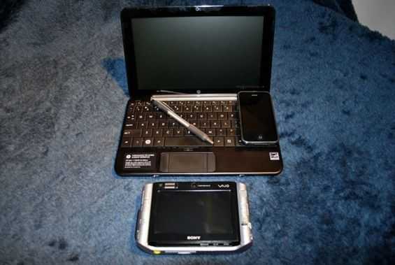
The Mini 1000 is actually quite small. Have a look at a size comparison picture.
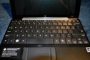
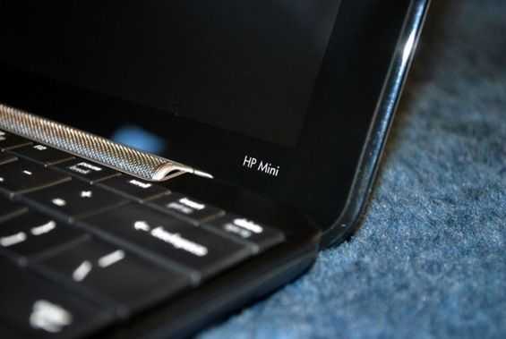
Opening up the Mini 1000’s lid reveals an impressively large keyboard. Not only are the keys nearly the size of a full blown laptop, but they also have good feedback and look very nice as well. The letting is a perfect snow white, opposite the majority color of the Mini 1000. The graphic letters on the letter keys themselves are printed very large and are easy to see, great for people who can’t quite type without looking down at the keyboard. For some reason the font on all of the other keys is very small and minimalist (example: the shift key); not too small, but certainly not making use of the space on the key. The board stretches from one end of the netbook to the other, utilizing all the space available to it, which is why they managed to fit such a large keyboard on a small netbook. The keyboard as a unit is not reinforced well from the bottom and will bend if you push down on the center of the board. If you aren’t trying however, you won’t notice this, that is just a build quality note.
Visually the Mini 1000’s keyboard might be very pleasing, and it also manages to have a lot of real estate, so you’d think it would be a great keyboard right? Well… not quite. Before I get started here let me say that the keyboard is very good, the best of any I’ve tested on a netbook so far. But, it might be a little bit different then what you are used to. I am used to a full sized desktop keyboard which has keys that stick up pretty high. The Mini 1000’s keys actually appear to be larger than those on my desktop keyboard. However, they are very flat and there is very little space between them. Imagine the seams on a concrete sidewalk. You know how each square of sidewalk runs right into the next one? That is very similar to the way that the keys on this keyboard are set up. I am a pretty fast touch-typer, I don’t need to look at my keyboard to type. One of the strategies that makes this possible is being able to feel the space between keys, and the edges of keys to determine where the next key lies. You can’t do that on the Mini 1000’s keyboard because keys are so flat and close together. This isn’t a huge problem though; it is easy to adjust to it after a short period of time, but you might notice it if you are very productive with a normal desktop keyboard. For the target audience of the Mini 1000 MIE it probably isn’t an issue at all, as they will be coming to the unit with little touch-typing experience.
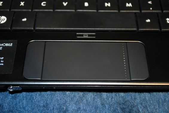
The trackpad is decent in size, and it is mostly personal preference when it comes to liking your mouse buttons at the bottom of your trackpad, or on the side. When they are positioned on the side, like they are on the Mini 1000, it seems to imply that you are to navigate the mouse with one hand and click the buttons with another. I personally like to be able to do both with one hand, so mouse-buttons on the side are not the ideal setup for me, but for Mini 1000 MIE target customers, this would probably work well because it allows them to easily use two hands to operate their computer instead of just one. It is also a space-saving design decision to cut down on the size of the palm-rest and the overall footprint of the computer. There is a handy button above the trackpad which disables it. This is a nice feature when you are trying to do some serious typing. It is easy to accidentally move the cursor with your palms if you are typing quickly.
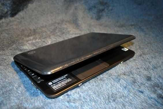
The Mini does a good job at finding a good design theme and sticking to it. No part of the device seems out of place, and the most complex and attention drawing part of the computer (the hinge) is subtle and stylish, which I think is a good description of the computer as a whole. Stay tuned for my extended hardware and software impressions and more coverage of the HP Mini 1000 MIE.




I hate that mousepad!
They also could get rid of the F1-F12 bar by using Fn key + 1,2,3,4,5,6,7,8,9,0,-,=; and set the display brightness to FN+SHIFT or FN+second row (qwertyuiop…).
The casing seems like black painted brushed aluminum. This probably (once scratched) will become very ugly, and will not be comfortable to rest the hands on.
I also dislike the keyboard. Too large looking; I hope they release a 9″ version of the Mini (HP Mini 900 MIE).
It seems no manufacturer seems to get it, but I like many others will like to see at least 1366×720 to 1280 x 720 to get to playback 720p video.
I had the 2133. The Keyboard is the best i ever had on a laptop, even it is very small. Two things are bad on the keyboard:
D-Pad is to small. The Letter 1 is smaller.
The mousepad was very good for this size. I also had concernings regarding the mousepad and the buttons, but there are excellent. As you dont work in train like at home at desk, its usefull to have the mousebuttons on the side, not below the pad.
It’s too long for my gadget bag (no more than 240mm), and I want a convertible tablet format.
I have an HP Mini Note 1000 10″ screen and have found that it’s keyboard is a lot friendlier than the Dell Mini 9 or the Asus EEE 701. In fact I bought my Mini Note because of the keyboard (I do a lot of typing too!). The touch pad took some getting used to, but I can cope! I now use my Mini Note as my main computer.
//bob
We have an HP 1000 10″, main grip is the 4200 RPM drive, minor gripe is the trackpad with the buttons on the side. Like stated in the article, feel weird too handing the trackpad. Otherwise, best looking, slim sized, fully packaged Netbook.
the best of any I’ve tested on a netbook so far. But, it might be a little bit different then what you are used to