It has definitely been an interesting testing experience with the Mini 1000 MIE [Portal page]. The netbook, as you have probably read, runs a custom Ubuntu interface designed by HP. They call it the Mobile Internet Edition of the Mini 1000. I am anything but a Linux pro, so I approached this as a newcomer to Linux. Luckily, HP is marketing the Mini 1000 MIE to less experienced computer users and not Linux pros. I gave you my initial software impressions not too long ago, but I’m ready to give you some more detailed information.
Home Screen
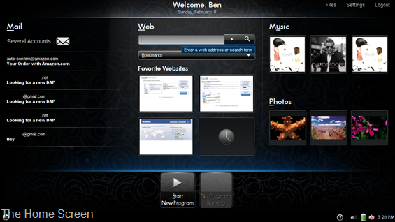
Where to start…. The home screen, as we’ve showed you before, does a good job of simplifying the computer experience down to some of the most commonly used activities on a computer. There is easy access to email, web, and photos/music. I have some issues with the home screen though; it seems like it could be set up to make people a bit more productive. My biggest issue is the photos/music section on the right side of the home screen. For some reason this is really unappealing to me. It shows the album art of the last three songs you have played, or the last three photos in your photo library. All it functions as is a shortcut to my photo or music library. Do I really need to have that 1/3 of my home screen experience taken up by the last three photos I put into the library? For some reason it just doesn’t sit right with me, I have no need to say “Hey look, those are the last three photos I took”. If I want to look at my images, I will actually go look at them, looking at thumbnails of the last three that I happened to take really doesn’t do anything productive for me.
I want dynamic information displayed in this extra space that is actually useful. You can squeeze shortcut button to my photos or music somewhere else on the home screen, but it seems like something else in this 1/3 space would be much more beneficial. One of the things I have considered would be weather. It would be really cool to see the current weather, temperature and, the forecast for the next few days. How about severe weather alerts too? Another idea, which could even be in addition to a weather section, would be some stocks. It would be nice to see some graphs of different stocks which could be customized by the user. Of course you could always p00 pull down some recent news from a major news website. This is the kind of dynamic information that I feel would be much more useful in this space rather than simply showing me the last three pictures I took, or the last three songs I’ve listened to.
The Web section of the home screen gives you a URL bar to reach any page, a drop down list of bookmarks, which aren’t easy to navigate if you have a lot of them, and four customizable squares that act as shortcuts to your favorite sites. It would be nice if each of the four site shortcuts had titles so you could see exactly what you were looking at. You can see small thumbnail previews, but all four of my boxes were filled with Google services, and every thumbnail was the Google login screen, I basically had no idea which site I was going to.
The Mail section of the home screen seems good in theory. There is a list of messages from your inbox right on the home screen. Mozilla’s Thunderbird is the application that makes all of this happen, and clicking on one of your messages in the inbox list will launch the application. I tried setting up Thunderbird using the automatic configuration of a Gmail address but it hasn’t worked correctly for me. It wanted to set up a POP connection to my Gmail account and it downloaded some very old emails for some reason. To be honest, I didn’t dig down and properly set up my email with Thunderbird for two reasons. The first of which is that I didn’t want to accidentally download a bunch of emails to the Mini 1000 and mess up the organization of my Gmail inbox. The second reason is that a target Mini 1000 MIE user should not have to dig through configuration options to make their email work, especially if they already specified that they have a Gmail account (it should know how to set it up correctly for them, given the proper credentials). I trust Thunderbird as a reputable email client to be able to be configured correctly for any email account that supports POP or IMAP, but the point remains that it shouldn’t be up to a target Mini 1000 MIE user to have to figure out how all of those ‘behind the scenes’ preferences work.
(Continue Reading on page 2…)




Long term software impressions — HP Mini 1000 MIE http://www.umpcportal.com/?p=5895
[reading] Long term software impressions — HP Mini 1000 MIE | UMPCPortal – The Mobile Internet and Comp.. http://tinyurl.com/djr6l6
Long term software impressions — HP Mini 1000 MIE: It has definitely been an interesting testing experience with.. http://tinyurl.com/c7v3kj
The media experience was probably lifted from their work on TVs – which is why it seems so much like a TV.