The Rest of the OS and Other Applications
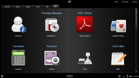
The OS looks pretty good. The home screen that hides the ‘real’ OS underneath helps to break away from that desktop-with-icons interface model, which is good for target Mini 1000 MIE users. It simplifies the computing experience. My only problem with the OS, as it performs on the Mini 1000, is the core rendering of UI elements. I described my issue in the inital software impressions post:
While the interface does look good while it is standing still, I’m not very impressed with it when things are actually happening on-screen. There are some rendering issues. Very frequently I will click to launch an app, or pull up a dialogue window, and I will see the frame of the window load first, quickly followed by the contents. The opposite will occur while closing some windows. The content will disappear and then the main window space will disappear a moment later (and maybe take a second to re-render what was originally underneath). In action, it doesn’t look very clean, and it seems unfinished. It seems like there is lots of ‘popping’ of windows and borders which does not appeal to the eye. Though this probably isn’t an indicator of performance, it does have the effect of making it look like the computer is running more slowly. There are a few things that could be causing this. It could be a hardware issue or the OS itself.
As I mentioned, it makes the computer feel like it is running more slowly than it is, and that shouldn’t be the case. It is disappointing to have capable hardware that doesn’t seem to be performing because of some poor loading of UI elements.
One of the reasons that Ubuntu is so popular as a Linux distro is that it has many of the features that people are used to on Windows machines. Putting files into an archive, managing folders and files, are all very similar to what people are used to in Windows, and they have done a great job at making sure that all the important functions are there. There hasn’t been a time when using the Mini 1000 MIE that I have come across something that I wanted to do, but couldn’t because it wasn’t replicated within the OS (keep in mind this computer is mostly for consumption of data, not creation). So far it seems like everything that is necessary is there. HP was smart and realized that if people were going to be productive on the Mini 1000 MIE, they would need good foundations for their most important apps. They made that happen. Look at this power lineup:
Email: Thunderbird
Internet: Firefox
Office Productivity: OpenOffice
These three components need to be really solid for productivity and the three apps that HP chose to go with them definitely fit the bill. Without these three things I think it would be tough for the Mini 1000 MIE to be a real productivity tool. These obviously aren’t the only three tasks that people perform on their computers, and HP allows you to install applications from a list approved by HP. Installing is simple and you’ll have access to apps that fill many of the commonly needed functions of a computer (think calendar, calculator, PDF viewer, etcetera). They might not be the applications you are used to on your Windows machine, but they are usually pretty functional alternatives. To see a list of all the installable apps, see this post.
There are still some UI issues that could be worked out. I love the hardware home screen and app switcher buttons and use them frequently. However, when the new program launcher is open and one presses the app switcher key, the app switcher comes up (visually) underneath the program launcher. Essentially it is invisible, but it still has focus of the cursor, and the cursor can’t leave the limits of this thin window. To undo this, all one must do is press the app switcher key again, but if you don’t quite realize what is happening, things could get confusing and frustrating fast. The same issue seems to be present within the media suite.
A few bullets before I leave you:
- No advanced power options
- Pet peeve: can’t stand how Firefox doesn’t highlight the URL as you click on it, it is annoying to waste time having to select the entire URL to type in a new one
(Continue reading on page 4…)




Long term software impressions — HP Mini 1000 MIE http://www.umpcportal.com/?p=5895
[reading] Long term software impressions — HP Mini 1000 MIE | UMPCPortal – The Mobile Internet and Comp.. http://tinyurl.com/djr6l6
Long term software impressions — HP Mini 1000 MIE: It has definitely been an interesting testing experience with.. http://tinyurl.com/c7v3kj
The media experience was probably lifted from their work on TVs – which is why it seems so much like a TV.