Thanks to the great crowd at DevMob2010 in London last week, I’ve had some good feedback to my scenarios and segmentation diagram which was originally created in 2006 and is now updated and re-published under CC license. It should help as a stimulus for software developers thinking about the possibilities in the space between smartphones and netbooks and can help device designers to think about usage scenarios. Customers will also find it useful to pick out their own usage scenarios and to see what type of device fits with their requirements.
FEEDBACK IS ENCOURAGED. If you have thoughts, please add them to the comments section below.
During my session at DevMob I had a set of suggestions which I’ve added to the diagram. It was interesting to hear suggestions for the 8-10 segment which included Multi-touch/User gaming (many players, one device) and multi-person video viewing. Those are two models that the iPad is targeting very closely. We also added ‘Media Overview / Chooser’ to the 8-10 segment based on the need for screen space for an overview of images, album cover art or video’s.
Many thanks to all that took part in the sessions at DevMob and thanks to all of you that took the time to present and talk about your ideas in this space. I hope to see you all again at the next DevMob2010 and at other events in Europe.
The diagram (V2.0) is available here (PDF)
Notes are shared in a Google Document here.
Update: I’m experimenting with a slightly different layout based on feedback below. The segments have been re-drawn to represent a more fluid crossover point.
V2.1 diagrams are here.
PDF: https://www.umpcportal.com/downloads/devicesegments-V21.pdf
JPG: https://www.umpcportal.com/downloads/devicesegments-V21.jpg
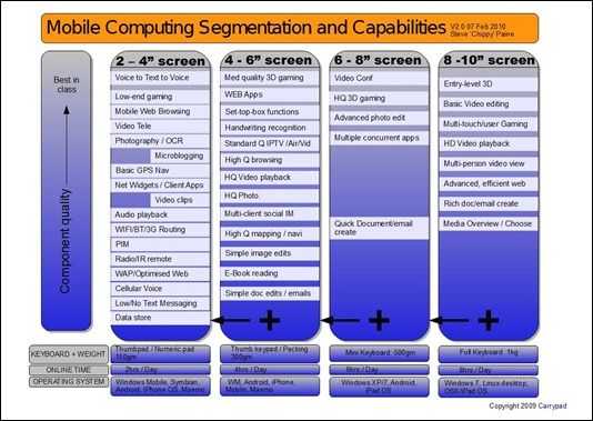
Click for full size jpg image.
Thanks to Intel for sponsoring my trip to London for DevMob and to the Soft Talk Blog team [twitter] for their assistance.

Mobile Scenarios and Segmentation by Carrypad is licensed under a Creative Commons Attribution-Share Alike 3.0 Germany License.




New article: Mobile Computing Segmentation and Capabilities. (Updated from DevMob 2010) http://bit.ly/b5EVWi
RT @umpcportal: Mobile Computing Segmentation and Capabilities. (Updated from DevMob 2010) http://bit.ly/b5EVWi
*cough*Feb2009*cough*
ooh! Thx
Doing away with the red squiggles would improve presentation, as would using PNG format – it gives much crisper image quality!
Thx. The PDF should be sharp, as is the full size (unzoomed) JPG (at least to my eyes) I’ll fix the squiggles.
Fixed the red squiggles and increased the quality of the JPG/PDF.
RT @chippy: RT @umpcportal: Mobile Computing Segmentation and Capabilities. (Updated from DevMob 2010) http://bit.ly/b5EVWi
whats the reasoning for not having moblin listed beyond the 4″-6″ segment?
The OS’ are only examples (as explained in the notes ;-) )
I have also overlooked that! :)
I’m eying the 4 inch devices with excellent video playback capability because I like watching my cartoons that are always in MKV containers.
Hi Chippy. Great diagram, and this portends well for device development. The really “sweet spot” for me, is the “pocketbable MID device,” with a 4 inch, to a 6 in screen. I am a new blogger to this great Website. Maybe you, JKK, or someone else, can answer one question, or resource for me. I own a vintage HP IPAQ hx4705,(circa 2004) with the great 4in VGA,640x480p TFT display. How can I upgrade my device, to “greater than” 128 MB of RAM? BTW, that Viliv S5 with Windows 7, fast Atom CPU, and SSD, sure looks nice. Also, where is your website called home? Thanks…P
I am not sure that this segmentation is good for us, or if companies should be telling us what feature/os is viable on a given screen size. it should only be limited by hardware
The diagram is flawed in so many ways. How is Ipad OS (it does not exist, it the next ver of iphone os) fighting win7 on the OS vs. screen size front?
And how is Moblin targeted to 4-6″? It was announced as a netbook OS for low power hardware with productivity also in mind. Actually I have it on 12″ tablet and is very usable.
Best mobility site FTW.
I totally agree that the diagram is flawed. Every diagram like this is going to be flawed but it’s there as a stimulus and i’m glad it stimulated you to comment.
The ‘segmentation’ is really based around ‘bands’ of screen/keyboard/battery life combinations but I fully expext those boundaries to cross over. I wonder if there’s a better way to represent that in the diagram.
Regarding the OS’, please don’t take them as a complete. They are just examples so I think i’ll take them out to reduce confusion.
Thx for the feedback.
Based on some feedback (keep it coming please) i’ve slightly simplified the diagram and removed the references to OS. They are’nt exhasutive and are just causing confusion. I’ve also added overlaps which hint at the ‘fluid’ nature of the diagram.
Again, the diagram is a stimulus for thought and discussion and not something I feel is the final solution.
PDF: http://www.umpcportal.com/downloads/devicesegments-V21.pdf
JPG: http://www.umpcportal.com/downloads/devicesegments-V21.jpg
Thanks for the feedback! Now that i realized the fluid nature, I am happy to see it on this page :).
I see that now! You might highlight the overlaps and mark them too a little. Also I don’t know if you go graphics, but you could add a LCD screen in the background proportioning the screen sizes as your rows go (making it visual how the actual screen sizes compare)
greetings
A graphic of the screen in comparison with hands or similar would be good. I’m terrible at graphic design so that might take some time!
Again, thanks for the feedback. It helps everyone.
Is there a way that you can recommend to companies that a 6 inch screen is the perfect size. 5 is a little to small. 7 is a little to big.
I looked at the Archos 5 Android at Best Buy. It is nice. I will look into the 7 when it becomes available.
The presentation looks a little light in the 6 to 8 range. Consider redrawing the lines from 3 to 5, 5 to 7, and 7 to 10. I can see a video call on a 6 inch screen held portrait in our future.
Thank you.
Remember that the diagram goes 4- 6 and 6 – 8. 6″ . The 6″ becomes a crossover point where a lot can be done. 5.6″ at 1024×600 could be a nice sweet spot!
RT @chippy – Requests for feedback! #DevMob2010 presentation on mobile computing segmentation and capabilities http://bit.ly/cXiEag
Thank you for the article, but i think the difference between ARM and Atom based devices is big and it should be shown on the diagram – for example usb-less iPad and Archos 9
the lack of USB is a apple design decision, not something inherent in ARM based devices.
Just posted on your “Choice is King” blog post. Handheld US announces the Algiz 7 tablet device, posted on Engadget at 1:11pm EST. Algiz 7, utilizes Atom at 1.6GHz, has 2GB of RAM, 64 GB of SSD, and runs Windows 7 Pro. It is a touchscreen “ruggedized device,” with large swappable battery(2400MAh). This is likely to be very pricey. Who is Handheld US, anyway? I’ve never heard of that firm. Just, thought I would post this.
lexequinerad , thanks for the info.