Software
The Droid X comes pre-installed with Android 2.1 but, of course, promises are being made for an eventual Android 2.2 upgrade. Promises mean nothing for users until they become a reality, so one can only hope that this upgrade happens soon. Still, there is nothing particularly wrong with Android 2.1, but it’s missing some cool stuff like Flash 10.1, voice actions, and the ability to work with Google’s Chrome to Phone extension (which is very useful).
Every single time I plug the Droid X into my computer, my web browser is automatically launched and navigated to a page that tells me all about Verizon’s “V-cast media manager inch. What’s more, this page automatically plays a horribly annoying flash video with audio narration. I’m not even sure if it will go away once I install the software they are trying to force into my life, but I’m not about to install it to find out. To continue the frustration, this page occasionally launches multiple times during the connection process.
Home Screen
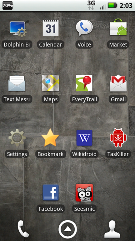 One of the very first things I began looking for on the Android market was a replacement for the default Droid X home screen. The Droid X’s home screen is custom-made by Motorola, and features some rather ugly graphics which show which page you are on when you a sliding between pages. There are 7 pages than can be scrolled through, and only three buttons that are consistent across all 7 pages. Those three are Contacts, Phone, and the App Menu button — none of which can be reconfigured. These buttons are covered up for a few seconds by the page indicator which means you have to wait to be able press them if you slide from one page to the next, then realized you wanted to use any one of the three buttons. The choice by Motorola to put the Phone and Contacts buttons down there seems redundant as the Phone application has a tabbed menu inside of it that takes you to Contacts.
This might sound picky, but even the unlock slider on the lockscreen performs poorly. Sometimes it will slide across fine and unlock in a fluid motion. Other times it will hang for just a moment, or move in a much more jittery manner than it should. This might not bother some people, but I suppose I’m used to the very smooth and consistent “Slide to Unlock inch slider on the iPhone. Luckily this can be amended with a search through Android’s marketplace.
Scrolling between home screen pages (as well as inside the App Menu) looks horrendous to someone who is accustomed to the iPhone’s silky smooth scrolling. The default home screen and App Menu lack any sort of landscape support. Fortunately, the jittery scroll and lack of landscape can be easily fixed with third-party software. I quickly found a Marketplace application called Launcher Pro which offers significantly smoother scrolling performance on both the home page and in the App Menu. Additionally, Launcher Pro replaces those two unconfigurable buttons with 5 fully customizable buttons which scroll to reveal a total of 15 buttons which are great for quickly accessing frequently used apps.
Widgets and Social Integration
Motorola has customized the Android interface with widgets and social networking. Sadly, its implementation is poor, and there is enough social networking overlap to make your head spin.
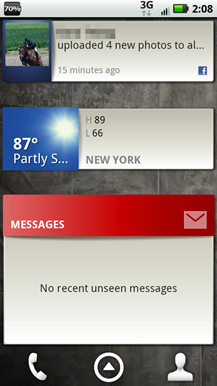 The widgets that Motorola has provided are useless for the most part, and absolutely inefficient. There is so much wasted space, it’s almost enough to make me cry. I honestly have no interest in a widget that shows me the latest Facebook or Twitter update from just one of my friends at a time, or a weather widget that takes up four app slots and only shows me the current weather and the high and low for the day (looks like a forecast could easily fit in there, no?). The instant I looked at Motorola’s custom widgets (and pretty much all the Android widgets) I was reminded of why I wrote this article. The only widgets I found useful were the four quick toggles that Motorola provided (WiFi, Bluetooth, GPS, Airplane Mode), each one only takes up one app slot on the home screen.
It’s nice that Android can populate your contacts with Facebook friends. I hardly had to add anyone to my phonebook after inputting my Facebook information which was really convenient. It’s a neat concept to think that because my contacts have been populated with Facebook friends, everyone’s profiles are automatically associated with the names in my phone book, but Motorola hasn’t pulled this off in a way that even comes close to making me want to use anything but third-party applications to manage my social networks. Their implementation is convoluted and not centralized. I swear there must be at least 5 different places where I can update my various social network statuses or check the statuses of my friends.
I’m sure there will be plenty of people who use the Droid X that will never realize that you can swipe left and right on the contacts page to reveal a list of social history and status updates of their contacts. The GUI hardly even hints at it, and if you don’t recognize the three little dots at the top right corner of the following screenshot as meaning that you can swipe left or right, then you’d never know that it was there (I’m pretty sure I came across it by accident):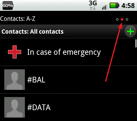




You should try an Android phone with HTC’s Sense interface, such as the Evo. Much more user-friendly, much slicker in appearance, and — in my view — a worthy rival to the iPhone.
Unlocking your mobile can be expensive sometimes, but have you seen this new cell phone unlocking project ? It aims to make it free and easy for anyone to unlock their phone.