Design
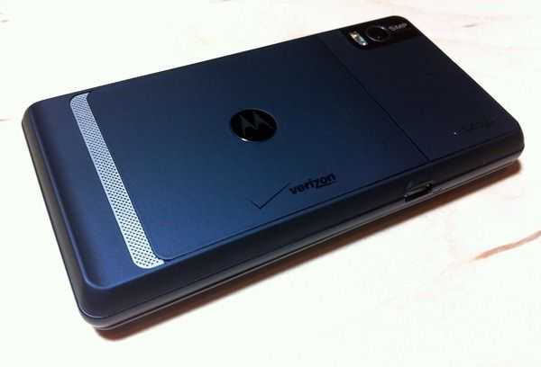 As you’ll find in the software section, the Droid 2 is not very different from the Droid X. On the hardware end, however, things are different. At first glance, anyone will see that the Droid 2 is quite a bit smaller than the Droid X. I mentioned that the Droid X felt like a little slate in one’s hands. The Droid 2 definitely has more of a smartphone feel to it. This isn’t a bad thing, but it’s smaller screen makes it feel more like a phone, and less like a multimedia device. Still, this feeling is entirely aesthetic, as the Droid 2 and Droid X have the same resolution screen and should be able to handle the same multimedia playback. Despite that the Droid X is a single piece of hardware and the Droid 2 is a slider, I have a strange feeling that Droid 2 is a bit more solid than the Droid X. Perhaps it’s the more squat form-factor (the Droid X is a bit more thin and has a larger surface area). Maybe it just fits in my hands slightly better.
While the Droid X was comprised of tones of grey and black, the Droid 2 consists of black, grey, and a dark navy blue which I think looks great on the device. The back is where the dark blue is found and it’s in the form of a metal covered with a rubberized coating. The coating feels really nice in the hands and doesn’t lend itself to something that is vulnerable so it doesn’t seem like such a travesty to set it down on a rough surface.
The hardware buttons (power/hold, volume rocker, and camera button) feel just about as cheap as those on the Droid X. They click quite poorly and feel like they are holding on by a mere thread. They wiggle, waggle, and do all sorts of things that you wouldn’t associate with a high-end smartphone. Honestly, Motorola, I’m pretty sure the that buttons on disposable cameras are more firmly rooted to their respective device. The buttons are also very flush with the edges of the device and are quite foolishly placed “over the hill inch, if you will; instead of being affixed to the zenith of the device’s side, they are just over the edge of it more toward the back of the device than the front. This makes them hard to find visually and harder yet to press with any sort of confidence. This is disappointing because, the lock button in particular, was rather good on the original Droid while the Droid 2’s pales in comparison.
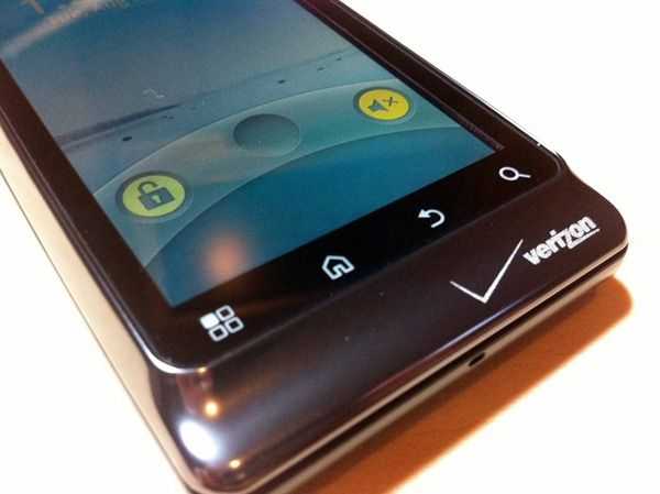 When I first got the Droid 2 out of the box, I preëmptively cursed the capacitive Android buttons because I’ve had poor experiences with touch-based buttons in the past, particularly in the realm of consistency. There is nothing more disappointing to tap a touch-button only to find that, after a few seconds, it hasn’t actually recognized your tap. Surprisingly, consistency was scarcely an issues with the Droid 2’s buttons. They actually worked pretty flawlessly every time I wanted to tap them, and a slight vibration provided feedback to know that they had been pressed. Where I was bothered though was the situations in which I accidentally pressed them. If part of your thumb or hand happens to be over one, there is a great chance that it will be recognized as a button tap, which can easily mess up whatever you happen to be doing on your phone at the time.
I enjoyed the fact that real hardware buttons allowed me to use the Home button on the Droid X’s front to unlock the phone. It was very useful if the phone was sitting down on a flush surface instead of reaching around to the top of the phone and pushing the hold button, I could simple press the home button to light up the screen and unlock the phone. This ability is lost with the Droid 2’s capacitive Android buttons which are active only when the screen is lit. I suppose you can always light the screen by slightly opening the sliding screen, but this creates problems of it’s own….
Screen
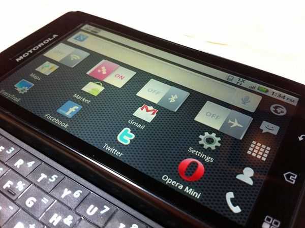 For the friends that I showed this phone to, I had to demonstrate to nearly each one of them that it was a slider. You could easily imagine a phone of this width that isn’t a slider, which is why most people don’t seem to pick up on it right away. The sliding mechanism snaps in place at both ends and doesn’t spring between the two states (as a phone like the N900 [product page] does). The slide feels well reinforced and the locking action on both ends is satisfactory but the lack of springing action lends itself to some problems. I’ve frequently found that while in my pocket, the screen would slide just slightly open and the screen would turn on. Occasionally the phone would even unlock and I’ve sometimes pressed buttons with my leg when the phone was unlocked. This can lead to pants-based phone calls (usually not a highly prized feature) and definitely doesn’t help the battery with the screen constantly turning on while in one’s pocket.
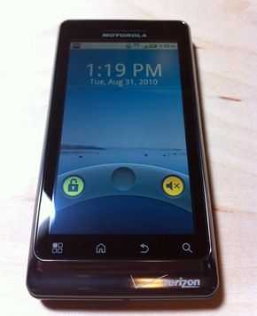 The screen itself is decently vivid and sharp at 854×480. Viewing angles are pretty impressive, but share the same slight washed-out effect as the Droid X anywhere after 45 degrees or so, the screen washes-out just bit. Fortunately, it doesn’t continue to wash-out past this point. The screen’s viewing angles are more than acceptable, but can’t quite stand up to the iPhone 4’s incredible IPS display. Direct sunlight use isn’t half-bad either, and the phone’s ambient light sensor does a good job at detecting, and subsequently adjusting the brightness of the screen automatically.




I have a Motorola Droid 1 and was hoping for the Droid 2 to have better Adobe Flash support. I even resorted to overclocking it to 1.1 GHz and video playback performance on the non-mobile optimized videos were just a little better.
If only there was something better than Flash. HTML5 doesn’t support encryption (DRM and all that) so most of the sites I visit to watch videos won’t be using HTML5 anytime soon.
Hopefully Flash becomes more resource efficient (not something Adobe is famous for) and/or these future faster ARM chipsets like dual core Cortex-A9 will be powerful enough for Flash.
For me, performance was probably less of an issue than the lack of usable controls/interfaces, but it is incredibly annoying that a YouTube video may playback just fine one minute, then is suddenly start running terribly (same video) with no explanation.