Software
Samsung has added a dash of their own style to the phone’s Android interface with their “TouchWiz 3.0 inch interface. They did a good job of equipping the phone’s software with it’s own style and not making it feel like just any old Android phone.
Lock Screen
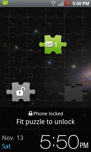 The lock screen consists of a puzzle piece with a lock on it that you have to fit into the background in order to unlock the phone. It would have been cool if the puzzle piece took on the part of your background that you fill it in with, but sadly this is not the case.
The puzzle piece idea is also used for messages and missed calls. If you have a message waiting for you, you’ll see an additional puzzle piece with a different icon on it. If you drag it into the open slot, you’ll be taken straight to the new message. This is a neat way to go about things, though I would have been much happier if it was all-inclusive. It doesn’t apply to email, voicemail, or any other system/app notifications.
Homescreens and Widgets
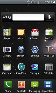 TouchWiz modifies much of the phones appearance and uses an iOS-esque paradigm. You’ve got your usual homescreens (which you can have up to 7 of) and across all of the screens is a consistent dock that holds up to four icons which you can customize to your choosing.
When sliding between homescreens, you can tap the little gear at the top right of the screen that will take you to the homescreen manager. Within it, you can define how many homescreens you want, reorder them, delete ones you don’t want, and even set any of them to the “Home inch screen which is the one that it will go to by default.
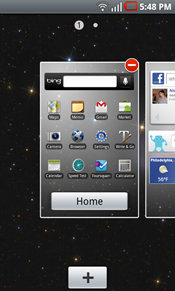 The homescreen doesn’t offer any landscape support which is a shame, but unlike Motorola’s take on the homescreen, the Fascinate’s scrolls smoothly and didn’t have me racing to the Marketplace to find a replacement. In fact, I quite like the feel of TouchWiz. It runs smoothly and responds well and really makes the phone feel snappy despite the fact that it might not be the fastest from a benchmark perspective.
If you pull down the notification bar, you’ll see that there’s a handy quick toggle for WiFi, Bluetooth, GPS, and Airplane mode. This is a nice place to put these toggles and I found myself using them on a regular basis.
In addition to the usual Android 2.1 widgets, Samsung has included their own which you’ll find in a menu after long-pressing and open spot on your homescreen. For completionists out here, here’s the full list of custom Samsung widgets on the Fascinate (most of them are self-explanatory [and boring/pointless]):
- Analog Clock 1
- Analog Clock 2
- Analog Clock 3
- Analog Clock 4
- Buddies now
- Calendar Clock
- Daily Briefing
- Digital Clock 1
- Digital Clock 2
- Dual Clock 1
- Dual Clock 2
- Feeds and Updates
- Program Monitor
- Weather Clock
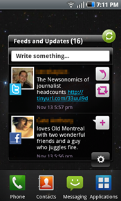 The “Feeds and Updates inch widget is just like any other of the 100 social networking widgets (aka: it sucks). It takes up an entire homescreen and shows a whopping two status updates from your configured social networks (Facebook, Twitter, Myspace). You can tap to respond or comment on various updates, but in the end it just always seems to make more sense to use a dedicated Twitter/Facebook/Myspace app.
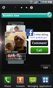 The “Buddies now inch widget also takes up an entire homescreen and isn’t completely useless except for one annoyance. The widget functions as a favorites list, upon which you add contacts that you’d like to quickly access. If they have been associated with a Facebook account, you’ll see their most recent status update and there is a shortcut to comment on their status or call them. You’ll also see a very low-resolution version of their profile picture that has been scaled and turned into a plethora of pixels rather than a comprehensible photo. The list is shown on a sort of revolving wheel which is much more touchy than necessary and would be happily replaced with a simple list. The annoyance? I text my favorite friends much more often than I call them. I know this won’t be true for everyone, but surely for the demographic of this phone (younger, more tech savvy folks), this is likely the case. The widget would be much more useful to me if it was an SMS button and not a call button. Regardless, you can always tap on their picture and you’ll be taken to their contact info, and from there, an SMS is only another tap away.
Homescreens filled with apps and simple widgets scroll with great fluid motion. Sadly, the two Samsung widgets mentioned above slow things down to a shaky unsmooth pace.




Great review. I like the Fascinate’s hardware and screen size but I would really like a directional trackball/optical pad to make website navigation easier (ie. clicking small links surrounded by other links).
I like the directional controls on other Android devices too. It also lets you easily activate mouse over elements on many sites.
I also prefer hardware buttons for those bottom keys as well. What I don’t want are those dedicated call/answer and end buttons. Don’t really want a call getting answered while the phone is in my pocket.
Looks like good phone, but i’m still waiting for the iphone from Verizon mbecause ky mom told me that she talked to Verizon and they would jailbreak it for us if we brought it to one of their stores so that’s what i’m going to do instead of getting this one.
So you can switch from Bing to Google on the Verizon Fascinate? I thought that Verizon permanently locked out Google.
Perhaps by altering the default software imagine. For the less tech savvy, “switching” between the two is as simple as finding a Google search bar from the Marketplace and downloading Google maps. The only caveat being that when you tap the Android Search button on the homescreen, you’ll be taken to Bing search. This and I suppose that a few applications that normally use Google Maps to externally map some info might open up in Bing, but again, getting around that is relatively simply (a little cut and paste would do the job).