Design
The Samsung Fascinate is impressively thin. It’s just a hair less thin than Apple’s iPhone 4 [tracking page][review] which Apple claimed was the thinnest smartphone on the market when it was released this past summer. It isn’t as thin, but it is markedly lighter.
The Fascinate sits in the hand very well. The rounded edges allow it to easily slip into a pair of tight jean pockets. The exterior of the phone is very simple. As you’ve seen in the hardware tour above, there isn’t a lot going on in the aesthetics department. There isn’t anything particularly wrong with this, but I will say that the phone’s exterior is somewhat unbecoming of its performance on the software side of things.
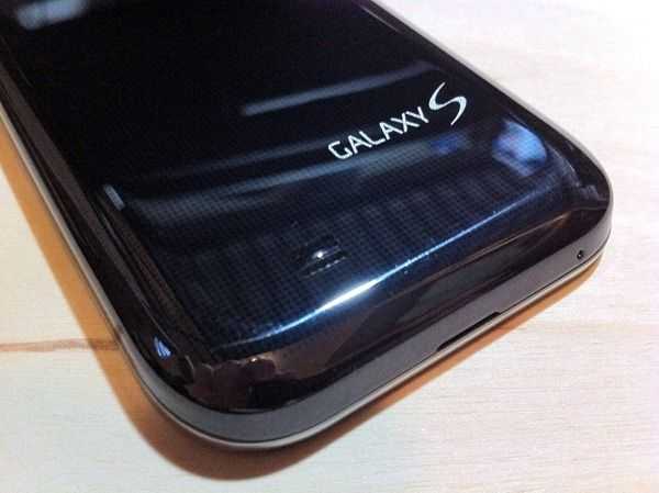 The phone is almost completely black, save a shiny chrome strip around the edge (Ã la iPhone 3G/3GS). The only other accent on the phone is the silver area which houses the camera and flash. While the front of the device is plain black, the back actually consists of a grid of tiny black dots over a slightly less black background. The dots are so small that the effect can’t be seen until you get up really close. Those with bad eyesight probably won’t ever notice it…. There’s something to be said about subtlety in design, but the Fascinate’s lack of aesthetic interest makes the phone feel somewhat boring from a purely hardware standpoint.
The phone is plastic all around (except the screen) and while this keeps it light, it also makes it feel a bit cheap. Samsung could have avoided this feeling by giving the plastic a bit of a different texture (slightly rubberized, perhaps?) but it’s just that same old glossy plastic that you’d associate with a toy.
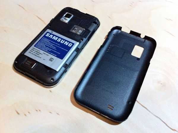 The phone lacks a usually battery cover and instead opts to allow you to remove the entire back of the device. This keeps the back free of any lines and allows for a user-replaceable battery and the ability to swap out the pre-installed 16GB card for other sizes (a feature some are sure to utilize).
The two hardware buttons (power and volume rocker) are absolutely solid with hardly any wiggle. This is a welcomed improvement over the hardware buttons on the Droid X, which felt like they were hanging on by little more than a tiny thread of root that holds a small child’s nearly-lost tooth precariously in place. The MicroUSB charging port has a retractable door (rather than a rubber plug) to keep dust out of it. The door works fine but feels a little cheap. I wouldn’t be surprised if it broke after some extended use of the phone. I’m wondering why Samsung found it necessary to include this when most other phones leave their charging ports exposed.
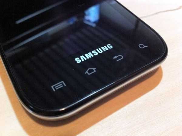 It would have been great if Samsung would have used similarly well rooted buttons for the four Android buttons, but unfortunately they decided to go with capacitive buttons instead. This decision really bewilders me. While I can quickly cite several disadvantages to capacitive buttons (zero tactile feedback, accidental presses more common, etc.) I’d have to scour my mind to come up with any practical advantage. And yet here we are.
The capacitive buttons work fine and are generally quite responsive, but I felt like they occasionally missed some of my presses (whereas I never found this to be the case with the Droid 2’s buttons [review][tracking page]). A bigger issue than the occasionally missed button press was the lighting of the keys. The keys oddly do not light up when you unlock the phone. In fact, they don’t light up until you actually press them. This means any time that you’re in the dark, you won’t be able to see the four of the most important buttons on your phone until you jab around in the dark to find them, and once again, the lack of tactile feedback from capacitive buttons foils any attempt to feel around for them. On top of this, the time-out for the keys’ backlights is three seconds! And yes, as you’d imagine, this means that the “I can’t find these damn keys because it’s somewhat dark inch scenario will happen a lot. Truly baffling, Samsung….
Before I move on, I wanted to mention that the Fascinate lacks a notification LED which I found to be an extremely simple, but useful feature on several other Android phones. It’s a shame that Samsung could have put one on the Fascinate but chose not to. I may as well also mention that the screen doesn’t light up unless you are getting a phone call. If it’s another notification (text, email, app notification, etc.) then you’ll just feel it buzz. This means that if you weren’t in the room to hear it make a noise or buzz, there is no visual way to see that there is something waiting for you on the phone.





Great review. I like the Fascinate’s hardware and screen size but I would really like a directional trackball/optical pad to make website navigation easier (ie. clicking small links surrounded by other links).
I like the directional controls on other Android devices too. It also lets you easily activate mouse over elements on many sites.
I also prefer hardware buttons for those bottom keys as well. What I don’t want are those dedicated call/answer and end buttons. Don’t really want a call getting answered while the phone is in my pocket.
Looks like good phone, but i’m still waiting for the iphone from Verizon mbecause ky mom told me that she talked to Verizon and they would jailbreak it for us if we brought it to one of their stores so that’s what i’m going to do instead of getting this one.
So you can switch from Bing to Google on the Verizon Fascinate? I thought that Verizon permanently locked out Google.
Perhaps by altering the default software imagine. For the less tech savvy, “switching” between the two is as simple as finding a Google search bar from the Marketplace and downloading Google maps. The only caveat being that when you tap the Android Search button on the homescreen, you’ll be taken to Bing search. This and I suppose that a few applications that normally use Google Maps to externally map some info might open up in Bing, but again, getting around that is relatively simply (a little cut and paste would do the job).