Screen
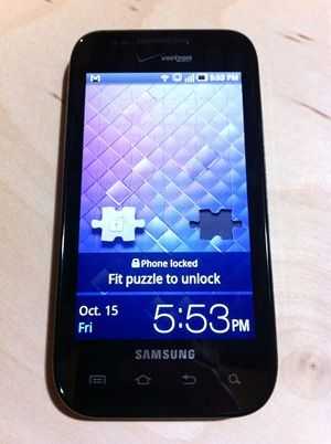 Samsung has touted the Fascinate’s “Super inch AMOLED screen as a major feature. They run commercials that try to imply that the screen somehow offers a cinematic experience that you just can’t get from any other phone. “Experience HD-quality video recording that’s clearly detailed, extraordinarily vivid and astonishingly colorful on the brilliant 4-inch Super AMOLED screen inch, they say. In the end, the AMOLED screen really doesn’t strike me as being much better (in terms of visual performance) than any other modern smartphone that I’ve used. Sure, the colors are more vibrant than the iPhone 4 and some of its other contemporaries, but this doesn’t necessarily mean more accurate.
While the visual performance of the AMOLED screen isn’t impressive enough to justify their commercials, the more practical advantage is power saving over LED backlit devices. OLED screens don’t require backlights which is what consumes most of the energy in an LED screen.
When you get up close, the 4 inch 800×480 screen becomes noticeably less sharp. I’ve been using the iPhone 4 which has a pixel packed display so I might simply be noticing this in a relative way. However, handling the phone at regular arm length shows smooth icons and text that most will be fine with.
Viewing angles on the Fascinate are superb. You won’t see any negative colors from any angle and the contrast holds steady within practical viewing angles and, to some extent, even outside of them.
Camera
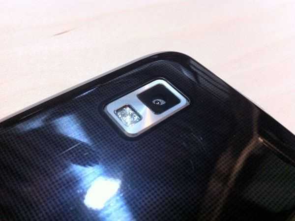 The Fascinate’s 5MP camera takes decent shots that work fine if you are just putting photos up on Facebook or taking pictures with friends. Other than that, the Fascinate’s camera probably won’t blow you away. It’s just about par for today’s smartphone cameras. Capturing a full resolution (5MP) photo takes longer than I’d like. This means that you have to keep the phone mighty still, otherwise you’ll end up with a blurry image. I can’t help but feel like the image I see through the viewfinder is much sharper then what ends up actually being captured. This is always disappointing when you feel like you’ve got it focused perfectly, only to realize that the photo that’s actually been captured didn’t turn out as well as it looked like it was going to.

The camera actually has a pretty expansive set of options compared to something like the iPhone 4. In addition to tap to focus, you can tap the arrow on the right side of the view finder to adjust plenty of settings.
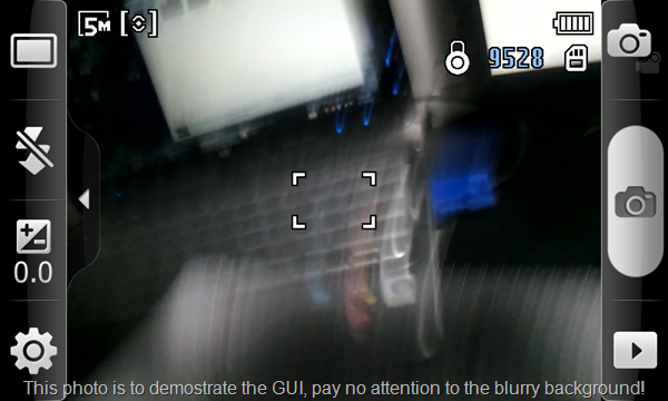 Sadly, the layout of these options is very confusing. For one, the camera offers several “Shooting Modes inch contained in one menu. Some of the modes include Beauty, Smile Shot, Continuous, Panorama, Vintage, etc. The “Add Me inch mode is particularly hard to use because the instructions for what it actually does stay on the screen for literally about one second. The panoramic mode is novel but almost useless because it automatically takes images as you swing the camera from one side to the other without pausing to let you make the camera very still to get a decent shot. In the end you get a blurry panorama. If you actually want to use this mode, you’ll have to move the camera at a snail’s pace. It ends up being easier to take your own individual photos and stitch them together in post.
Let’s get verbose for just a minute so you can see how deep the options go:
— Flash
——- Off
——- On
——- Auto flash
— Exposure
——- Slider between 2.0 and 2.0
— Settings button
——- Outdoor visibility
——- On/Off
—- Focus mode
——- AF
——- Macro
——- Face detection
—- Scene mode
——- Portrait
——- Landscape
——- Night
——- Sports
——- Party/Indoor
——- Beach/Snow
——- Sunset
——- Dawn
——- Fall colour
——- Firework
——- Text
——- Candlelight
——- Backlight
—- Timer
——- 2/5/10 seconds
—- Resolution
——- 8 options of varying resolutions
—- White Balance
——- Auto
——- Daylight
——- Cloudy
——- Incandescent
——- Fluorescent
—- Effects
——- Normal
——- Negative
——- Black and White
——- Sepia
—- ISO
——- Auto/100/200/400/800
—- Metering
——- Centre-weighted
——- Spot
——- Matrix
—- Anti-Shake
—- Auto-Contrast
—- Blink detection
—- Image quality
——- Superfine
——- Fine
——- Normal
—- Adjust
——- Contrast
——- Saturation
——- Sharpness
— Settings (within settings button)
—- Guidelines
—- Review
——- Off
——- 2 Seconds
——- On
—- Shutter sound
——- Sound 1/2/3/Off
—- Reset
Are you overwhelmed yet? Yeah, I bet most users will be too. Options are nice and all, but does Samsung honestly think even 1% of the users of this phone will go through all of these before taking a photo? Did I mention that these are all laid out on a horribly inefficient interface that shows only three of the above options at a time?
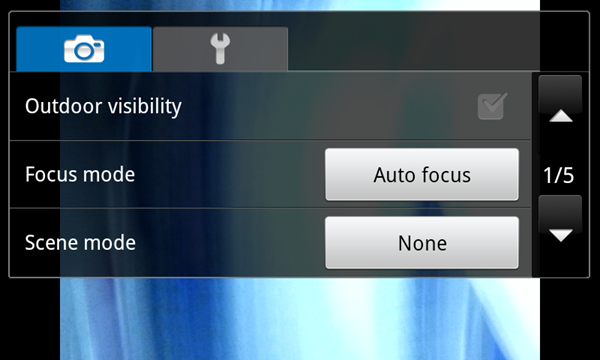 Get ready for a lot of scrolling and digging through this confusing hierarchy.
Tap-to-focus is the opposite as it is quick and easy to use, and much more realistic to use for the majority of images that I end up taking.
Macro:
As with the Droid X and Droid 2, the Samsung Fascinate can take some mighty fine macro shots, but only if you can get the auto-focus to work correctly. The Fascinate has touch-to-focus (a la iPhone) which works pretty well for regular shots, but down at the macro level you’ll often frustratingly watch your subject get into a perfect focus, then back out as the crosshairs flash red and the phone says “Sorry, I’ve got no idea what you want me to focus on inch. You’d think that when you selected macro-mode, if would at least snap to the closest possible focus when it couldn’t come to any conclusion about what you are trying to focus on, but instead it snaps back to it’s middle focus range. When it does work, the results are pretty impressive (click for full size):
Video:
As for video, the Fascinate supports up to 720p HD recording (1280×720). There’s no touch-to-focus with video, but it does seem to focus automatically as it’s recording, and once at the beginning as you press the record button. The quality isn’t bad, but the colors seem a bit dull. You’ve got many of the same options as when taking a still photo, but again, most of the time when people are recording with their phone, it’s unlikely that they’ll have time to sort through these options before beginning their recording. And thus, for most circumstances, having a good default (or automatic) settings without many options trumps having a poor default settings with lots of manual options.
Take a look at a comparison between the iPhone 4 and the Samsung Fascinate’s recording capabilities. I’ll inline the videos below for your perusal, or if you’ve got a particularly powerful computer you can click on this link to watch both videos side-by-side. Either way, be sure to switch the YouTube player to 720p quality:





Great review. I like the Fascinate’s hardware and screen size but I would really like a directional trackball/optical pad to make website navigation easier (ie. clicking small links surrounded by other links).
I like the directional controls on other Android devices too. It also lets you easily activate mouse over elements on many sites.
I also prefer hardware buttons for those bottom keys as well. What I don’t want are those dedicated call/answer and end buttons. Don’t really want a call getting answered while the phone is in my pocket.
Looks like good phone, but i’m still waiting for the iphone from Verizon mbecause ky mom told me that she talked to Verizon and they would jailbreak it for us if we brought it to one of their stores so that’s what i’m going to do instead of getting this one.
So you can switch from Bing to Google on the Verizon Fascinate? I thought that Verizon permanently locked out Google.
Perhaps by altering the default software imagine. For the less tech savvy, “switching” between the two is as simple as finding a Google search bar from the Marketplace and downloading Google maps. The only caveat being that when you tap the Android Search button on the homescreen, you’ll be taken to Bing search. This and I suppose that a few applications that normally use Google Maps to externally map some info might open up in Bing, but again, getting around that is relatively simply (a little cut and paste would do the job).