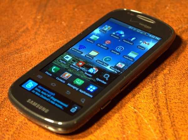
 Samsung previously piqued my interested with it’s Galaxy S Fascinate [tracking page][review], so I’ve been excited to give the Continuum a try. The Continuum is much like the Fascinate except it has a 1.8 inch 480×96 AMOLED “ticker inch display underneath the main screen for notifications and quick access to info like time/date/weather/twitter/facebook/etc. Does the extra display equal extra functionality or is it merely a monotonous novelty without much depth? Read our full review to find out!
We’ll start out with the classic hardware tour, but before that I want you to know that, as I mentioned, the Samsung Continuum is very much like the Samsung Fascinate that we reviewed a little while ago. It’s pretty much the same device in a slightly different body and without the Continuum’s extra display. We aren’t in the business of boring our readers so I’m not going to hit you with information that we’ve already covered. I’ll point you to the Fascinate review if need be, but for the most part this review is going to focus on the Continuum’s unique aspects (ie: the ticker display) and it’s particular performance. Now that we’ve got that out of the way…
Hardware Tour
Here’s a quick visual rundown of the Continuum to get you familiar with the device:


And here’s the specs (as always, you can find more detailed technical info on our Samsung Continuum tracking page in the device database).
- 3.4 inch capacitive Super-AMOLED screen @ 800×480
- secondary 1.8 inch capacitive Super-AMOLED @ 480×96
- Android 2.1 (custom Samsung overlay)
- ARM Cortex A8 CPU @ 1GHz
- PowerVR SGX graphics
- 366MB of RAM
- 5.0MP auto-focus camera with single-LED flash (capable of 720p HD recording)
- WiFi b/g/n & BT 3.0
Design
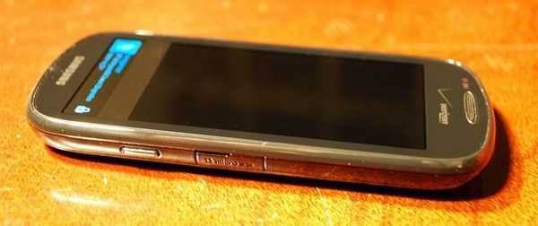 The Continuum is lightweight (125g) and fairly thin (12mm). It’s not as thin as the iPhone 4 or Fascinate, but definitely close. The entire phone casing is made of plastic; coupled with the lightweight nature of the device, it ends up feeling somewhat cheap compared to some of its contemporary devices. Still, it’ll slip into a jeans pocket with no problem and won’t bother you while it’s there.
The aspect ratio on the Continuum is nearly 16:9 (as with most modern Android devices) which makes the device quite tall and thin to begin with. Slap the extra display below it, and you’ve got a phone that feels peculiarly tall. This feeling will fade eventually though, and the height doesn’t hinder usage of the phone at all, unless you’ve got ultra-shallow pockets!
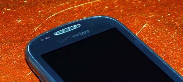 As with most of the other Galaxy S phones, the Continuum doesn’t have a lot going on aesthetically and it’s materials don’t feel premium. The front is bland with little more than an ear piece and a Samsung logo to break up the black bezel.
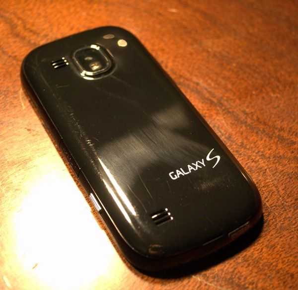 The back of the device has a camera and LED-flash housing that is centered horizontally. The camera housing has a chrome accent and is raised up just about a millimeter or so from the back of the device. The lack of sliding lens cover leaves it susceptible to scratches..
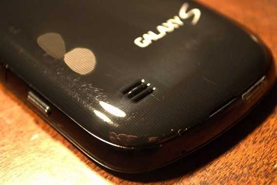 Other than the camera, there’s a Galaxy S logo and a pair of speaker vents for speakerphone and media playback on the back. The rear plastic grabs fingerprints readily. The back of the phone wishes that it had some texture as the color is actually made up of a bunch of little black dots on top of a grey background. Sadly they are so small that it just looks like a plain color unless you have great eyesight and are inspecting it closely.
The rear panel is indeed removable, but it’s terrifying when you do so. It always feels like it’s about to break in half as you are pulling it off, but so far I haven’t managed to do that (yet…).This is a plus for road-warriors who carry extra batteries on them, but a negative for the average consumer who won’t be happy if they suffer a crack in the thin plastic after a drop.
Samsung removed the sliding cover over the Micro-USB port that was on the Fascinate. I think this is a good move as it didn’t feel like it would last very long before breaking off.


