Screen(s)
Samsung loves to talk about its AMOLED technology. Their recently announced 4G LTE phone has a “Super AMOLED Plus inch display, but on the Continuum we have to settle for the a Super AMOLED screen. I think Samsung might be trying to pull an Apple with all those adjectives….
Primary Screen (3.4 inch 800×480)
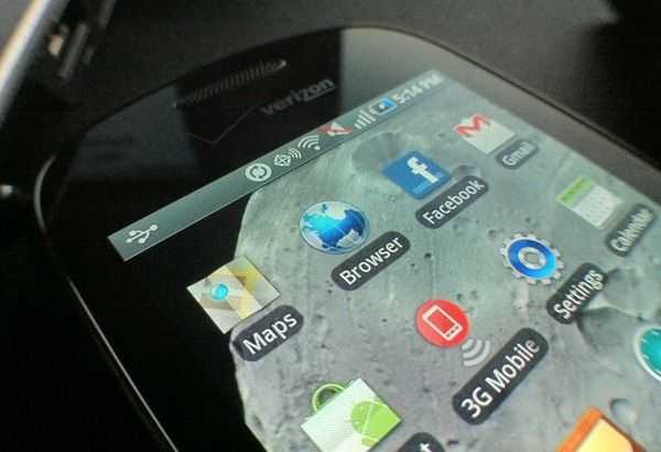 Colors on the Continuum’s screen are more vibrant than those on the iPhone 4, but it feels slightly oversaturated. The Continuum’s screen has better contrast than the iPhone 4 which means that the distinctions between darks and bright is more defined, resulting in more detail visible in videos/photos/games, etc.
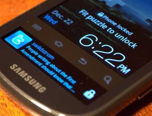 The four capacitive buttons underneath the main screen appear pixellated and I believe are actually lit by the screen itself (extending under the bezel between the main and secondary screen). They are definitely different from the Fascinate’s buttons which are independently lit by LEDs. The capacitive screen and buttons are generally responsive, as expected, but when the system is under load they can become sluggish when registering your presses, and that is frustrating when it happens.
The 800×480 resolution isn’t quite the 16:9 standard so you’ll notice some cropping if you are watching 16:9 widescreen movies/films. The relatively small (by today’s standards) 3.5 inch screen offers a less pleasant typing experience than some of the larger screened phones that I’ve used. If you have big fingers, I would suggest looking for a phone with a larger screen for more typing space. Perhaps the Droid X?
Ticker Display (1.8 inch 480×96)
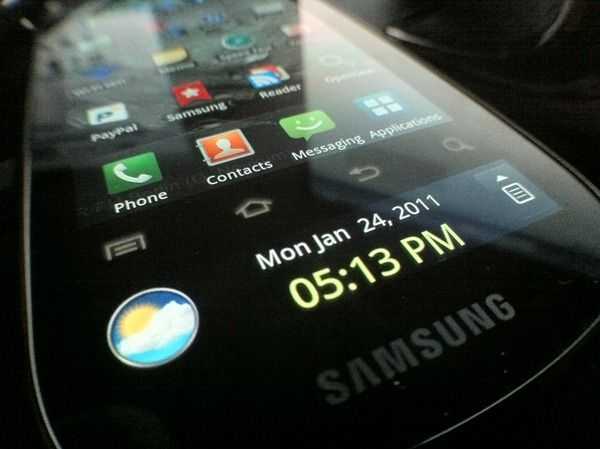 The “ticker inch display, as Samsung calls it, is also a Super AMOLED screen, but this doesn’t mean all that much because you won’t be looking at pictures or viewing photos down there. Instead, the ticker display is designed for at-a-glance info (weather, news, notifications) etc.
Here’s a video that gives you a good idea of the weaknesses of the ticker display. Below it, I’ve elaborated on the issues:
The phone actually has a capacitive region on the sides of the display that you can squeeze to light up the ticker display. This is a great idea, but it’s implemented poorly. First, there are no markings on the side of the phone that indicate where you need to squeeze it. Activation is often inconsistent. Sometimes you’ll squeeze it expecting to turn on and it won’t. Other times it’ll turn out without specifically attempting too. You might also find that the screen can be accidentally touched while the phone is in use (especially in landscape mode) and will sometimes launch you out of whatever you’re in the middle of, which is quite frustrating. The phone also pretty much doesn’t acknowledge the squeeze feature anywhere on it, so I could see someone hastily opening the box and removing the stickers without reading them and thus never being informed that there was a squeezeable region. I could see these same people being bewildered as to why that damn screen keeps turning on when they are holding it in one hand!
In the end, the squeeze-to-activate function is more frustrating than convenient due to inconsistent activation and unintuitive implementation.
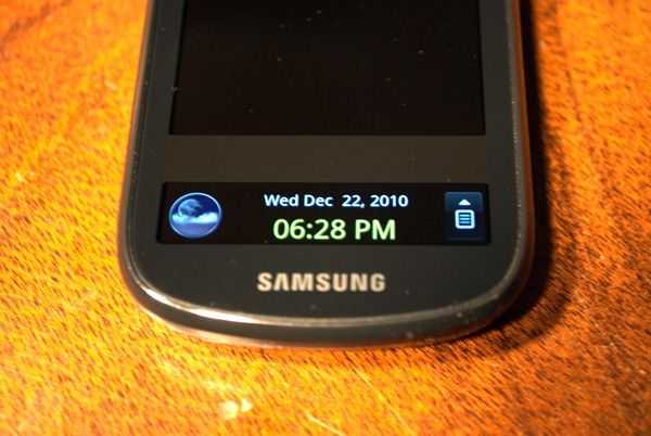 So how about the ticker display functionality? The display itself is a capacitive touchscreen just like the main display. You can slide between the default screen, which displays the time/date and an icon representing the current weather, and one that gives you a summary of notifications: SMS, voicemail, email, missed calls, and IMs.
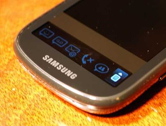 Sadly, the notification screen works like a worse version of the notification bar that’s already built in to the OS. You’d think that Samsung would have designed the firmware to redirect all notifications down to the ticker display right? Wrong. You only get the select few notifications that I mentioned above. You won’t see the universal notification list (that is found in the notification bar) down in the ticker display. You won’t get app notifications or notifications about updates, etcetera. What’s more, all the notifications on the ticker display are redundant in some way or another. An SMS notification, for instance, will display on both the ticker display and in the normal notification bar — not to mention on the lock screen thanks to Samsung’s custom interface. That means three different places where you are being notified of an SMS!
And if only some of the notifications (like SMS or Email) are found in the ticker display, but others are not (like app notifications) this creates inconsistency, which is a big no-no when it comes to user interface design. The entire point of Android’s notification bar was to gather all system notifications in one easy to access location. The ticker display’s notification functionality is a step backward in this sense.
It must also be mentioned that the ticker display doesn’t show when you have messages waiting in your inbox unless you use the “Email inch program. That’s right, it doesn’t function with the Gmail app, the service that is at the core of Android! So unless you want to give up Gmail on your Android device and use the generic client, don’t expect to get email notifications in your ticker display. Same goes for the voicemail notifications — unless you are signed up for visual voicemail, you won’t get voicemail notifications in the ticker display.
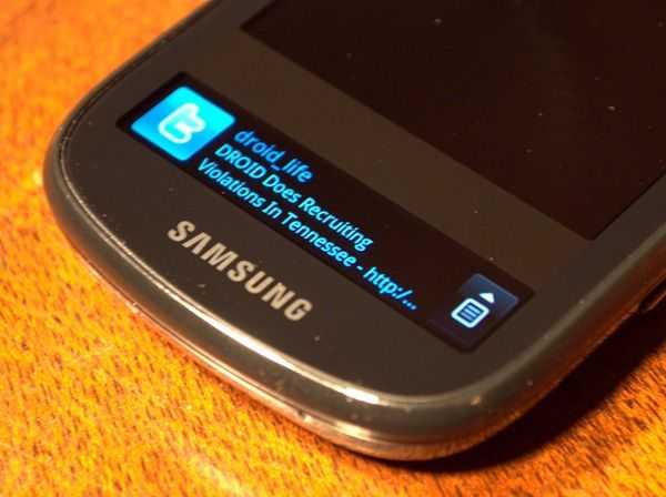 And then there’s the matter of social networking services. One of the would-be cool concepts of the ticker display is the ability to give you real-time social networking updates like Facebook messages, Twitter mentions, and MySpace (but honestly, who uses MySpace?). It’s a great concept, but has failed to be implemented in a useful way. The reason for this is two-fold, but the biggest one is that the granularity in which each service can be configured is not adequate
For instance, let’s say you hook your Facebook account up to the phone to get Facebook stuff through the ticker display. I think most Facebook users would like to see their familiar notification list (and anything that would pop up on it) come through to the phone, right? Unfortunately, you can’t quite say “Just give me my notifications inch. Instead, you get a list of things that you’d like to be notified of. That list includes the following:
- Receive All
- Message
- Poke
- Friends Request
- Invitation
- Comment
So instead of just saying “give me anything that would normally pop up on my Facebook notifications list inch, you have to pick from these things. And for some reason, either by a bug or just terrible design, you can’t check the “Receive All inch box without also checking everything else in the list off. This really limits how you can use the ticker display with Facebook. Let’s say I’d like to receive all of my friends’ status updates and nothing else. I can’t do that because in order to get status updates, I have to check “Receive All inch to get statuses, and in order for “Receive All inch to be checked, everything else in the list needs to be checked.
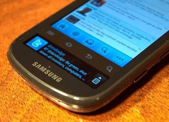 Twitter is the same way but probably handled even worse. I follow 189 people, and that puts me on the low-end of the friend spectrum. Chippy follows 1278 people. Here’s the kicker; the configuration options for Twitter on the ticker display are so paltry that you either get everything (all status updates, all mentions, and all DMs) or nothing. You can’t just get important stuff that you’d probably want to know about while on the go, like DMs and Mentions. On the configuration screen the options are “Receive All inch and “Messages inch. I’m presuming Messages means DMs/Mentions, but it doesn’t matter because if you check the “Messages inch box, “Receive All inch automatically becomes checked as well, which means I’ll get status updates from all 189 people (or 1278 people in Chippy’s case). And let’s say for some crazy reason I want everyone’s status updates but not DMs/Messages, you can’t even do that because the reverse is true: check the “Receive All inch box and “Messages inch becomes checked as well; there’s no getting around it.
I mentioned that the problem is two-fold, and here comes the second half. Managing any more than just a few notifications is impossible. Unless you’ve got 5 friends on Twitter and Facebook you’re going to get flooded with alerts and I’m doubting you’ll be able to actually derive any use out of them. Whoever designed the ticker didn’t seem to realize that maybe 50 or so updates can accumulate from Twitter alone in 30 mins, and I’m only following 189 people. For those that are following, say 1000, they’re looking at something like 200 messages in 30 minutes. Facebook/Twitter/MySpace messages aren’t intelligently grouped when they come down the line, (that’d be much too easy…) instead they have to sit on the ticker screen one by one until each and every one of them has been displayed. And just for the irony, let’s look at a bit of math. Let’s say each of 200 message are shown for 5 seconds barely enough time to read it that means 16 minutes of the screen being turned on for everything to come through, and by default, your phone will vibrate each time you get a ticker notification. So yeah… enjoy 16 minutes of constant vibrating until you finally get so annoyed that you figure out how to turn it off.
Furthermore, notifications do not come through in real-time which kills the purpose of the ticker display if the above hasn’t done so already. You’re better off turning on email notifications for Facebook and Twitter because you’ll get them faster that way. Just glancing at the Continuum beside me now shows that it hasn’t updated my social status on the ticker display since 7:40pm… it’s now 8:30. It’ll be upwards of an hour gone by with no checks, which means that when it does, I’m going to get a figurative waterfall of new notifications. Now how exactly is that useful?
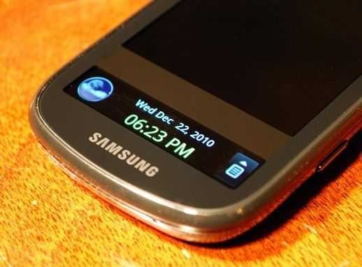 I’m sorry, but what user interface designers are being hired by Samsung? There’s the “all or nothing inch nature of the social networking on the ticker display, and even the most simple thing seems to have eluded them. I’m talking, of course, about the weather icon. So you’ve got the time and date displayed on the ticker display’s default view right? That’s nice, but certainly nothing you couldn’t see by simply tapping the lock button once on any other Android phone. But then there’s a weather icon. “Great, now I’ll be able to check the temperature at a glance before I go outside! inch you might be thinking. ERR wrong. Instead of being able to see the temperature, all you get is a little icon showing what’s going on outside. I’ve got a serious problem with this. Any 10 year old will tell you that if you wanted to find out what the weather is like, just look outside. My eyes can tell me much more accurately what’s happening outside than a little icon. What they can’t do however, is tell the temperature. So why on Earth wouldn’t the ticker display provide me, at very least, with something that I couldn’t already tell by looking out a window?
I’m belaboring the point here, I apologize. Here’s what you need to know: The ticker display is a neat idea that has seen horrendous implementation. From failing even the most basic and obvious uses (like not displaying the temperature), being plain-old buggy and hard to configure, to getting floods of status updates checked usually no more than once an hour — the Samsung Continuum’s ticker display sucks. This thing needs an update, badly! Without some major improvements, the ticker display will continue to be a useless and tacked on feature that not only doesn’t provide the user with any particular benefit, but actually decreases the user experience by creating redundancy and inconsistency between itself and the existing notification bar.


