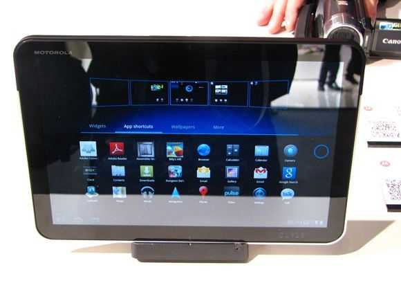
In a previous post I highlighted my surprise at how different Honeycomb really is. The UI is totally different, the apps totally re-worked and obviously the core has been optimised for fast touch response. Check it out in this video from MWC 2011
Posted on 14 February 2011, Last updated on 14 October 2024 by Steve Paine
In a previous post I highlighted my surprise at how different Honeycomb really is. The UI is totally different, the apps totally re-worked and obviously the core has been optimised for fast touch response. Check it out in this video from MWC 2011

 |
| |||
 |
| |||
 |
| |||
 |
| |||
 |
| |||
 |
| |||
 |
| |||
 |
| |||
 |
| |||
 |
|
Man, im gonna get one of these. My buddy works at Fry’s and just got the Xoom today, pretty stoked about that, its nice.