Design
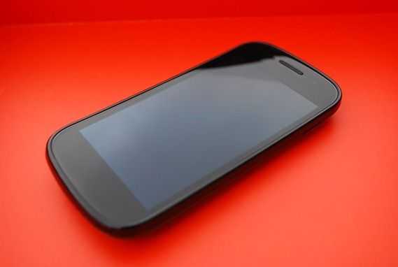 I hate to say it, but the Nexus S is far from the bleeding edge of mobile design. The phone feels plastic and cheap through and through. It feels just slightly less cheap than the Samsung Fascinate thanks to the curved screen, but the phone is quite literally plastic all the way around except for a metallic accent ring on around the back camera (and the glass screen, of course).
The curvature of the screen is almost unnoticeable and doesn’t have any apparent advantage over a standard flat screen.
The design lacks any good distinguishing aspects from every other Galaxy S phone from Samsung to date. There’s so little that’s aesthetically interesting about this phone that this will likely be the shortest design section that I’ve ever written.
Yup… if you’ve read my Fascinate (or Continuum) review, you’ve head this all before. It’s cheap, it’s plastic, and it’s not very attractive or compelling. The back also feels like it’ll break every time you try to remove it, though with no access to internal memory, you probably won’t have much of a reason to take it off. Perhaps they just wanted it to appeal visually to anyone and everyone by making it so bland and uninteresting that no one could be turned off by it. Be sure to realize though that there is a big difference between ugly and boring. The Nexus S is boring, but at least it isn’t ugly.
The plastic… everything… makes the phone slippery and I usually use it with a pinky tucked under the bottom to make sure it doesn’t slide out of my hand.
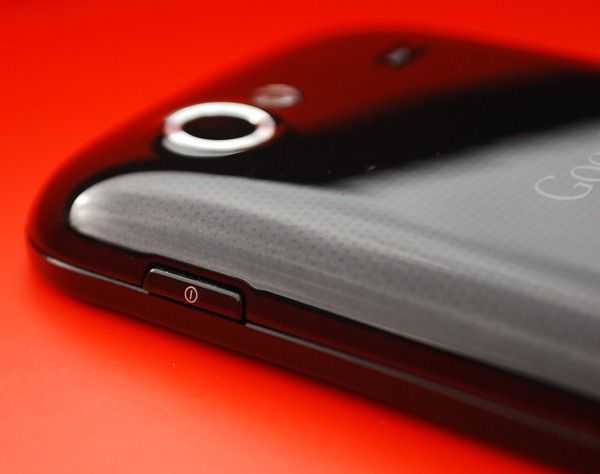 With that said, at least the two buttons on the phone (the power/lock and volume rocker) are mounted well. They don’t wiggle more than you’d expect and they have good feedback too. Samsung decided to move the power/lock button to the right side of the phone (instead of the traditional top placement), which I actually like. I’m left-handed and my index finger finds it’s way to the button easily. Held in the right hand, my thumb naturally lands right on the button, so this position works very well.
Screen
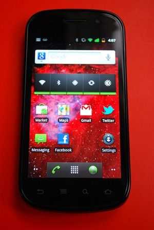 The 4 inch Super-AMOLED screen is probably the most impressive part of this phone.
The non-standard 1.67:1 (800×480) aspect ratio means that the phone’s screen isn’t perfectly fit for 4:3 or 16:9 media, but the screen being less thin than 16:9 displays (usually 854×480 on cellphones) is preferable as it is better suited for app interfaces, in my opinion.
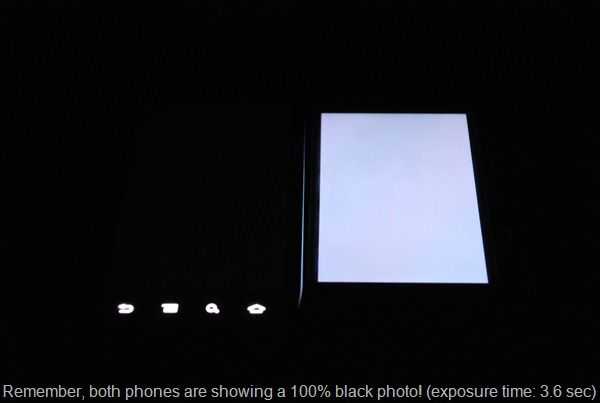
 The contrast ratio on this phone is fantastic; absolutely the best contrast ratio I’ve ever seen on a phone! The blacks are so dark that when the screen is completely filled with a black image, the phone looks as though it’s screen is turned off. Truly impressive. Android 2.3 helps show off the incredible contrast ratio by making the app menu have a completely black background, and changing the color of the status bar to black. It’s actually hard sometimes hard to tell where the screen stops and the bezel starts, but fortunately the bezel around the screen is quite thin so this hasn’t been an issue.
Take a look at this long-exposure photo (3.6 seconds) that shows the difference in the depth of black between the Nexus S and the iPhone 4. In the photo, the iPhone 4 is on the right, and the Nexus S is on the left. Both phones are set to max brightness, and are displaying an image that is completely black:
Colors are vibrant and the viewing angle is great as well (on-par with the IPS display used in the iPhone 4). You won’t see any color inversion even as you approach extreme angle viewing.
The only issue with the screen has nothing to do with displaying images. Actually it’s that the capacitive touchscreen is too sensitive. I think that this is likely a calibration issue and one that could be fixed with a software update. It’s not a deal breaking issue, but it’s possible to have the screen register a tap even when you don’t touch the screen. I can float my finger just barely over the screen and it will sense a tap. I have to move my finger very carefully to achieve this on purpose, but the miscalibration has caused me to accidentally activate apps during use several times. The same thing (registering a tap without actually touching) can be achieve on the iPhone 4, but the threshold is much smaller, and I cannot recall a time that the phone has registered a tap when I didn’t actually touch the screen during normal use.
The capacitive buttons work, but I had an issue with accidentally tapping them (especially while using the phone in landscape mode). This may be related to the poor calibration issue that I mentioned above.
I’m still having a hard time understanding why they refuse to put physical front buttons on phones these days….




I Own one of these, coming from an N900 @ 1.2ghz for the last 2 years this device is a dream to use, and very very fluid (even at stock 1ghz, allthough i like it at 1.3ghz ;)
The “stand out” features that u mention are missing are all i nthe software of this lil beauty, a point thay has been sorely missed!
And the thing is very light, the main POSITIVE of having a plastic device, it does not feel cheap, it feels like all the other handsts sold over the last half a century, liek a PHONE!
I think apple has had a negative effect on far too many people (including this article writer).
Materials exist that are light, but don’t feel cheap: aluminium, carbon fiber, glass, etc.
The iPhone 4 is only 5% heavier than the Nexus S (4.6oz vs. 4.8oz), but feels way sturdier and has a more premium feel.
Even phones like the Droid X, which are completely plastic, just like the Nexus S, don’t feel cheap like the Nexus S does because the plastic is rubberized and feels rugged. It isn’t even necessarily the plastic that makes it feel cheap, it’s that the plastic is slick, untextured, and round. The Galaxy Tab, which is also all plastic, and made by the same company as the Nexus S, doesn’t feel as cheap. The back has some texture to it, and it just doesn’t feel as plastic and cheap as the Nexus S.
It isn’t that Apple has a negative effect, but it cannot be argued that they make well built devices, and even set the bar for what feels like a premium device. Back in the days of the iPhone 3G, the Nexus S would have felt nice comparatively, but now that mobile design has evolved and advanced, the same plastic devices are naturally going to feel cheap compared to newer devices with more advanced materials.
And I didn’t miss the point about the software. Android 2.3 is a bit better than Android 2.3, but currently, I don’t think it’s enough of an improvement to be called a “stand-out” feature. That being said, I did dedicate an entire section in the beginning of the review to the fact that the Nexus S benefits because of it’s Nexus status, and talked about this being an advantage at the beginning of the performance section.
I just wanted to point out that the reason that OLED screens appear to be off when displaying black is because they are. OLEDs produce their own light, unlike LCDs, which (incompletely) filter a white backlight.
But anyway, excellent review!
Hi Ben,
Yeah i agree some of the other materials mentioned can feel a little more solid to some extent, but to me this does not make a device feel expensive,
In my experience the more solid the casing, the more liekly the thing is to have a component failure when dropped (hence half the “goold old phones” being far more dropable than the new fandangled gadgets).
So whilst i see you angle, i have to disagree as my preference is the other way around. Not everyone needs something shiny or “feel good” to realise it’s merits, plastic is used in devices across the world for many reasons, i don’t thinks it’s quite as bad as it sounds myself.
And regarding software, its a MASSIVE standout in performance, you may not have pushed the dive enough to notice the dirrefence (heck most apps run on 1ghz regardless eh?).
My galaxy tab after exts mods for double the IO’s and many many tweaks puses 1700 quadrant (not the best of benchmarks i know ^^). but this little thing did that at stock!!
After some tweaking, and hacks i now have the nexus pushing 3500+ quadrant, and the actual speed using the device reflects this. it is twice as fast as the galaxy tab in any situation, and a quater of the size …how that’s not a amajor feature, or noted is beyond me.
Thanks for bringing the phone to your pages however, coming from my maemo n900 to this (something i was hesistant about) has actually shown me that i was holding back for too long.
Cheers,