Screen and Capacitive Buttons
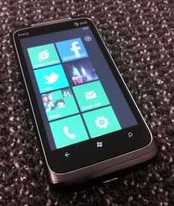 The Surround’s 3.8 inch screen feels spacious and looks particularly sharp, thanks to the edgy “Metro inch GUI that WP7 employs. The viewing angle is great and you won’t see much color inversion or a major decrease in brightness from the sides.
The contrast ratio is sub-par but tolerable as long as you aren’t expecting a home-theater viewing experience on the device.
Outdoor viewing is actually step above most other phones, but not because the screen is using any special technology that gives it an advantage. Actually it’s thanks to the Metro GUI that the phone is easily operable outdoors in the sun. The GUI uses highly contrasting colors, sharp shapes, and large text which makes it way easier to see what’s going on than other mobile OS GUIs.
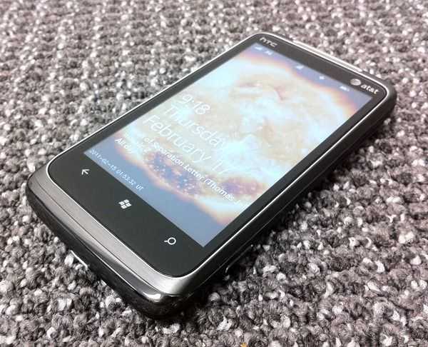 The three capacitive buttons are responsive enough but they weren’t without the occasional accidental press when using the phone in landscape mode. I would have like their active area to be a bit larger too. Several times I’ve gone to press buttons and missed the sensitive area resulting in a non-press. It would be nice if the area was defined with a circle around the particular button icon to indicate the limits of the area, or if it was expanded somewhat to be larger and easier to press in general. Or they could have always gone with regular physical buttons which have plenty of advantages over capacitive ones.
Camera
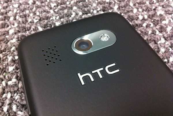 The Surround advertises a 5MP camera, but this is a classic case of ‘mega-pixels don’t matter‘. This is your typical CMOS camera which doesn’t perform well in low-light but it also underperforms many contemporary devices in average lighting conditions. The only way that you’ll get a particularly good photo from this phone is if the lighting is perfect. It’ll work fine for Facebook/twitter photos, but if you’re going on vacation, bring a real camera.
Still Photos
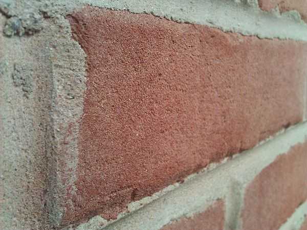 Macro-mode is superior to many other phones that I’ve used, not because of superior photo quality, but because the focus actually works! I was really frustrated with both the Droid X and Samsung Fascinate; they had the capability to take gorgeous macro photos, but it was almost impossible to get the auto-focus to focus correctly. The Surround gets the focus right for macro photos much more frequently.
Photos captured by the surround just aren’t as sharp as other phone cameras that I used, and despite being the same mega-pixel rating as the iPhone 4, it doesn’t quite compare. Below is a comparison shot between the iPhone 4 and the Surround. I’ve cropped it in equally for both devices so you can see the difference in quality. Notice the compression artifacting (strange colors) that you see in the Surround’s photo (this is due to it’s poor low-light performance):
Video
 Video on the Surround is captured at 24 FPS in MPEG4 format. Like the still photos, capture quality for video is less than similar devices, and requires good lighting to get anything that looks decent.
In my experience of testing video capture on devices, if two devices have similar video capture quality, determining which one is “better inch is a personal and subjective thing. In the case of the HTC Surround though, I feel that there’s a clear victor in capture quality when compared to the iPhone 4. Have a look at the two videos taken with the two devices below. As I’ve noted in the videos, the iPhone 4 has sharper video with higher quality audio. The only place where the HTC Surround does better in this case is color accuracy. In these particular lighting conditions, the iPhone 4 video showed colors more red than they should have been. This could have been due to the auto-exposure, but regardless, the Surround recreated the colors of the scene more accurately. The Surround also has a wider field of view. (If you have a powerful computer, click here to watch both videos side-by-side)

