Speaker Bar and Kickstand
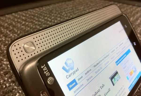 The name-sake feature of the Surround is the speaker bar that slides out where you’d normally expect a hardware keyboard to slide out on other phones. The bottom section of the phone slides out about 1/3 of the way to reveal a silver plane with a grid of holes for sound to pass through. There’s also a button that toggles between normal, Dolby Mobile, and SRS audio processing.
So how’s the audio? Not great. Actually, it’s not even that good. As far as smartphones go, it’s quite standard. The speaker on the Surround sounds scarcely better than my iPhone 4 which only has a mono speaker. Toggling between Dolby and SRS processing changes the sound… but not necessarily for the better. When you press the button there’s no on-screen indication of which mode you are switching from/to. If I had asked someone to guess which was normal, Dolby, or SRS, I doubt they’d be able to tell or say which one sounds “better inch; if that’s the case, what’s the point?
Things are a bit different when you put on headphones. SRS applies a virtual “home theater inch effect which moves the apparent source of the sound away from your ears and makes it seem as though the sound is coming from all around. The effect is somewhat convincing, but I don’t quite get it. Am I missing something, or is this useless for the most part? The difference between Dolby and normal is also completely without purpose. Neither one sounds explicitly better to me, and I doubt it will to most other people.
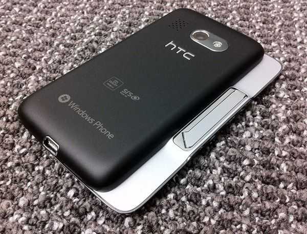 An awkward thing about this sliding section is that it seems upside down. I suppose this could be because I’m used to sliding the screen “up inch to reveal a hardware keyboard (Ã la N900 [keyboard section of our review] or Droid 2 [keyboard section of our review]). On the Surround, however, you are asked to slide the screen “down inch, which is a far less natural gesture.
The reason for this apparent weirdness is because of the kickstand that is revealed when you slide the screen down. The kickstand flips out from the screen-half of the phone, and the only way that it will keep the phone sitting up is if the speaker bar is positioned at the top.
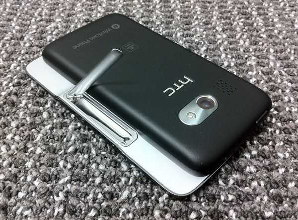 The kickstand actually works really well but is foiled by the fact the Windows Phone 7 rarely features landscape components. This means the the kickstand use will be mostly relegated to video watching (which could be nice if you are on a plane) rather than just kicking it up and using the phone for apps while you sit back and relax. The stand is metallic and is held in place with a magnet. Give it a little nudge and it pops out with an “I’m ready to go! inch attitude. Click it back into place and you can almost hear it whisper, “I’ll be here if you need me. inch It’s actually quite fun to play with even when you aren’t using it to keep your phone held at an angle.
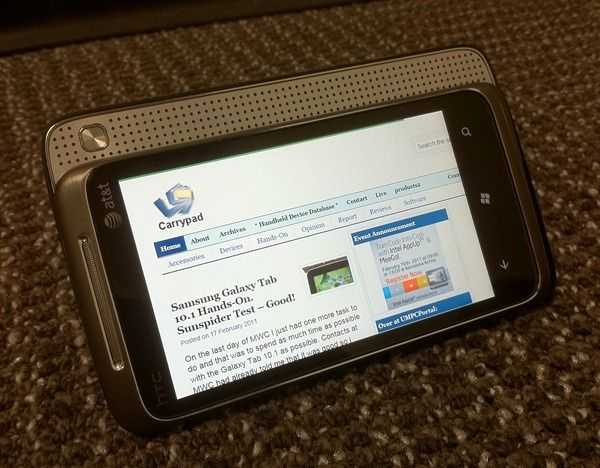 One tiny oversight that I would have loved to see with the stand: close the stand automatically when you slide the phone closed. This would just be smart design, but it’s not a big deal that it’s missing. It’s just strange, it almost works, but as you slide the screen closed the stand flips almost all the way back into place, but still needs a little help.
Performance
Performance on Windows Phone 7 is somewhat hard to judge because we haven’t seen that much hardware that uses the platform. Complicating things is the fact that the browser on WP7 lacks much compatibility and therefore can’t run the SunSpider Javascript benchmark or the V8 benchmark suite which are useful for looking at performance across multiple platforms.
This video will give you an overview of the device, and a good idea of how smooth the core UI is:
Time tests for website loading indicate that the phone is slightly behind the iPhone 4 (iOS 4.2) and the Nexus S (3.2) in terms of speed, but not by too much. Still, this is very dependent on the actual performance of the browser, and doesn’t give us a clear indication of processing capability.
In general WP7, at it’s core, is very responsive. Scrolling is always silky smooth on the home screen as well as within built-in apps/hubs. It’s clear that there is hardware acceleration happening here.
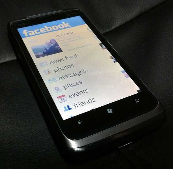 Third-party applications differ in their performance on an app to app basis. Some apps are as smooth as the core apps, and others fair much worse. The official Facebook app tends to be very unresponsive while it’s loading data (which it has to do every time because of the lack of multitasking more on that below), usually cutting out animations all together until it’s done loading. Twitter is the same way.
 Once everything is loaded, these apps are much more responsive, but not up to the smoothness that you see from the core applications like the People hub.
Either Microsoft needs to enhance WP7’s ability to load data on the fly within these applications and their unique interfaces, or perhaps developers need more time with the platform until they’ll find out how to best tune their apps for performance. Either way, there is room for improvement.
The lack of responsiveness while apps load could also simply be that the phone doesn’t have enough oomph to power the smooth UI while also loading data. This is less likely considering that the phone meets Microsoft’s hardware requirements for a WP7 device, but we won’t know for certain until we get our hands on some other WP7 devices.


