Software
 I really like the Windows Phone 7 interface. I’ve been really impressed with it ever since I got my hands on the Surround. The Surround doesn’t have the top-of-the-line CPU, nor does it have the most RAM of any smartphone out there. Still, it powers the WP7 GUI with ease. You’ll find slick and smooth animations throughout the core parts of the OS. Particular apps vary in their performance and are sometimes sluggish on the interface side of things.
Though I’m very impressed with the unique interface of WP7, there’s one thing that’s really bugging me. To explain, you’ll have to watch this:
This was the video used to announce Windows Phone 7 a little while back. The analogy of apps being rooms that you can only be in one at a time was a great way to poke fun at Apple’s iOS which, at the time, only ran one application at a time with no apparent backgrounding/multitasking. Microsoft promised that they were going to avoid this and let applications work together and provide glance-able information rather than asking you to jump between different apps.
Now here’s the sad part: While iOS went on to provide a great multi-tasking experience by freezing applications in the background and providing the ability to quick-switch between them, Windows Phone 7 actually became exactly what it was mocking in the WP7 announcement video.
Apps in WP7 function exactly like they showed in the video; as individual rooms. Apps cannot run in the background (beyond your typical email/sms/music). Many don’t even run while the phone is locked! For instance, if I lock my phone while viewing the official Twitter app, then come back to the phone a few seconds later and unlock it, I’ll be greeted with a several second pause and a “resuming inch message as I wait for the app to get going again. If I see something online that I want to share on Facebook, I have to exit the browser and wait for the Facebook app to get started.
The video also mentions that apps on other platforms “rarely work together inch. In WP7 they never work together. Because of the individual “room inch nature of each app, and the lack of cut/copy/paste, WP7 doesn’t feel like it’s geared toward productivity.
“I need to get this address from the web browser into the Maps application… well with no way to copy text, or even switch quickly between the apps, I guess I can’t do that. inch
“Wow this is a great webpage, I’d love to share this link with my twitter friends. Wait a minute, can’t do that! inch
“I’ll just record this meeting while I reference some notes from my email. Oh no, that’s impossible on WP7! inch
Ok, I think you catch my drift. All of the above is quite possible on iOS or Android, but impossible on Windows Phone 7. Clearly, they haven’t delivered on their promise to prevent the app “room inch analogy.
Hubs
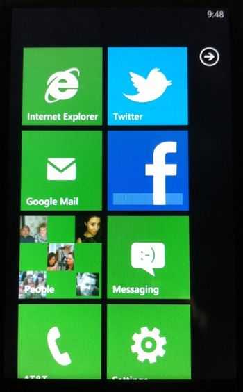
According to the video, the saving grace of a world filled with individual apps would be “hubs inch which are.. er.. apps that encompass multiple things. For instance, the People app, which is basically the contacts section of the phone, let’s you link into Facebook to associate contacts with Facebook profiles. Unfortunately that’s where the integration stops, there’s no MySpace, there’s no Flickr, there’s no Twitter. With this, they show you a “What’s New inch section that pulls down info about your Facebook friends, but why would I ever go here for my Facebook info over a dedicated Facebook app? The integration gives you about 5% of the Facebook experience, and there is nothing that would prompt me to go into the People hub for Facebook info when I could go to the full fledged app.
The problem is that the social integration of the People hub isn’t nearly inclusive enough to replace an app, and how could it ever hope to be? Facebook is filled with technically complex social interactions. Groups, pages, likes, comments, events, videos, photos, messages, chat, fa pages, etc. Then think about someone who uses twitter. You’ve got a whole new set of social interactions: tweets, retweets, DMs, follow/unfollow, lists, trends, etc. There’s no way that Microsoft could get all of this into one “hub inch. Specialized apps are entirely necessary to consume such specific and complex information. The last thing I want to do is be sorting through this information in a hub, then when there’s something that I can’t do within it, have to kick out to the dedicated app anyway and end up seeing the same info twice. Going straight to a dedicated app the first time makes way more sense. Microsoft clearly hasn’t planned these hubs out very well, and has poorly executed them. They either need to fully embrace the app concept and get backgrounding into an update ASAP, or go with hubs and really rethink them. If they wait too late, Windows Phone 7 may not survive.
Just for one more example, let’s look at the “Music + Videos inch hub. If Microsoft really doesn’t want me rummaging through various applications, then this should really become the Music + Videos + Photos hub and had better include Netflix, YouTube, Flickr, Hulu, Pandora, Last.FM, etc. But is that realistic? Probably not. Even if they could integrate all of these services, there’s hundreds more that someone will want within the hub, and keeping the integration tight and up-to-date would be nearly impossible with today’s fast paced development.
Live Tiles
Live tiles was also promoted as a big thing for WP7, but under-delivered. The promise was that the apps would be always running and you’d be able to see relevant info through the Live Tile (the app icon on the Start screen). Unfortunately, Live Tiles became little more than what badges are in iOS.
For instance, the Email tile shows the number of unread mail, and the Messaging tile tells me how many unread SMS I have. But beyond these simple numbers, there isn’t much. The Weather Channel app at least gives me the current condition and temperature outside (a step up from the Continuum’s embarrassingly uninformative “ticker inch display).
Live Tiles are a good idea, but aren’t seeing a lot of use, and could definitely afford to tell me a bit more. The official Facebook and Twitter application don’t utilize Live Tiles at all so I don’t know anything about what’s going on within those apps unless I launch them (and wait for them to load). A nice third-party Twitter app called Beezz will actually push DMs/Mentions through as a notification that will show up on the home screen, but the Live Tile only displays a single number. I don’t know if it’s a DM or Mention, and I don’t know who it’s from. I have to launch into the app to find that out. A much cooler use of the Live Tile would be to show me the Avatar(s) of the people who DMed or Mentioned me. I think the capabilities to do something like that exist in Windows Phone 7; perhaps developers just need more time to familiarize with the platform.
Xbox Live
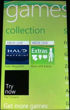
 Microsoft also pointed to integration of it’s popular Xbox Live multiplayer gaming service as a big feature of the phones. Unfortunately things fell flat in this department. I’ve been a member of Xbox Live for 5 or more years, and hardly any of the Xbox Live offerings on the phone interest me. At the very most I’d like to be able to see which of my friends are online and what they are playing. Unfortunately, instead of this info being up front, it’s hidden in a sort of meta-app called Xbox Live Extras. You see, you launch the Xbox Live app and you can see a “collection inch section which exclusively lists games for your phone (or in the confusing case of Halo Waypoint, apps) and you can also see a “spotlight inch section which actually doesn’t have anything to do with Xbox Live aside from highlighting phone games, then there’s my gamercard which is another fairly irrelevant piece of information that shows a static photo of my “Avatar inch (a horrible virtual representation of yourself that Xbox Live forces you to have then throws in your face despite the fact that it has zero purpose for existing) and it shows my gamerscore and the last achievement I got. Oh there’s also a requests section for people who want to be your Xbox Live friend, but seeing as there is a 100 friend limit on XBL, this is used quite infrequently.
 What’s that you say? You want actual Xbox Live integration instead of pointless stuff? That’s where the meta-app called “Xbox Live Extras inch comes into play. You launch this app from inside the Xbox Live app and you’ll find some useful information like which of your friends is online and what they are playing. Unfortunately the whole Xbox Live Extras app is bogged down because it’s constantly loading peoples 3D Avatars and making them do stupid animations. If there was any purpose whatsoever for Avatars, this wouldn’t piss me off so much. But the fact that viewing my online friends is slowed so that Microsoft can put Avatars in your face and try to give people a reason to pay real money to equip them with virtual clothes is just aggravating. Ok, this isn’t the time or the place for a rant about how Microsoft implemented the Avatar system in an attempt to appeal to would-be Wii owners….
Let me just say this then, the Xbox Live functionality feels tacked-on. They are trying to make it a sort of gaming social network, but Xbox Live will need a major overhaul before it will resemble anything of the sort.


