Software
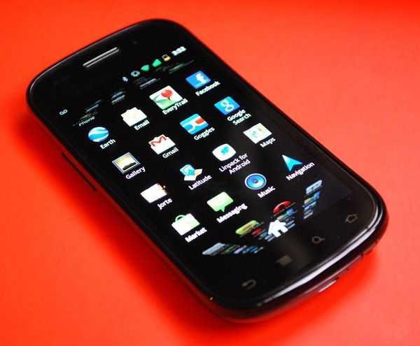 The Nexus S brings Android 2.3 to the table, and with it comes a host of tweaks an improvements.
Improved Keyboard and Text Selection (finally!)
In my opinion, Android has the weakest on-screen keyboard offering of the mobile OS lot. I feel that both the Windows Phone 7 and iOS keyboards are easier to use, but fortunately Google is working on improving text entry and Android 2.3 is touting adjustments in this area.
Google says that the buttons on the keyboard have been repositioned to make them easier to press and see, but I’m not sure I can feel a difference between this and phone running earlier Android software. One thing that is definitely noticeable though is that the top row of keys have small numbers on them. If you hold the keys for a moment, you’ll enter the number marked on the key, without having to switch to the alternate keyboard. This is nice and makes entering passwords and usernames with numbers faster.
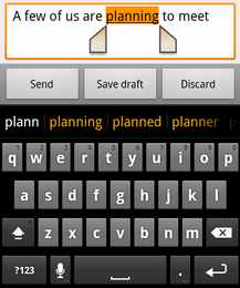 The best part about the keyboard tweak is the improved text selection. In previous builds of vanilla Android, selecting text was an absolute nightmare. It pretty much required you to be as precise with your finger as you would be with a mouse, which no one is. Android 2.3 adds text selection handles (much like the iOS implementation) that let you easily adjust the beginning and end of your selection. It’s quick, simple, and oh so much easier than before (not to mention overdue!).
Prediction also seems a little bit smarter, but it’s still far more intrusive than iOS of WP7, they still have a lot of room for improvement in this regard.
.
.
Improved Battery Info
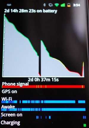 Google has improved the already good battery info center that shows which apps and system components are using your battery the most. They’ve added a graph that shows the charge level over time, and underneath it you can see a visual history of the phone’s signal, GPS, and WiFi use. You can also see when the phone was charging, how often the screen was turned on, and how often the phone was in an “awake inch state. It’s a great way to visualize your power consumption and is one more tool to find out what might be killing your battery.
NFC (where?)
Native NFC (near-field-communication) support has been added for Android 2.3, but it’s pretty much useless for the time being because there’s nowhere to use it. The idea behind NFC is that the phone can scan “tags inch that could be in movie posters, stickers, clothes, at restaurants, etc. and be able to receive information from them during the scanning process (which involves simply swiping your phone over a tag). The holy grail of NFC use is usually seen in “phone as an electronic wallet inch usage which is popular in other parts of the world, but has scarcely caught on in the US.
It’s a chicken and egg problem. Hardware manufacturers aren’t going to add NFC hardware to their devices and push up the cost of production if there aren’t any uses for NFC out there. Conversely no one is going to be placing NFC tags if there’s no hardware to read them! Someone has to make the first step, but one phone isn’t going to be enough. Until we see real adoption, NFC is useless, and really shouldn’t even be a bullet point on the outside of the box in regions where NFC isn’t used.
VoIP/SIP Calling
Google has also added native VoIP/SIP internet calling functionality into the core software. You can add a SIP address to a contact just as you would a normal phone number, and dial them right from the contacts page. This is handy for anyone who relies on internet calling to cut down on their phone bill by saving voice minutes.
I’m not a big VoIP/SIP user, but if you’re looking for a more detailed analysis of it’s usage, the folks over at OnSIP.com have a concise technical write-up about SIP support on Android 2.3.
Camera
The default camera application now allows the user to switch easily between front and rear cameras, and also puts all settings just a few taps away (a big difference from the menu maze that we saw on the Samsung Fascinate (and other Galaxy S devices).
Status/Notification Bar
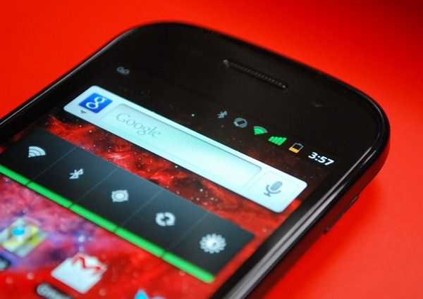 The bar at the top of the screen has received a visual overhaul. They’ve dropped the white and instead gone with complete black. They also redesigned the status icons for battery/WiFi/signal strength and more. I think the new icons are more attractive than the outdated set that they had been using. The bar still pulls down as usual, and you still don’t have the option to delete or manage just a single notification at once, which is annoying.




I Own one of these, coming from an N900 @ 1.2ghz for the last 2 years this device is a dream to use, and very very fluid (even at stock 1ghz, allthough i like it at 1.3ghz ;)
The “stand out” features that u mention are missing are all i nthe software of this lil beauty, a point thay has been sorely missed!
And the thing is very light, the main POSITIVE of having a plastic device, it does not feel cheap, it feels like all the other handsts sold over the last half a century, liek a PHONE!
I think apple has had a negative effect on far too many people (including this article writer).
Materials exist that are light, but don’t feel cheap: aluminium, carbon fiber, glass, etc.
The iPhone 4 is only 5% heavier than the Nexus S (4.6oz vs. 4.8oz), but feels way sturdier and has a more premium feel.
Even phones like the Droid X, which are completely plastic, just like the Nexus S, don’t feel cheap like the Nexus S does because the plastic is rubberized and feels rugged. It isn’t even necessarily the plastic that makes it feel cheap, it’s that the plastic is slick, untextured, and round. The Galaxy Tab, which is also all plastic, and made by the same company as the Nexus S, doesn’t feel as cheap. The back has some texture to it, and it just doesn’t feel as plastic and cheap as the Nexus S.
It isn’t that Apple has a negative effect, but it cannot be argued that they make well built devices, and even set the bar for what feels like a premium device. Back in the days of the iPhone 3G, the Nexus S would have felt nice comparatively, but now that mobile design has evolved and advanced, the same plastic devices are naturally going to feel cheap compared to newer devices with more advanced materials.
And I didn’t miss the point about the software. Android 2.3 is a bit better than Android 2.3, but currently, I don’t think it’s enough of an improvement to be called a “stand-out” feature. That being said, I did dedicate an entire section in the beginning of the review to the fact that the Nexus S benefits because of it’s Nexus status, and talked about this being an advantage at the beginning of the performance section.
I just wanted to point out that the reason that OLED screens appear to be off when displaying black is because they are. OLEDs produce their own light, unlike LCDs, which (incompletely) filter a white backlight.
But anyway, excellent review!
Hi Ben,
Yeah i agree some of the other materials mentioned can feel a little more solid to some extent, but to me this does not make a device feel expensive,
In my experience the more solid the casing, the more liekly the thing is to have a component failure when dropped (hence half the “goold old phones” being far more dropable than the new fandangled gadgets).
So whilst i see you angle, i have to disagree as my preference is the other way around. Not everyone needs something shiny or “feel good” to realise it’s merits, plastic is used in devices across the world for many reasons, i don’t thinks it’s quite as bad as it sounds myself.
And regarding software, its a MASSIVE standout in performance, you may not have pushed the dive enough to notice the dirrefence (heck most apps run on 1ghz regardless eh?).
My galaxy tab after exts mods for double the IO’s and many many tweaks puses 1700 quadrant (not the best of benchmarks i know ^^). but this little thing did that at stock!!
After some tweaking, and hacks i now have the nexus pushing 3500+ quadrant, and the actual speed using the device reflects this. it is twice as fast as the galaxy tab in any situation, and a quater of the size …how that’s not a amajor feature, or noted is beyond me.
Thanks for bringing the phone to your pages however, coming from my maemo n900 to this (something i was hesistant about) has actually shown me that i was holding back for too long.
Cheers,