YouTube
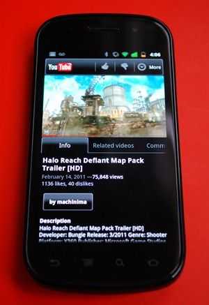 The YouTube app has been modified to allow for in-line video which let’s the video play at the top of the page while you can still access info about the video. If you’d like to watch in fullscreen, just turn the phone to landscape view.
While watching the video in portrait mode, you have access to the video description, related videos, and comments. You can also give a video at thumbs up or down, save it to a playlist, favorite it, share it (via the native share menu), or copy the URL. The improved app even supports captions which is pretty cool for anyone that needs translation or accessibility.
You can also access your own channel and upload or delete videos and the player bar has been refined to look more like it does on the desktop flash player. A large and easy to grab nub has been added to the seeking cursor to make it easier to seek through videos, but you can only seek in fullscreen mode.
Lock Animation
Android 2.3 has a really cool lock animation built right in. The effect takes on the look of a classic tube-TV turning off and is very smooth and very convincing. It looks great! If you look carefully at one particular part of the screen, you can almost see the color fields separate as the image collapses and the screen shuts off. Without a great contrast ratio, this effect wouldn’t be convincing because you’d be able to see that the screen doesn’t actually turn off until the end of the animation. However, with the extremely impressive contrast ratio of the Nexus S’s AMOLED screen, the screen actually appears to be turning off as the image collapses. I demonstrate the animation in the video on the first page of this review (toward the end).
Market
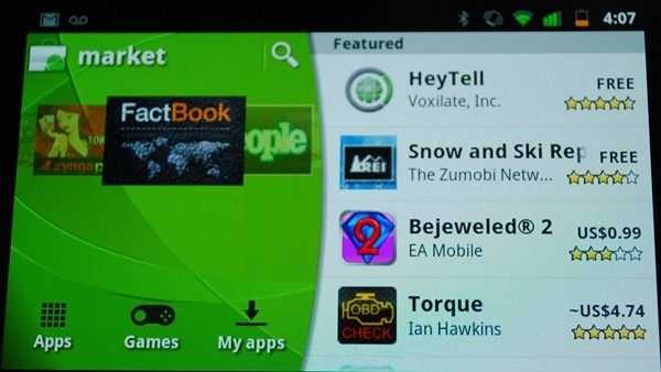 Though the Android Market update isn’t unique to 2.3, I think it’s worth mentioning, at least briefly. Google has done some visual work on the market to better highlight apps and genres of apps. There is also landscape support for the new layout which is nice too.
Google Maps
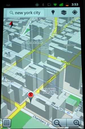 The latest version of Google Maps looks quite similar to the old, but the underlying system is vastly different. Instead of using static image tiles at varying zoom levels, Maps is now using vector tiles which boast a number of advantages. Vector graphics can be dynamically scaled to any resolution and still retain their sharpness. Now, instead of downloading one tile for each zoom level, you may only have to download one tile for a particular area and then it is scaled to any level of zoom. This means less downloading (less data usage) and easier caching (storing for use later/offline)
Vector graphics also allow the map text to stay right side up even as you rotate the map. Additionally, you can now use two-fingers to tilt the map to get a different angle (again, thanks to vector graphics). And you’ll be able to see 3D buildings in places where it’s supported.
Navigation also now intelligently routes you around traffic.





I Own one of these, coming from an N900 @ 1.2ghz for the last 2 years this device is a dream to use, and very very fluid (even at stock 1ghz, allthough i like it at 1.3ghz ;)
The “stand out” features that u mention are missing are all i nthe software of this lil beauty, a point thay has been sorely missed!
And the thing is very light, the main POSITIVE of having a plastic device, it does not feel cheap, it feels like all the other handsts sold over the last half a century, liek a PHONE!
I think apple has had a negative effect on far too many people (including this article writer).
Materials exist that are light, but don’t feel cheap: aluminium, carbon fiber, glass, etc.
The iPhone 4 is only 5% heavier than the Nexus S (4.6oz vs. 4.8oz), but feels way sturdier and has a more premium feel.
Even phones like the Droid X, which are completely plastic, just like the Nexus S, don’t feel cheap like the Nexus S does because the plastic is rubberized and feels rugged. It isn’t even necessarily the plastic that makes it feel cheap, it’s that the plastic is slick, untextured, and round. The Galaxy Tab, which is also all plastic, and made by the same company as the Nexus S, doesn’t feel as cheap. The back has some texture to it, and it just doesn’t feel as plastic and cheap as the Nexus S.
It isn’t that Apple has a negative effect, but it cannot be argued that they make well built devices, and even set the bar for what feels like a premium device. Back in the days of the iPhone 3G, the Nexus S would have felt nice comparatively, but now that mobile design has evolved and advanced, the same plastic devices are naturally going to feel cheap compared to newer devices with more advanced materials.
And I didn’t miss the point about the software. Android 2.3 is a bit better than Android 2.3, but currently, I don’t think it’s enough of an improvement to be called a “stand-out” feature. That being said, I did dedicate an entire section in the beginning of the review to the fact that the Nexus S benefits because of it’s Nexus status, and talked about this being an advantage at the beginning of the performance section.
I just wanted to point out that the reason that OLED screens appear to be off when displaying black is because they are. OLEDs produce their own light, unlike LCDs, which (incompletely) filter a white backlight.
But anyway, excellent review!
Hi Ben,
Yeah i agree some of the other materials mentioned can feel a little more solid to some extent, but to me this does not make a device feel expensive,
In my experience the more solid the casing, the more liekly the thing is to have a component failure when dropped (hence half the “goold old phones” being far more dropable than the new fandangled gadgets).
So whilst i see you angle, i have to disagree as my preference is the other way around. Not everyone needs something shiny or “feel good” to realise it’s merits, plastic is used in devices across the world for many reasons, i don’t thinks it’s quite as bad as it sounds myself.
And regarding software, its a MASSIVE standout in performance, you may not have pushed the dive enough to notice the dirrefence (heck most apps run on 1ghz regardless eh?).
My galaxy tab after exts mods for double the IO’s and many many tweaks puses 1700 quadrant (not the best of benchmarks i know ^^). but this little thing did that at stock!!
After some tweaking, and hacks i now have the nexus pushing 3500+ quadrant, and the actual speed using the device reflects this. it is twice as fast as the galaxy tab in any situation, and a quater of the size …how that’s not a amajor feature, or noted is beyond me.
Thanks for bringing the phone to your pages however, coming from my maemo n900 to this (something i was hesistant about) has actually shown me that i was holding back for too long.
Cheers,