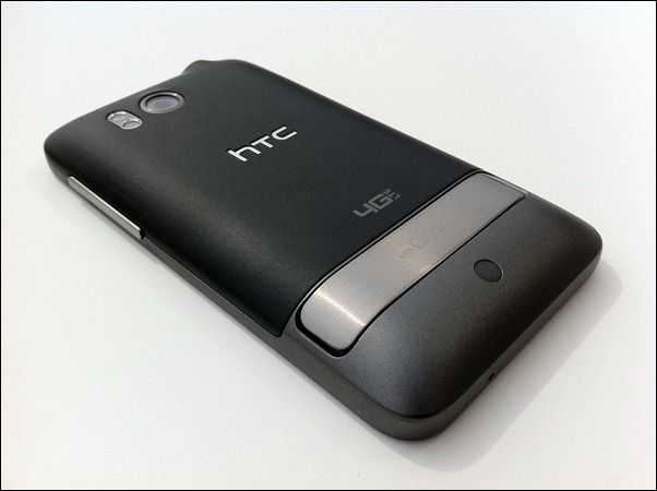
 If you’ll recall, the HTC Thunderbolt was released as Verizon’s first phone compatible with their 4G LTE network, which provided impressive speeds which are even capable of functioning as a high-end gaming connection for consoles. Beyond the impressive 4G speeds, the phone has HTC’s hallmark build-quality, a good camera, and a great kickstand to boot.
The HTC Sense overlay that takes place of the default Android interface is liked by some, but hated by others. While I don’t hate Sense, I will say that I lean more toward the latter group. Not that I don’t see the value in HTC Sense, they’ve actually build an impressive number of widgets and mini-applications for users to choose from, but I tend to prefer multi-platform solutions (and official ones at that), so that I don’t have to wait for a company like HTC to get around to updating their software to take advantage of updates to Twitter, Facebook, etc. I spoke a bit more about HTC Sense in my HTC Thunderbolt overview video.
Because the Thunderbolt has been on the market for some time, I’m going to give you a quick rundown of notes that I’ve taken during testing, rather than a full fledged review. If you’re looking for a formal review, the folks over at Laptop Magazine have a great one waiting for you.
Notes
- Haptic feedback motor can’t keep up if you type too quickly, the motor won’t be able to vibrate the phone as quickly as you type, this makes it feel as though the phone is dropping key presses when it’s really not.
- Custom skinning (HTC Sense) is visually clunky, especially in the People (contacts) application
- Twitter for HTC Sense is a nightmare the widget for the homescreen is called ‘Twitter for HTC Sense’ but the corresponding app is called ‘Peep’ in the application screen; the DM section of which inexplicably doesn’t tell you who sent you the DM, or even the time that it was sent (looks to be a bug). The widget that interacts with Peep shows, at most, three tweets, and has no indication of what tweets have arrived since the last time you checked. You can’t directly click on anything within the tweets of the widget, such as a username or link, instead you have to click the tweet in the widget which launches Peep, then you can go ahead and click on the link or the username.
- The ‘dismiss keyboard’ button is where the number pad toggle or shift key usually is on other handsets annoying!
- The lock button on the Thunderbolt is too small and too flush with the top of the phone. It’s a little bit hard to find with the finger and the feedback should be better.
- HTC has included a cursor handle to make it easier to move the cursor around in text which is tremendously frustrating to do without such a handle. Thanks to HTC for adding this as it doesn’t get officially implemented into Android until 2.3 (Thunderbolt is running 2.2). It’s oddly inconsistent though; you can tap in the text field to evoke the handle, but if you hold your finger, a small magnifier will pop up and move with you as you move the cursor. It almost seems like they tasked two people to come up with a solution for cursor selection then accidentally implemented both.
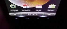
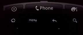
- When looking from a high angle, there is backlight leakage at the bottom of the LCD screen, and at two small points under the capacitive buttons.
- SMS doesn’t vibrate the phone by default which seems a bit silly (dig through the settings and you can fix this)
- Thanks to HTC Sense, many of the default icons have been changed visually for no reason that I can think of, other than to be different, which isn’t a good thing if you are trying to cater to users who are already familiar with Android (perhaps they are going for people already familiar with Sense?).
- I may rag on HTC Sense a good deal, but if you like to customize your phone, it has a number of great themes and options to do so.
- Between the keyboard and the predictive input pop-up, little room is left for what you’re actually looking at on the screen.
- The space bar on the landscape keyboard is off-center which causes me to hit the period key frequently when I meant to hit the space bar.
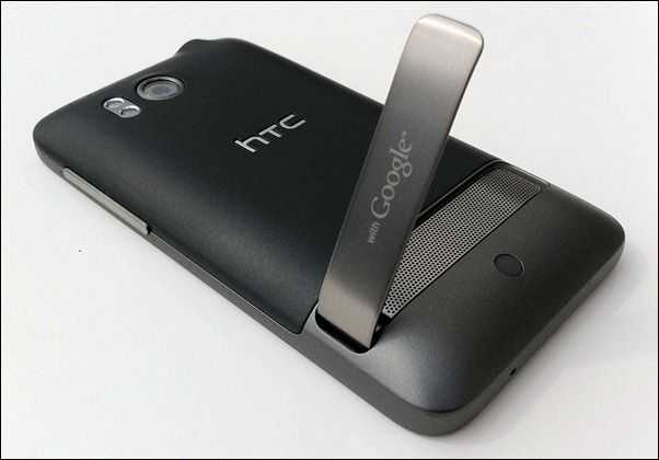
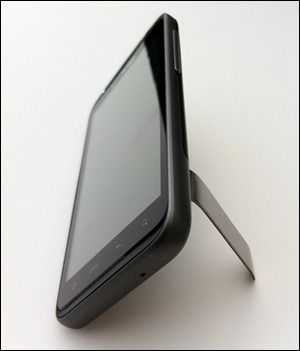
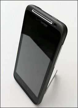
- The Thunderbolt’s kickstand is top-notch and springs up and down with satisfaction. As a bonus, it also holds the phone up in portrait mode which is great for video calling. Sadly, HTC missed a golden opportunity with the stand. They should have placed the micro-USB port on the bottom of the device so that it could sit in landscape with the stand and be an excellent bedside alarm clock/info center while charging. Unfortunately they placed the micro-USB connector on the ‘bottom’ of the phone when the stand holds it in landscape, which blocks the micro-USB port.
- HTC added four arrow keys to the already clunky keyboard which take up lots of space and I’ve never desired to use them.
- You can calibrate the keyboard for a better typing experience, which is something that I haven’t seen any other phone manufacturer allow you to do (it’s unclear whether or not this calibration affects keyboard input only, or all touch input {I would hope the latter}). After calibration, typing on the Thunderbolt’s keyboard is a better experience than most Android phones. Unfortunately this advantage is counteracted by the fact that the Thunderbolt’s screen is overly sensitive. It’s quite easy to press a key by holding your finder near the screen without actually touching it (and issue I’ve found on other devices as well). This means that accidental key presses can (and likely will) occur during fast typing.
- At 4.3 inch the screen is too large in my opinion, especially when asked to reach all the way up to the status bar for notifications, then all the way down to the capacitive buttons.
Camera
In my review of the Nexus S, I noted the following about the device’s camera:
What you see is not what you get. It’s very hard to visualize exactly how your photo will turn out after you press the capture button. Pictures are often suddenly brightened after you hit the capture button. Shooting good photos with the phone would be much easier if the viewfinder gave a more clear idea of what will actually be captured once you pull the trigger.
I’m very happy to report that the Thunderbolt is the opposite of the Nexus S. When you hit the camera button, you can be assured that what you see on the phone’s screen is exactly what you’re going to capture. This makes it much easier to snap good photos. Noisy low-light photos and the lack of an HDR mode makes the Thunderbolt’s 8MP camera still inferior to the iPhone 4’s 5MP camera.
The Thunderbolt is capable of capturing great photos given the right conditions (as with many smartphone cameras). Here’s a few unedited sample shots I took with the phone (click to enlarge):




The colors could pop a bit more on some of these photos, but it does work in daylight as a great point-and-click camera.


