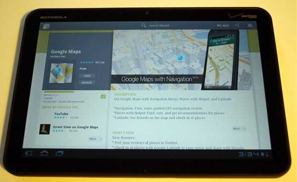
 As with the HTC Thunderbolt, I’ll be dropping my Xoom testing notes here. This isn’t a full review (though Laptop Mag has a nice thorough one if that’s what you’re looking for). These are just a few thoughts I had while using the device (and waiting and wondering when the 4G upgrade will be come available).
Notes
- The Xoom seems to collect dust and fingerprints very well. More so than other devices I’ve used. The Xoom may lack an olephobic coating that is designs to reduce the amount of finger oils that stick to the screen. The dust attraction could be from a slight static charge building on the screen.
- Auto-correct is mostly invisible and doesn’t correct very well by default. If you go into the keyboard options, you can enable ‘show suggestions’ and increase the agressiveness of the auto-correct which improved the typing experience for me.
- The lock button (on the back of the device) works well when the tablet is in your hands, but it’s a pain when the device is flat on a table or in your lap (which it usually is when you’re typing). People that I give the Xoom too (even those familiar with technology) usually spend at lest 20 seconds looking for the lock button, which easily marks it as being not placed in an intuitive place.
- The screen is glossy and highly reflective; a pain to use with bright overhead lights found in office and school environments.
- The portrait keyboard is a better size than the iPad’s (ie: easily thumb-typable but the aspect ratio and weight of the devices makes it harder to use than I’d prefer. The option to float the keyboard in the middle of the screen (like the iPad will do with iOS 5) would distribute the weight more evenly and make for a better portrait typing experience. Extended portrait typing with the current keyboard layout will likely cause strain as you have to hold the weight of the device with your palms while typing with your thumbs.
- Quick controls on the browser is great for maximizing screen real-estate and making navigation quick and easy. Just swipe onto the browser from the left or right of the screen and you’ve got all of your browser controls quite literally at the tip of your finger. Android Honeycomb 3.1 updated this to offer even more comprehensive controls from quick controls. Be sure to activate quick controls in your browser’s settings menu under Labs.
- The familiar four Android buttons have moved into software which is good because they change with the orientation of the device. The ‘menu’ button has been removed in favor of putting things that would otherwise be hidden by the button into the software of the application itself.
- Keyboard input can be slow on ‘heavy’ sites like Facebook which makes typing a pain.
- Auto-rotation on the screen is was slower than it seems it should be doesn’t feel responsive.
- Lack of portrait support in the Market app is annoying!
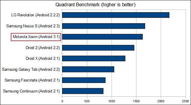
Benchmarks
So there you have it! If you’re interested we’ve got some other great coverage on the Xoom:


