Design
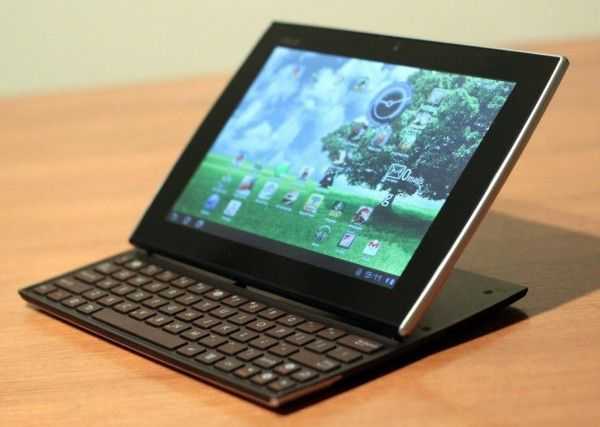
There are some aesthetic flourishes that Asus have dropped into the Slider to help it rise above pure function. The first is the classy two-tone back panel with a middle chrome-like strip to separate the colours. They could have gone with a single tooled backing but the design gives it a stylish appeal. The same goes for the mirror finish on the square bracket that holds the screen in place while in keyboard mode. Finally, the slightly convexed sides of the Slider provide another subtle design touch.
If I wanted to be picky, the volume controls could have been placed a little differently; the toggle is situated on the lower left hand side when holding as a tablet, and so not instantly selectable with the index finger. In fact, it’s positioned a little too snugly to the power button — I accidentally turned the power off a couple of times when in keyboard mode when feeling for the controls.
The engineers assigned to this project were always going to be fighting an uphill battle integrate a keyboard and speakers without making the whole thing looking like a high-tech sandwich. And for the most part, I think they’ve succeeded.
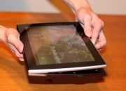
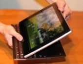
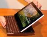
The most important part of a Slider’s day is… the slide. The design works on a bit of index finger strength to lift the top panel above the front webcam, and then ease your other thumb up to reveal the keyboard underneath. And then, as the bottom of the screen passes the second row of keys, the stored kinetic energy of the spring mechanism takes over and smoothly finishes the movement to lock the screen in its final position. It’s a very well designed slide. And the screen isn’t literally “locked inch; the bracket holds it there until you use a bit of gentle force to bring it down again.
The actual tilt of the screen in keyboard mode may end up being a bone of contention for some, as the tilt angle is fixed. The inability to adjust may frustrate some who may be sitting in different environments cafés, home office desks, lounge chairs. The inflexibility means you have to adjust your sitting position to suit the display. At a normal desk height, the screen angle was perfect. Sitting on a stool with the Slider on a low table, however, I would have preferred the ability to tilt the screen even further. This may be one area where the Transformer might be better suited to some.
Keyboard
This is really the pivotal feature that will either attract users for its innovation and usability or be derided for being nothing more than a tablet parading as a netbook. Here are the impressions I received when I first demonstrated the slide-out keyboard “Ooooh…. Aaaah. inch Seriously, nearly every man, woman, and child thought it was a “cool inch feature. But is it useful?
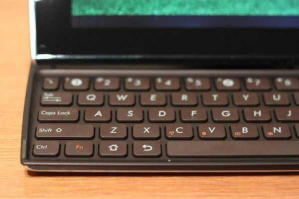
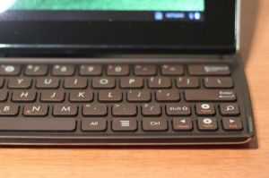
From a physical key perspective, when compared to a netbook, each of the keys are longer horizontally rather than vertically. This does compress the range your fingers usually have from the numeric keys down to the space bar. And there is one slightly annoying factor — the return lip on the edge of the keyboard is close to the bottom row of keys, closer than any keyboard before it.
This makes for a strangesensationwhenever hitting the space bar with the left thumb — you have to make it a good hit or the lip stops the full press-down. This does hamper speed to a certain degree because you’re always second guessing the effect of the keying. That said, it is still a generous keyboard, nearly as wide as my 11.6 inch netbook from Q to P, and the island design keeps miskeying to a minimum.
Layout-wise, Asus have taken some Android touch functions and made them into keyboard shortcuts which are accessed with an Fn key. The home, back, search, and menu functions have all been given their own place on this keyboard, replacing the Windows, left Alt, and right Alt keys. These buttons make sense. Once I remembered where they were and what they did, I found myself using them if the keyboard was open.
One thing I did keep doing with the keyboard was habitually reach for the trackpad an instinct hardwired into my hands after many years of using a notebook. The keyboard real estate stops right at the space bar no palm rest, and no touch pad or mouse keys. It was a little strange to start with, and I had to train myself until I had somewhat rid myself of the habit. Of course, once I returned to my normal notebook I had to readjust once again.
This could well be where the Transformer has trounced the competition – it’s drawn us all in with its netbook-like form factor, including keyboard and trackpad, then closed the deal by making the keyboard disappear when you don’t need it. But I actually think the trackpad is a kind of crutch anyway, due to the fact that you need to remember to press the cursor key once only, just like a screen gesture switching between a cursor pad on my Windows notebook and my Android tablet would drive me slowly insane, or at least my fingers will eventually shut down in epileptic fits.
Not having the front-most space on the keyboard does two things. It makes it more of a desktop keyboard, where there is no trackpad, and once you treat it like that, it becomes more comfortable to use. The touchscreen is also at the perfect distance from the keyboard to use touch gestures in combination with the keyboard.
Then it struck me… a desktop keyboard, with a touchscreen display, with integrated speakers. That’s it! This is the ultimate portable all-in-one unit! It takes all the benefits of an all-in-one and shrinks it down to the point where you could be using it on a plane in economy class, in comfort.




Looks like a worthy successor to the MBA!
If it has a keyboard, then it’s not a tablet, it’s a netbook.
That may be your personal definition, but I wouldn’t say it’s one shared by the majority.
Sorry, but disagree. The form is of a netbook and not a tablet. Sure doesn’t look like an i-Pad or Galaxy S form to me.
At one time, ‘everyone’ thought the earth was flat and the sun rotated around the earth. So, being in the majority isn/t proof of anything.
True, but the netbook form-factor is a human-made thing and thus it is defined by humans; this is not so for laws of physics.
It is only recently that the majority of tablets are manufacturered without a keyboard. Tablets with keyboards existed long before the term “Netbook” was coined.
Netbooks don’t have touch screens.
Sure they do. How about Lenovo IdeaPad S10-3t?
Glad to see there’s a Slider with a proper keyboard layout. The one I got to test in the last weeks came with that awful European layout, with the bigger enter and the tiny Left Shift. The same Asus uses for all laptops in my country and a total fail in my eyes.
I also hate that there’s no trackpoint, I see you guys weren’t too bothered by this aspect, but i found it a bit frustrating to have to reach for the screen all of the time. And carrying a mouse around ain’t really a solution for a device that should be ultra-portable.
Also, I don’t think the sound is redirected towards that front grill. The speakers are definitely there on the back near the sliding mechanism and their volume is quite low for my ears, especially when using the Slider in tablet mode. I carefully checked to see if the sound comes from the grill and i’m pretty sure that’s there just part of the design. Sound comes from underneath the screen, and that’s why it’s a bit stuffy in this mode.
Anyway, great review. I for one rather pick the Transformer though…
I’m all for trackpointers myself.
While you compare it for weight and dimension to the ipad – it loses, but why don’t you continue comparing it to the ipad with all the input/output scenarios? the keyboard itself? then the ipad outright loses completely and can’t do without accessories – try carrying them around all the time.
Why don’t you compare it to other Android tablets? i always wonder why everything has to be compared to that companies products? If people consider an Android tablet with keyboard, then they go for Asus with Android – who cares about ipads. Just because ipads are the most sold devices it does not make them the best out there.
I think the weight of the Slider should be compared to the weight of a non-slider tablet plus a case.
A 10 inch tablet really is much more useful if it can stand by itself at an angle appropriate for reading. It’s a pain, literally, to hold a tablet of this size for more than a few minutes. For most tablets, the answer is a case that can hold the screen at an angle. The slider sits at a decent angle for reading, so it doesn’t need a case.
The official Apple Smart Cover for iPad 2 weighs 137 grams (4.8 oz). Typical 3rd party covers weigh a few grams more.
nice review:)
iPad 2 vs Asus Eee slider-Take a look http://www.techzags.com/2011/09/ipad-2-vs-asus-eee-slider-take-look.html