 Yesterday the company behind the infamous Joojoo, Fusion Garage, revealed itself as the real name behind the fake company TabCo which had been teasing the tech world for the last few weeks about an upcoming tablet.
During the announcement webcast, Fusion Garage did indeed reveal a new tablet which turned out to be the Grid 10 device that we saw pass through the FCC a few weeks back (though at the time we didn’t know it had anything to do with TabCo). You can find full specs, links, photos, and more at the Grid 10 tracking page in our mobile device database.
In a genuine surprise, Fusion Garage released not only the Grid 10, but also a smartphone called the Grid 4. The Grid 4 is quite thin at 9.6mm. You can also find full specs and plenty more for the Grid 4 in our database.
Both of these devices run Fusion Garage’s own ‘Grid’ OS which is not Android, but is based on the Android kernel. Grid will be able to run Android applications natively, but neither of the devices will have official access to the Android Market, nor will they have the usual Google applications that you find on an Android device, like YouTube, Gmail, Maps, etc. To compensate for this, both will come pre-installed with the Amazon App Store as well as Fusion Garage’s own Grid application store.
Devices aside, I can’t help but comment on some of the remarks that Fusion Garage made during their webcast.
According to Fusion Garage’s CEO, Chandra Rathakrishna, Apple’s iPad is the only real tablet in town, while Android tablets offer nothing but “parody”. Specifically, Chandra said that there is no innovation in the Android tablet market and that companies out there are offering nothing but sameness. He also went on record as saying that Fusion Garage would change that, that the market needs a “shakeout”.
I have to wholeheartedly disagree with Chandra’s remarks. Not only is there innovation in the Android tablet market, but even if there wasn’t, Grid is not the answer.
If anything, Apple has been the stagnant one in the tablet field thus far. Sure, they may have arguably started the market, but they’ve added very little to their initial iPad offering. Don’t get me wrong, the iPad is certainly a good product, but between the iPad and iPad 2, there isn’t much except for an increase in speed, reduction of weight and girth, and some cameras. That’s not innovation, it’s just improving on what’s already there.
Meanwhile, some rather brave companies have been experimenting in the Android tablet field with features and functions that Apple simply doesn’t offer with the iPad at this point.
Look at Asus. Their Eee Pad Transformer, which docks to a keyboard and can then be folded closed like a netbook, has been very well received in the market, and is empowering people to use their tablet in situations where they otherwise wouldn’t. They’ve also got that excellent looking Eee Pad Slider launching soon, which keeps the keyboard hidden away under the screen when you don’t want it, and they’ve thrown in a full-sized USB port for connecting useful peripherals like a flash drive or mouse.
And it doesn’t stop there.
Have a look at the HTC Flyer, the first Android tablet equipped with an active digitizer for serious digital inking. Then there’s the ThinkPad Tablet which seems to combine functions of the Transformer with the Flyer by offering a dockable folio with full keyboard and mouse, which folds down like a netbook, as well as an active digitizer for digital inking and notetaking.
Not to say that these devices have been or will be smash hits, but these companies are experimenting and innovating, and producing devices that are all stepping stones toward more productive and useful devices that can be used in scenarios where the iPad (and the Grid 10 for that matter) cannot.
I hate to put down Fusion Garage; they’re a company of around only 100 people, and have limited funding compared to the likes of Apple and Google. I appreciate their vision, but I don’t think they’ve been realistic about what they can accomplish.
In the webcast, they offered their Grid OS as the cure to their perceived sense of sameness that they say is found in the Android tablet market, but from their own demonstrations, they’ve done nothing but offer up different (not new) ways of doing the same old things.
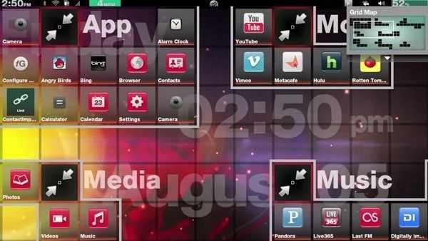
During their demonstration of the Grid OS, I saw lots of eye-candy and even some cool visual design, but little in the way of intuitiveness. The home screen, for instance, works like a big open canvas where you can place all of your apps. The area is so far zoomed in that there is actually a map at the top right of the screen to indicate where you are on the home screen. I’m sorry Fusion Garage, but if the homescreen of your device requires a map to be used effectively, you’ve failed on ease-of-use:
I hesitate to even start talking about the “3D tilt” that they’re so proud of. They’ve got this scrolling animation that slightly tilts the list that you’re scrolling through. Listen to how they laud it on their site without even saying how it’s beneficial:
“Scroll your contacts quickly with a 3D tilt. Find your contacts quickly and easily.”
“Have a big video collection? Scroll through it quickly with Grid10’s 3D tilt. Scrolling through your collection has never looked better.”
I’m sorry FG, but tilting the thumbnails on a list by 5 degrees or so as I scroll doesn’t not make my movie collection look any better than if it just scrolled with no tilting.
The problem with “3D tilt” is that it does nothing but distract visually. It doesn’t help you find anything in the list any easier than if it didn’t tilt. It isn’t even there to indicate the direction of motion as that’s already accomplished with a non-tilting scrolling list. It’s pure eye-candy, and I’ve got a major problem with that. It’s like giving a race car curves to make it look cool instead of being aerodynamic — it’s flair with no function. You can see their silly 3D tilt effect here (and notice how you’re never really certain what part of the interface is going to pop our of where – lack of intuitiveness!):
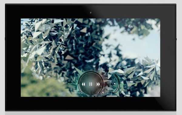
Then there’s their video controls that we “haven’t seen anything like” which are just your basic video controls, which they managed to make more intrusive than putting the seek bar across the top or bottom of the screen like everyone else:
The Grid interface isn’t the only thing with needless eye-candy. Fusion Garage’s entire presentation showed me little but wasted money. A small company doesn’t need to put on a big press event and parade around with an Apple costume on – people get this. But here is Fusion Garage, wasting money by building a big stage with moving parts for a virtual audience, and trying desperately to be like Apple or Google, even if people wouldn’t mind if they were just themselves.
I actually chortled to myself when they announced Grid; lights flared, and a big metal lattice with some squares bearing the “Grid” name lazily slid in from both sides of the stage. Once they stopped moving, Chandra said “So people, there you have it, Grid.” Much like 3D tilt, this was just eye-candy for the sake of it. There was absolutely no reason to waste money on fabricating and moving the stage like that. You can see the laughable spectacle here. I dare not even get started talking about the dub-step….
All the while, on the screen behind Chandra, you could watch a bunch of unnecessarily animated (and visually distracting *cough*3D tilt*cough) slides playing. Waste waste waste. Save that money and put it toward HCI testing.
The Grid OS showcases no new ideas but instead is just a whole new unintuitive operating system that they’re asking people to learn from the ground up. Not only that, but Grid brings along with it the disadvantage of not having official Android Market access, and missing out on some of the key apps that make the Android platform so useful. The ability to run Android apps natively is merely a crutch, as they won’t share the same interface design as the core Grid apps and those from the Grid application store.
Fusion Garage has not demonstrated anything revolutionary or innovative that I’ve seen. They’ve only introduced different ways to do things that we already do without issue on other mobile operating systems.
The Grid 10 is what the Joojoo should have been – an impressive product, for a small company, but nothing that’s going to take off.





I agree with everything in that, especially this:
>>>During their demonstration of the Grid OS, I saw lots of eye-candy and even some cool visual design, but little in the way of intuitiveness.
It amazes me how little today’s “revolutionary” new operating systems fail to incorporate things that we learned 15 years ago about human computer interaction. Case in point: Ideally, every icon should be uniquely distinguishable by it’s outermost silhouette. This is User Experience 101 for Human Computer interaction. The moment you surround your icons with boxes, no matter how feint, you make them all the same shape. Could you imagine how stupid it would be if all traffic signs were surrounded with “stylish” boxes? That’s the kind of wisdom that GridOS features. If you really want useful grid-goodness, then go run xmonad.
MeeGo eats this POS for breakfast.
I wholeheartedly agree with the analysis, though the example of the Eee Pad is a bit misleading.
The Eee Pad does feature a keyboard dock that is rather useful, yes, but that doesn’t mean the iPad doesn’t have anything quite like it.
http://topoflists.com/2011/05/09/ipad-2-cases-keyboards/
It’s the same situation as the iPhone. Apple improves upon its product, whereas accessory makers and users innovate its usage. In the case of the Eee Pad, ASUS knew before hand that the tablet may not garner enough attention for accessory makers to start making docks for it, so they went and made one themselves. It’s different with the iPad when every other week or so, you learn about the existence of a new case, or dock, that will revolutionize or innovate one aspect of the device. In fact, some of those keyboard dock/case concepts far precede the Eee Pad. It wouldn’t be a stretch to say ASUS might have been inspired by some of those designs.
The leader of the pack is actually always innovating. It’s just that if you don’t keep up with news, you wouldn’t know that X thing is possible with the iPad.
I did consider the many third-party accessories that can extend the usability of the iPad, but I can’t acknowledge them in the same way as the Transformer. There’s a key difference:
Asus is committed to the Transformer as being a product that can function as a netbook, hence the keyboard dock.
Apple, on the other hand, makes no such first-party accessory; they haven’t shown a commitment that they think that is how the iPad should be used, instead they’ve waited for third-party accessory makes to sort of shoe-horn the functionality in there. Many of the cases for the iPad are really just stands or props, they don’t actually lock the device to the keyboard, or just prop themselves up, making it much more frightening to use such a setup in one’s lap.
If Apple had designed the iPad from the get-go to work with a netbook style form-factor, you can bet that they would have released such an add-on from day one.
Not to say that those third-party accessories don’t enhance the usage and definitely help people be more productive, but the majority of users certainly aren’t buying keyboard folios, while I would wager that the majority of Transformer users bought the keyboard accessory.
Android also supports a mouse (and the Transformer’s keyboard has a trackpad and mouse buttons) which changes usage to some extent.
While I would agree that Apple doesn’t seem to condone the use of the iPad as a netbook replacement, I’d disagree that such attitude should dictate how the device could be used by the user, and I’d disagree that it necessarily bars the iPad from being used as such.
Indeed the majority of users aren’t buying keyboard folios, but I’d argue that those that need the functionality can still afford it quite easily.
And I think it’s also worth noting that many apps, including Apple’s own, on the App Store do make use of an external keyboard quite well.
A mouse or touchpad seems really redundant, in my opinions, to a tablet since there is a touchscreen that can be used for the same purpose and a cursor would cover up whichever interface element that might be essential. But for what it’s worth, you can still add support for a mouse if you jailbreak an iPad.
I very much admire ASUS’ commitment to further familiarize the tablet form factor to traditional laptop users. However, I feel that it’s misleading to imply that if Apple doesn’t offer the same features on the iPad, then it can’t be.
I’m not saying that it can’t be if Apple doesn’t explicitly say that it is so, but obviously the use-case scenarios that have Apple’s blessings are where the most support from the company are going to be seen (ebook reading, internet consumption, apps, etc.).
But of course Apple does support the use of an external bluetooth keyboard in their apps and third-party apps, which would undoubtedly cover support for keyboard docks and cases.
It’s broad, but the support is there. They just don’t specifically go into it with a clamshell use case, but I don’t suppose they openly disregard clamshell cases entirely.
Great article, nice to see others feel this way about the industry and the innovative (or lack there of) products being dropped on the market.
Ive used and quoted your article over here http://www.sponsoredbythelettert.com/?p=1099
Thanks guys, just what I need, some good ole second hand information to make my choice for me. Maybe we all should just put on ca$h down on the latest improvement of the iPad or better yet, one of the gazillion Android tablets based on a clearly and highly fragmented OS.
Mine job has been made much easier. Not !!!!! Think I’ll wait until MS puts out a tablet with their oh sooo boring Metro UI (which by the way is 99% more times informative at a glance than anything else I’ve seen), I’ll take one of the none eye-candy OS please.
Within reccent times, I’ve had to return to my dictionaries to find out what the words “review”, “unbiased” and “impartial” means, think I forgot. Cheers