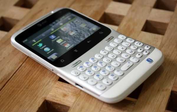
HTC kindly offered to lend us the HTC Status to have a look at and I was happy for the opportunity because it’s giving me some time to step back and look at Android on the lower-end of the phone spectrum. We tend to focus on the bleeding edge devices, and sometimes it’s easy to forget that not every person (in fact, the majority of people) don’t want to drop $299 on the latest phone every year. The HTC Status runs a cool $49 on contract which blows me away because this phone is pretty damn gorgeous.
The HTC Status is running Android 2.3 on a 2.6″ 480×320 (3:2) screen which is curious because this is the exact same resolution that the very first Android phone, the HTC G1 (AKA Dream), used. If you’ve read my analysis of the ergonomics of Android, you shouldn’t be surprised to find that, from an ergonomic standpoint, HTC is way easier to use with one hand. Instead of stretching and shuffling to read between the navigation buttons and the notification bar, it’s all right there, easily within reach.
The unfortunate fact is that almost all of today’s Android applications are designed with the assumption that the phone they will be used on is primarily portrait and with much more screen real estate. Despite how it may seem, I was actually really impressed with Android’s ability to scale everything down to the smaller landscape resolution of the HTC Status. Things are no doubt cramped at times, but the ability to adapt the entire interface, from something like the massive 5.3″ 1280×800 screen of the Samsung Galaxy Note to the relatively tiny 2.6″ 480×320 screen of the Status, is rather amazing.
HTC has never disappointed in the hardware department. Even though the Status will only run you $49 on contract, this hasn’t made any impact on the attention paid to the hardware. The Status feels great and I love the styling — it’s clean and sharp. The keys on the keyboard are firm and have near-perfect feedback when clicked.

