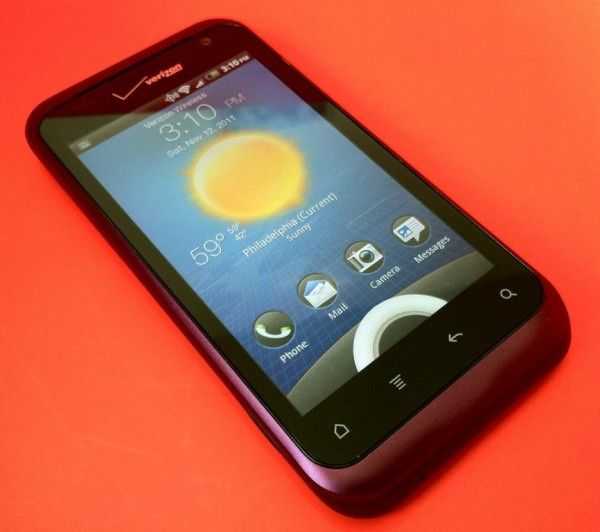
The HTC Rhyme is an attempt to incorporate a little feminine charm into a product that runs an operating system that is typically represented in products that are completely black, have sharp edges, and seem to shout, “THIS PHONE IS FOR GUYS!” Is a feminine touch enough to appeal to different demographics? Read on to find out.
Design
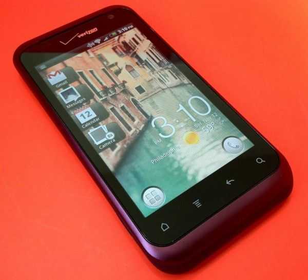
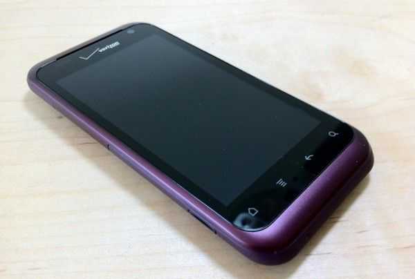
You’ve heard us say it before, and it’s about to be said again. HTC makes beautiful hardware. The Rhyme is no exception. Even though it is smooth and svelte, it’s also solid and lean. Materials feel high quality and the HTC Rhyme is nearly as thin as the iPhone 4S. The back of the phone is matte so you won’t often need to wipe it clean of fingerprints unlike some other glossy devices.
The back is indeed removable but the battery is not. Popping the trunk only offers you access to the MicroSD card slot which comes pre-installed with an 8GB card. The back casing of my review unit didn’t seem to go on quite right (you can see this in the first photo of the Hardware Tour), but I do believe this was a unit-specific issue.
The lock/power button could have a bit more click to it for my taste, but it is raised sufficiently so it’s easy to find. The volume-rocker actually has the opposite problem — it’s a bit flat so it can be hard to feel, but it clicks sufficiently.
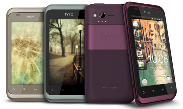
For me, the size of the phone is very nice. The 3.7″ screen of the HTC Rhyme sits in the hand easily and can be operated sufficiently with just one hand without a bunch of shuffling, as required by many of the 4″+ screens on the market. Aside from the color, I wouldn’t say that there is anything outwardly “feminine” about the HTC Rhyme. The shape and design otherwise seems to be a perfectly neutral. Slap a different color on it, and I think plenty of men would be just as happy to use the phone as women. In fact, I did see some press photos of a champagne and light blue version of the Rhyme, but I’ve not seen those colors actually available for sale anywhere:
Hardware Tour
Right: Volume rocker
Top: 3.5mm headphone jack, mic, lock/power button
Left: MicroUSB slot (covered)
Bottom: Nada
Display
The HTC Rhyme’s 3.7″ screen is pleasantly vibrant and crisp. It’s rocking an 800×480 resolution, which doesn’t put it up there with some of the other insanely pixel-dense devices on the market, but the 3.7″ screen doesn’t quite necessitate it.
Viewing angles are top notch all the way around the screen, and auto-brightness does a good job of keeping the display at appropriate levels. Black-levels are typical for an LCD display, which means they’re pretty awful compared to AMOLED displays. Unless you regularly watch high quality movies on your phone, or you’re a photo buff, you probably won’t notice the poor black-levels.
Software
The HTC Rhyme comes installed with Android 2.3.4; HTC hasn’t yet said whether or not the phone will receive an update to Ice Cream Sandwich.
On top of Android is HTC Sense, a set of custom graphics and widgets that run throughout the system. Some people have grown fond of HTC Sense, but I’m sure there are an equal number of people who, like me, would rather not use Sense. Unfortunately, Sense cannot be disabled.
While Sense does add some widgets and other functionality to the HTC Rhyme, the proprietary nature of the skin means that you’ll end up waiting longer for Android updates, and might miss out on features until HTC decides to update Sense. For instance, let’s say that you like to go into your contacts page to see a friend’s Facebook status updates. Hypothetical: All is working well until one day Facebook adds some new feature that allows people to add short audio clips to their status updates — because that feature didn’t exist when your version of Sense shipped, the phone has no idea how to handle it, thus you cannot access the content (or post your own audio clips from Sense’s proprietary Facebook integration).
With the pace of updates and changes to our various social networks and other online services, trying to use software that is built into the firmware of the phone is just a pain, especially given the update track record of various Android phone manufacturers. Another example: even with the latest HTC Sense twitter client (which doesn’t exist as an app on your home screen but can be launched from a widget — totally confusing) still doesn’t support lists. Lists were added to twitter back in 2009.
One of my biggest pet peeves for Android skins is when they waste space in the notification menu. When I pull down the notification menu, I want to be able to see as many of my notifications as possible, not scroll through them one by one. The more space wasted in the menu, the less notifications I can see without scrolling.
On the HTC Rhyme’s notification menu, there is the obligatory carrier branding at the very top which takes up at least one notification slot. Below that is a scrollable list of recently used applications which takes up at least one and a half notification slots; more annoying still because the user can pull up a list of recently used applications by simply holding the Home button. Why is redundant functionality wasting space in the notification menu? Further down, there are two tabs, one for notifications and one for “Quick Settings” which you can access to quickly toggle things like airplane mode, bluetooth, mobile hotspot, WiFi, and more (but annoyingly, not brightness). These tabs take up another half a notification slot, but at least they are useful.
After all that wasted space, you can only see four notifications instead of seven or so. I’d rather they trim all of this unnecessary fat from the notification menu and slap the Quick Settings options in the native recently-used applications menu (hold Home) which has ample free space.
Also, prepare to be badgered by your phone constantly as HTC Sense tries to link all of your contacts into unified contact cards. Any time you get a new Facebook, Twitter, or Email contact (and maybe a few other services), you’ll get a notification that HTC wants to link the service for that user to a contact card (this is done based on name matching apparently). So this way you can have one contact card for your friend John Smith and it’ll know what his Twitter and Facebook profiles are as well. The functionality would be appreciated by the power user, if implemented non-intrusively, but I can tell you that my father, brother, mother, sister, and the majority of my friends would absolutely not understand what all this “linking” business is, because HTC Sense does a terrible job of explaining exactly what it’s doing.
Even so, contact linking should happen in the background and be managed by the user when they see fit, rather than popping up a new notification every few days. As far as I’ve been able to find, there is no way to disable notifications about contact linking.
That’s not to say that Sense is all bad, there are a few nifty bits like the ability to see weather on your lock screen, but as far as I can tell, there is nothing added that couldn’t be added from the Android market; tying these ‘improvements’ to the firmware just brings along unnecessary disadvantages. The user should really not be locked into HTC Sense, the option to switch to vanilla Android would be a perfect compromise for both sides.
Performance
The HTC Rhyme’s 1GHz Qualcomm MSM8655 ought to be able to handle Android just fine, but Sense seems to bog the system down. List scrolling is surprisingly clunky and could definitely stand to be more smooth.
As with other HTC devices that I’ve tested, the HTC Rhyme’s Sense keyboard feels a bit bloated, but they have trimmed down on the space-wasting word suggestion pop-ups. More annoyingly, if you are a fast touchscreen typist, you can tap fast enough that the haptic feedback (vibration) won’t be able to keep up. From time to time you’ll get one vibration for two taps and it feels as though the keyboard isn’t keeping up when it actually is.
Minecraft Pocket Edition plays on the HTC Rhyme on fancy settings with no issues and no apparent lag.
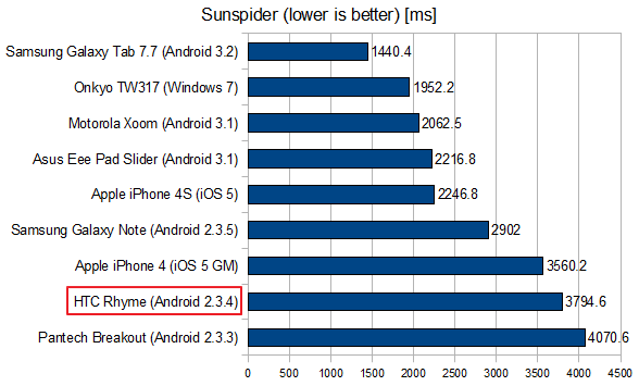
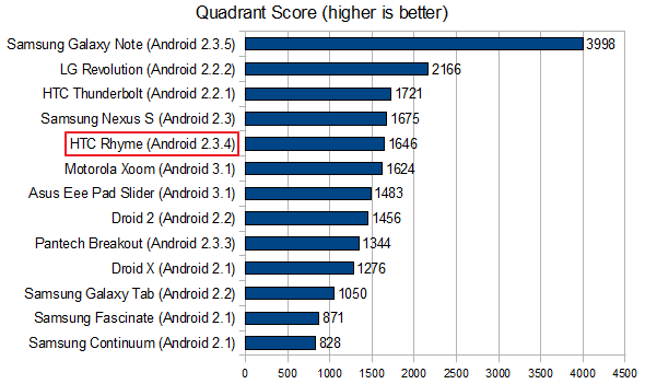
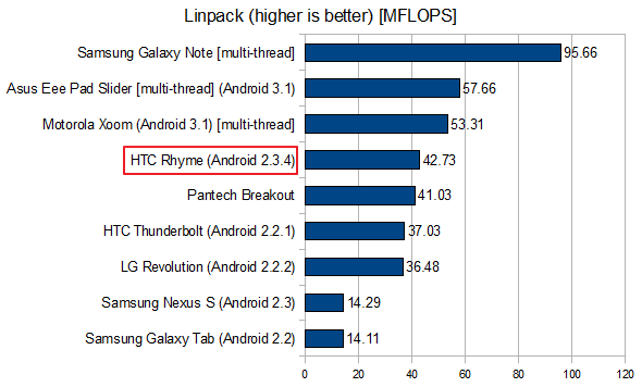
I’ve run the usual tests, and while the HTC Rhyme doesn’t appear to lag drastically behind similarly speced phones, I can tell you that it feels much slower because of how clunky Sense is. Between the browser and list scrolling (two things you are sure to be doing a lot of on a smartphone), there is much improvement to be desired.
Charm
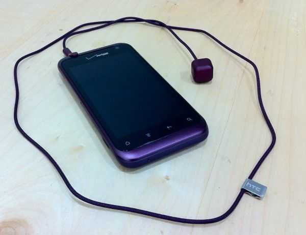
The ‘Charm’ that comes included with the HTC Rhyme is actually a very unique accessory. It is a little cube with an LED inside that lights up to give you alerts. The cube is about 1cm squared, plugs into the headphone jack, and glows purple.
Apparently, HTC sees women (or men, I suppose) dangling the charm out of their purse or handbag so that when their phone is buried deep inside they won’t miss calls or other events. While I don’t personally fancy a tote bag, I’ve spoken to two friends about the idea and they said they could absolutely see it being useful when it comes to wearing dresses without pockets and jeans that as so tight that they may as well not even have any.
Really neat idea, kudos to HTC for that, but the execution is poor. The only events that will make the cube glow are messages (SMS), incoming calls, and missed calls. Beyond this, the Charm may as well not exist.
Why they didn’t simply make the Charm an extension of the HTC Rhyme’s built-in notification LED, which can respond to a wider array of events (and is extendable), is beyond me. For this to be a seriously useful accessory, HTC needs to make the Charm’s triggers much more customizable. And why not offer some different options for how the Charm glows so that you can tell a missed phone call from a text message? Actually, saying that the charm ‘glows’ is misleading, it’s more of a sharp flash which is supposed to get your attention, but might get the attention of others as well.
Dock
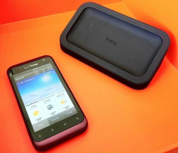
Also standard with the HTC Rhyme is a compact black dock. There are no ports on it except for a microUSB plug so that you can plug the unit into a charger. Once plugged in, you can drop in the HTC Rhyme to connect to the docks speakers, and there is some simple dock based functionality.
The dock will charge the phone thanks to three contact points that match up with those little circles on the back of the phone. The HTC Rhyme is held into the dock with magnets, but the process of actually putting the phone into the dock could be more satisfying. Instead of the magnets grabbing the phone and pulling it right into place, you have to put the phone down then slide it around to get it to fit in. If used as a simple charging dock at your bedside, the dock is a thoughtful inclusion.
However, HTC missed an opportunity by not kicking the dock up to the next level. First, the speakers are extremely weak. They aren’t much better than the HTC Rhyme’s built-in speakers; they are just a bit louder. If your only usage is an alarm, this shouldn’t be an issue, but for anyone who likes to listen to music as they sleep, or perhaps wake up to a podcast in the morning, a bit more oomph would have been appreciated.
Then there’s the actual software part of the dock’s functionality. When you put the HTC Rhyme in place, the dock will be detected, and you’ll get a simple ‘dock mode’, but the actual usefulness of the functions provided therein is very weak. You can see more detail about this in the video at the end of the review (start at 14:58 for dock functionality).
Camera
According to HTC, the 5MP camera on the HTC Rhyme is “best in class”; to some extent, I’m inclined to agree. I was impressed with its low-light performance. Most smartphone cameras tend to be lacking in the low-light-sensitivity department, so it is nice to see the HTC Rhyme perform about as well as the iPhone 4:
Macro shots were also quite impressive:
Despite the decent appearance of these photos, there’s an odd grainess to them as soon as you get up close (click to enlarge):
The grain is likely the result of aggressive photo optimization on the part of the phone. When snapping photos with the HTC Rhyme, you’ll notice that ‘what you see is what you get’. As soon as you press the capture button, the image will be captured exactly as it is on the screen. For a device that is destined to be used primarily as a point-and-shoot, this is exactly what you want, and it works well. For quick photos for social networks (even in somewhat low light), the HTC Rhyme’s camera should perform very well. However, due to the graininess, print quality photos these are not.
By default, the HTC Rhyme snaps photos with a 16:9 aspect ratio which is a bit weird considering that the standard is pretty much 4:3. Weirder still, this shape is achieved by reducing the resolution from 2592×1952 (4:3) to 2592×1552 (16:9). Why the default photos would be set to less than maximum resolution and a non-standard shape is, once again, beyond me.
Headphones
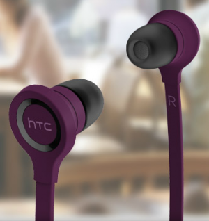
The HTC Rhyme comes with a pair of in-ear headphones that are designed to look like they might be of a similar quality to some other name-brand in-ear headphones (more on that in just a moment). The headphones have an inline control on their flat cable that lets you pause, fast forward, rewind, and change tracks. Despite the + and – icon on the buttons, I was unable to change the volume from the inline control.
These are truly in-ear headphones. Be sure to understand the difference between in-ear and earbud headphones. Earbud headphones (like those included with the iPhone) rest in the pinna (external) part of your ear. In-ear headphones stay in your ear by being crammed into your ear canal. Some people don’t seem to have issue with such headphones. Personally, I’ve never found in-ear headphones to be comfortable, nor do they seem to stay in my ears very well — with iPhone earbuds, I can quite literally dangle an attached iPhone from my ears with the headphones — with the headphones included with the HTC Rhyme, it seems like the slightest tug on the cord will pull the headphones free.
Three sizes of ear pieces are included with the headphones and I had to switch to the smallest pair get them to stay without falling out all together. Once the headphones are in, it seems hard to get them to both be in your ear an equal amount, which causes annoying uneven pressure on your ears. Just imagine stuffing ear plugs into your ears, it’s just like that.
In terms of quality, these are some of the worst headphones I’ve used. Don’t get me wrong, there are probably plenty of other horrible headphones out there that cost $0.99 to manufacturer that are far worse, but if we’re talking about headphones that are actually intended to be used for honest to goodness music listening, this pair is pretty bad. One of the problems with small headphones (earbuds and in-ear) is that it’s hard to create bass with such small speakers. HTC seems to have completely overcompensated for this — the headphones are actually quite bassy, but this comes at the cost of quality.
To my ears, it sounds like much of the midtones are unfaithfully recreated, and are instead throw into the bass spectrum. You might be able to toy with an equalizer to get them to sound better, but it seems like all the sounds are getting lumped toward the treble or bass end of the tonal spectrum, with little fidelity on the remaining mid tones. I found the same issue through both my computer and the HTC Rhyme itself. Even though Apple earbuds have significantly less bass, I would prefer them over the Rhyme’s headphones because they do a better job of representing all of the audio information. If you aren’t an audio person, let me use a metaphor: this is like the difference between being able to see your favorite painting with very vivid reds and violets, but all the colors in between are black and white, or being able to see the painting with all of the colors in tact, even if slightly less vibrant.
Conclusion
As seems to be the case with all HTC phones, the HTC Rhyme has impressive build-quality. The phone is sturdy and sleek. Unfortunately, coloring a phone purple and including a few neat but flawed accessories does not cut it if HTC is really hoping to attract a more feminine demographic. The issue actually lies less with the color or the accessories, but more with the phone’s software.
The changes HTC has made with Sense don’t make the phone any easier to use — just different. Not to say that there aren’t tech savvy women out there, but I think we can agree that they are less common than tech savvy men. If HTC really wants to appeal to that demographic, the phone is going to need to offer a smoother and easier user experience — something non-techies from both genders would benefit from.









I do not agree with you. I love the new Sense.
It’s a happy day to be able to read an theorem that is so clearly research and written. I cyst very much enjoyed this information content. Your layout is excellent. I will come back again.
LOL at the Charm: “the only events that will make the cube glow are messages (SMS), incoming calls, and missed calls. Beyond this, the Charm may as well not exist.”
It must be a female issue, so annoying to have your phone in the bottom of you bag, and not hear it, or see any flashes, I don’t own this phone, but certainly the Charm seems to work towards a problem no other mobile is tackling.
I was thinking earlier today that so many manufacturers focus their NPD on men, with the increase in female disposable income it will be interesting to see how manufacturer change their game. Although I suspect they will still launch new products with male colour palet rather than gender neutral.
Liked your article,
sometimes my phone takes pics by itself like earlier today it took a pic of the screensaver and i don’t know how it did that. do you know how?
Hi,
My wife just got this phone and loves it. However, while in Dock Mode the ringer volume is crazy loud. Any idea’s on how to make it silent or lower the volume while in Dock Mode?
I have tried turning the volume down from the side buttons, change the sound profile to silent in Settings, and un-checking the Pocket Mode in Settings.
Thanks!
I have had these headphones sitting at my desk at work for back up. As soon as I exchanged for smaller bud attachments, they looked flat out uncomfortable. The feeling of cramming these in my ear canal was terrible.
Terrible.
While its on the docking station theres some options, one of your options should be for volume, if not check the settings for dock!