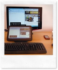
 I’ve read a lot of negative press about the Windows 8 user experience recently which seems to focus on a ‘problem’ created by having two user interfaces that will confuse users. I just don’t see that issue. Sure, there will be some new things to learn, every new system has a learning curve, but I don’t see huge barriers in Windows 8.
Today I’m working on a Windows 8 Tablet. I’m working, which means I’ve got a keyboard, a mouse and a large screen in front of me.
Windows booted quickly on this Atom-based tablet PC (ExoPC) and because I just wanted to do some Chrome work and write this post I went straight to the desktop by clicking ‘Desktop.’ It works like any laptop or desktop.
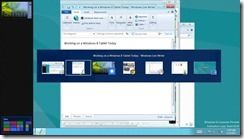
I’ve been in ‘desktop’ all the time I’ve had my bum on my seat (apart from taking a few images) and as you would expect, Metro is not causing me any problems. I can switch to it very easily by dragging the mouse to the top left, bottom left corner or pressing the Windows key, Alt-Tab and other methods that didn’t take me too long to work out. If you want to use Windows 8 like you used Windows 7 there’s no issue.
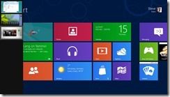
If you end up in Metro through inquisitiveness or accident you can either hit the ESC or Windows key to toggle to the last application, Alt-Tab to see a list of running programs, use the programs list accessed from pointing to the top-left corner of the screen or I can hit that big icon in front of me that says ‘Desktop.’
On my keyboard I even have an Alt-Tab button that looks like a set of Windows, a media button that starts Media Player (in the Desktop) or I can even just start typing “desktop inch and I’ll be shown the shortcut to hit. If in doubt, press the Windows key and start typing. Word, Desktop, Mail, Photo, Music, Help. You can even type the name of a file or a setting. They all work! If you don’t have a keyboard, swipe from right and press the search button.
How simple do people actually need this to be to be convinced that if you want the Desktop it’s there and if you want to do stuff when you don’t have a keyboard, there’s a new interface that can really help. You can get going on day 1, and start discovering after you’ve read your email!
Windows 8 is not a Fischer Price toy or a gaming console, it’s a rich operating system that can help you get things done like few other operating systems can, either with keyboard and mouse or with a finger. Some people may take a few minutes to understand this idea but isn’t that just normal, and worth the time, for a rich operating system?




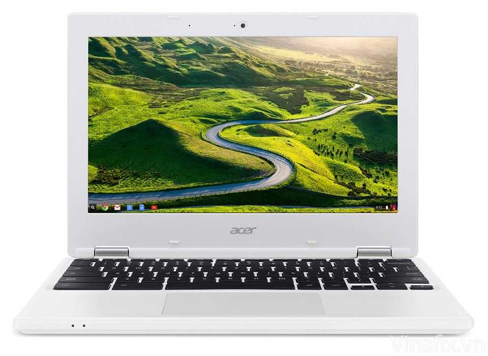
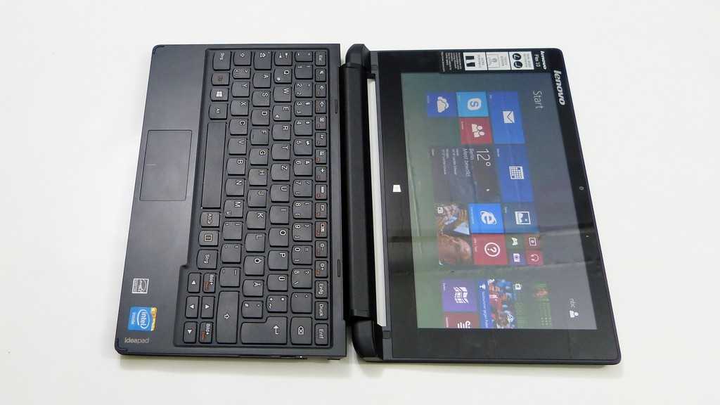
(Below, wherever I used quotes “”, it probably mean I want to quote what must be going through user’s minds.)
First hour of usage:
– Many things are invisible (all the border-activated bars, hot corners, able to start typing on metro-start), and people won’t know it’s there short of someone/reading some article or youtube explaining it. Un-expecting users might accidentally chance-upon these bars/corners, which briefly flashed up on the screen, and the user will think “Oops, what was that!? What did I do??”
– The Metro start screen bears no resemblance to the start menu, and unexpectedly takes up the full screen. Upon pressing the start button on keyboard, user will think “What did I do to launch this fullscreen app?? Go away! I want my start menu.” They try again and eventually found out THAT, was now the start menu. “Too many things going on there, the tiles are using the screen space so inefficiently, too disorganized, and where is… oh wait, WHAT was it I was looking for!?” (All the while, there’s nothing to hint the user can actually start typing in the program name while he still remembered.)
– “How do I close this App? It’s still running, perhaps taking up data usage, definitely hogging CPU/Ram/Power!”
– “Now the start button is gone, where is the shutdown button!?” Despite 20 years of using Windows, I would NOT have guessed it was under the “Settings” charm, which must have been the most feared place for ordinary users.
After Long-term usage:
– Win 8 requires the USER to remember even more things: There’s bars hidden here in this app, but not in that app; This app is on desktop, and that app is on metro; etc.
– With Start menu, you don’t have to remember the name of that program you installed 2 months ago, the Start menu is mostly chronological, you’ll know it when you see the folder name. But metro-start? It’s got a bazillion colorful tiles now, and I’ll have to remember at least part of the name to find that program. IE. It requires YOU, the user to remember program names. Just horrible.
– “My colleague can do metro-snap, but I can’t. Never knew why.” Of course it was because of resolution requirement.
– “I don’t want this app to run full-screen”
Conclusion, Windows 8 will really separate the PROs from the Average-skilled user, who has other things to remember, resists keyboard shortcuts, and likes their computers to remind them what they can do/click.
I’m afraid that’s “user-friendliness” going out the window (pun intended) and will drive many people away to seek Apple’s OS.
A majority of those users won’t be driven away to Apple OS as it’s just too expensive for your average user.
Chippy,
Do yourself a favor and read the Human Interface Guidelines for Osx.
https://developer.apple.com/library/mac/#documentation/UserExperience/Conceptual/AppleHIGuidelines/HIPrinciples/HIPrinciples.html#//apple_ref/doc/uid/TP30000353-TP6
This metro business is basically orthogonal to these very thoughtful HIG.
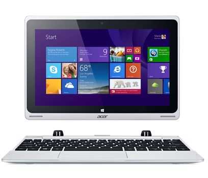
Using win8 on my acer w500 is really easy even with an external monitor and desktop extended (not duplicated) :
You can view some windows on the monitor while using metro oriented software on the touchscreen ! You can move the mouse on the monitor, or on the touchscreen if needed. This works very intuitively and without problem
You can also disconnect the monitor to use the tablet on the sofa, and connect back later
Very very clean concept so far
I’m just glad someone is making a full featured “mobile OS” because after using iOS/Android for any length of time they are absolutely worthless for long term use.
I can use my PC all-day every-day, I run out of stuff to do in iOS/Android after literally a couple minutes. Typing sucks, watching videos suck, games suck, & so on. This new era of tablet devices are the worse compromise of everything, as every single thing they do can be done better on a different device (PC, TV, game console).
To be fair, I think W8 ARM will suck just as bad. The only thing saving W8 is it’s legacy functionality driven apps & Intel.
It’s humorous to see all of the Apple-leaning general tech media (TWIT, TheVerge, Revison3, & so many more) constantly praise the iPad, yet in every vidcast they always have their laptops in front of them instead of iPads. Many of them, somewhat accidentally, admitted they don’t know why they keep buy them since they barely use them (that’s the Apple magic).
As someone who’s wanted the vertical tablet form factor to take off for the last decade now, what tablets have ultimately proven to me is how much I love a real desktop OS.
@chippy : you are far to geeky in using os’ses to a fair measure for the almost 99% of common usres of pc’s who still struggle even with things lke windows if they do not work as they are used from their own pc’s.
this said, every hidden function is thus a nightmare for these users. we have now for almost 40 years the memnomics of a right sided drown dropping menu established and things are working well this way. why must the fucking crazy it techies industry all the time try to invent the wheel time and again? there is no reason for this. this job is done long time ago. actually the whole finger touch thing is a more than 1000 years back stepping from the invention of the writing pen.
Chippy may be geeky but so are most of the people commenting here and most complaints of Windows 8 are from so called geeks.
After all, this is still only a preview version that pretty much only geeks are interested in checking out right now and there are still hundreds of changes left for MS to do before they release the final version.
Opinions will of course vary but anything more but cautionary disapproval would be over reacting at this point. Lack of familiarity and the incomplete nature of previews leaves too limited a understanding of what the final product will actually be like.
While actual lay persons would have to learn how the OS works whether it’s Windows 7, or Windows 8, or OSX, etc. So long as no actual functionality has been removed then we’ve yet to see whether MS solution is good enough or not yet.
The idea of complete customization for example was one of the things MS considered from the beginning and they’ve yet to state that won’t be the case. So it remains to be seen whether the final version will have enough customization options to satisfy everyone or not and we can’t tell that from a preview version.
Additionally, the preview version still has things like developers code that makes it much more bloated than the final version will be and thus prevents us from yet knowing how efficient the OS will be, but it’s suppose to be more efficient than Windows 7. After all, most mobile devices have yet to exceed the performance range of even Intel ATOM netbooks. So Windows 8 will have to be very efficient to run well on those devices.
There are also other new features and capabilities that MS is going to try to integrate into Windows 8 that the preview version doesn’t yet include.
So let’s not solidify any opinions yet and remember one of the purposes of releasing early versions of the OS is to get potential consumer feedback…
you should also not forget the main target of Windows 8 : tablet PC ! because ms was late on this market ;)
now i’m running win8 on my Windows tablet, i’ve to admit that i won’t go back to Windows 7 anymore ! the UI is sometimes difficult to learn but don’t forget that Windows is running on an actual computer, not a ‘toy’ like an ipad or an android ;) you’ve same possibilities with win8 on a tablet than your desktop computer and i think ms have some problems to deal with all of these features. anyway win8 on a tablet is at now the best way to use it.
for desktop computers without touchscreens, and when you dock the tablet on your desk, there are certainly some difficulties to work with win8… but after some days of use, i think everyone will manage to use it…with one word : simplify the way we work with the OS
metro interface is ridicuolus ans that’s all about that.
HTC-phone fans shouldnt have influence over system made for WORK.