 One of the main aims of the Ultrabook is to reduce component count. High integration of silicon, removal of ‘sockets’, reductions in ports and simplification of the power subsystem are areas that Intel and its partners will be working hard to advance in the next 12 months. By reducing component count you make the Ultrabook simpler and cheaper to design and manufacturer. You also increase reliability. For the end user, it means smaller, thinner designs are possible too and there’s no question that we all like ‘thin.’
The current Ultrabook design guidelines require 13.3” screen products to be no more than 18mm thick. An extra 2mm are allowed for touch enabled devices. In the future, Intel think, at least in theory, that 12mm is possible. It will require advanced design but the technology is almost available. One wonders if Apple may be going along this route for the new MBA. They are one of the few companies that have the money to design something like this and then sell it the premium price it will need.
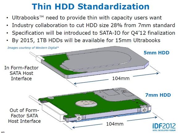
Only the best-in-class components can be used for ultra-thin laptops and these included stamped metal chassis’, lithium polymer batteries and the next generation ultra-thin screens. SSD’s, memory, CPU, GPU and even hard drives may need to be glued or soldered directly onto the chassis or motherboard and thermal design would be a big challenge. You wouldn’t have any space for optical drives, VGA or RJ45 ports although you might be able to squeeze a USB port or two into the design. One of the biggest challenges could be the only electro-mechanical left device in many ultrabooks – the keyboard. New technology could be needed here because the traditional scissor switch method may have reached its limit in terms of key travel and feedback. New mechanical switch technologies will need to be developed. Maybe this is an area where the $300m Ultrabook fund will help. Intel are also challenging their partners to work on ‘in-cell’ touch sensors in screens for ‘one glass solution’ premium screens at 0.7mm thick. 5mm hard drives could be the solution for large storage requirements. 1TB of storage is already expected on a 7mm thick drive in 2015.
Looking at the technology, one wonders whether if 12mm is the limit. Until a screen can be printed with circuitry, solar receptors, touch, camera and gesture support, I don’t see how the design can get much smaller. Even then, it will require the user to be happy with little mechanical feedback from keyboards. The mind boggles!
Don’t expect 12mm Ultrabooks (or MacBook Air) in 2012 or even early 2013 as we’re only at 16mm today (Toshiba Z830) but once the design challenges have been overcome, 12mm Z-height could be the ultimate laptop challenge.
Information via Intel IDF presentation. Slides for all IDF 2012 Beijing presentations are available here.





I downloaded & read this PDF last night before I sleep, and keyboard design ideas keeps churning all night!
They’re talking about “z-height” (ie thickness) when the lid is closed. It got me thinking, the thickness of the keyboard can be attributed to two elements: i.) “Sum of thickness of components” & ii.) “Acceptable key travel” element.
Obviously the “key travel” element is not needed when the lid is closed, but current keyboard design has always allowed this element to occupy thickness (~2-3mm) even so.
So I’m thinking of entire grid of key caps on the keyboard that “float up” when required (such as when the lid is open). The extra z-height gained in the process is used for “key travel”. When not required, the underlying tray/frame sinks all keys by 2-3 mm.
An interesting thought might be, with “island” style keyboards, the sinked keys may be flush with the rest of the keyboard surface, and a flat surface like that may have some potential, such as using it like a giant trackpad, or a somewhat usable surface for pico-projecting image on top… It may also be possible to tuck part of the keyboard under the palm-rest, although I don’t know what advantage that might bring.
If i’m understanding you, the key caps wold be connected, somehow, to the lid and when the lid closed, the caps drop away saving 1 mm. The mechanics for this could be a problem. You can’t let the screen push the keys down either (it would pop up again)
If you look at the Z835, a 16mm design, you’ll see that they’ve sunken the keyboard by 1mm, the travel of the key.
I can’t imagine that you can get any mechanics to drop down the keycaps automatically without having a complex design and a thicker keyboard module.
I think we’ve reached close to the limit on keyboards.
steve how about using airflow to lift up keys or some kind of magnatic push :-) ok i am fantacizing i should go to sleep lol
The only thing I can think of is a new type of haptic keyboard combined with finger hover and (very ) intelligent software correction.
Let’s keep these thoughts going Robert. All good. I’m hoping designers are reading our thoughts and comments!
Even if you could somehow get the keys all flush with the space around them, that isn’t going to make for either a good keyboard or a good trackpad like surface.
When flat, the surface would still be broken by the horizontal gaps between the keys.
As a keyboard, the ability to turn it into a flat surface removes the ability to have dimples on the keys which are vital to making a usable keyboard. Also, good tracking surface is smooth and easy to move a finger over, a keyboard surface should be able to easily hold the user’s finger so it doesn’t slip off the key. The surface of the key is especially important since we are forgoing dimples.
If you still like the idea, I think the best way to achieve something like that without adding thickness would not be to make a keyboard assembly that lowers the keys, but rather raises the area surrounding it.
Hello Clio, regards the keyboard that pops up upon use and flattens back when closed, i was thinking something similar this morning, only you fleshed it out with more skill than i could have:-)
Instead of making keyboards thinner for the sake of making thinner ultrabooks, I would prefer making keyboards thin for the sake of fitting more comfortable keyboards in the same thickness.
The number of acceptable ultrabook keyboards can be counted on one hand. There are none that come anywhere close to good.
I wonder how many mm’s Lenovo needs to shave off of the X1 keyboard to fit it in the U300s.
Get rid of the touch pad, palm rest, & tactile keyboard.
Replace with a capacitive keyboard that double’s as a touch area for navigation. This would also allow ultrabooks to become significantly smaller without the wasteful touch pad/palm rest area.
These devices will NEVER get as thin as you want as long as there are any moving parts.
Unfortunately I don’t have the opportunity to meet the Z835 “in person”… But I don’t mean sinking the entire base-tray of the keyboard (which doesn’t help make it thinner because it kept the key-travel all the time), I mean only sinking the button caps at times when key-travel is not needed.
A piece of jig-saw to the mechanics of floating or sinking the keys… the “scissor-switch” under each key-cap consists of 2 crossed legs with the intersect point fixed.
http://www.google.com.hk/imgres?q=keyboard+scissor+switch&start=90&um=1&hl=zh-TW&sa=N&tbm=isch&tbnid=3c3QfWCItjbaDM:&imgrefurl=http://techcrunch.com/2012/02/23/apple-patent-application-details-ultra-flat-keyboard/&docid=33i5lKam_48-xM&imgurl=http://tctechcrunch2011.files.wordpress.com/2012/02/scissor.png%253Fw%253D640&w=259&h=171&ei=dbuHT9a8FK6TiAfiv7izCQ&zoom=1&iact=hc&vpx=988&vpy=118&dur=6719&hovh=136&hovw=207&tx=159&ty=131&sig=102027545845188911037&page=5&tbnh=110&tbnw=167&ndsp=24&ved=1t:429,r:11,s:90,i:28&biw=1280&bih=592
The picture above showed both legs are allowed to slide along the base tray, but in practice, most implementations fix one leg with a circle hole (below reffered as “circular leg”), and only allow the other leg to slide within an elliptical hole (“elliptical leg”).
What we can do to enable floating/sinking the key-caps is to divide the keyboard base-tray into two interlocking “F”-shapes (or “E” shapes if you like), and leave room to allow the 2 “F”-shapes to slide closer/further against each other. We can then fix each “elliptical leg” of the scissor-switch for all key-caps onto one “F”-shape, and the “circular leg” onto the other “F”-shape. As a result, when the 2 “F”-shapes slides apart, the key-caps sink; when they slide closer together, the key-caps floats.
Lastly, we just need a mechanism to control the sliding movement of one of the “F”-shapes. The “F”-shape hosting the “elliptical legs” can be fixed, the sliding should happen to the “F”-shape hosting the “circular legs”.
One (crude) implementation is to put a spring between the two “F”-shapes such that the key-caps are “default-raised” (This spring maight need to be relatively stiff to give a stable typing experience) Then, as the screen hinge closes, mechanically pull the “F”-shapes apart to lower the key-caps (can be achieved with wedge shapes/gear tooth/magnets/etc).
Having said all these, that’s far from the whole picture. The silicone dome and the electrical contact underneath still need some thinking. But I think it’s a start.
I’m trying to avoid using battery power for the mechanisms here, hence they’re all mechanic.
Nothing really all that new here. The 2-year-old Sony Vaio X was a 14mm laptop at its thickest point. Granted, it was a cripled Intel Atom CPU, but still…
On the keyoard discussion why not keep it simple, touch screen keyboard existing technology, invest of making it UX freindly (touch responsiveness, etc). I wish I could patent my toughts wait but the technology already exist with our sister groups in UMG and NTG I suppose.
For a device that is supposed to be a notebook form factor, not only no, but HELL NO.
You want a virtual keyboard, buy a tablet/slate.
I personally despise virtual keyboards and would NOT want to see them become the standard for Ultrabooks.