The coding teams competing for $10000 have just completed week 2 of the Ultimate Coder Ultrabook Challenge and have all posted their updates. I’ve also received my developer preview Ultrabook with touch and sensors! Read my thoughts about the competition at this stage and view the video below.
Lee Bamber of The Game Creators has a detailed post this week which goes into visual design and coding. He’s already worked out how he’s going to use touch and some of the sensors in his messaging app and reveals some details about Always On Notifications. “The idea is that when you close your Ultrabook, the app runs in low-power mode, and if someone sends you a new Love Hearts message, the Ultrabook will ‘ping’ you, even when closed. You can then open it up, and see the message running in the app.” I need to look a bit further into this – I think it’s part of the Intel Smart Connect feature. Lee, do you have more details? I’m looking forward to seeing this in action. Read Lee’s week 2 update here.
 George and Suresh of the Blue Innovations team have no less than 10 posts up this week, making us judges work hard but doing the right thing and exposing their design choices, methods, tools, thoughts and problems. Take a look at the excellent video showing over 250 design element choices. Designing the app first from a UI perspective is the right thing to do in my opinion. When I was hacking C code in the 90’s I always skimped on this part. I wrote a live BPM analyser for a Commodore Amiga and I spent way to many hours hacking in UI ideas as I went along. Bzzzt!
George and Suresh talk about how version 2 of Money Bags is a complete re-write, how they created a fluid size-adapting UI (great details in the post,) how the app uses both touch and mouse, the use of new UI ideas, cloud sync and even a nod to eco-friendlyness. They’ve even got an app preview ready which I’ll be taking a look at when they’e activated it in a few hours. Overall, an impressive and useful set of information from Blue Innovations. One thing I’m not sure about at the moment is touch-enabled applications in the standard desktop mode. Or have I missed something here? Is MoneyBags a ‘Metro’ application? I’ll find out when I test later. Read the week 2 summary here.
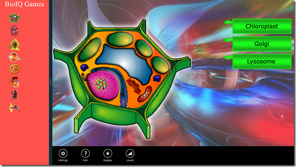
Clef Software’s Shailesh is clear that his application, BioIQ, is going to be a Metro app but also tells us that a Metro app (yes we’re still calling it Metro, sorry, Metro) will run in desktop mode. The week 2 action from this team seems to be centered around UI design choices and you can read about touch and orientation choices. The actual development has already started though and there are some screenshots available. The one shown above highlights the app bar and Shailesh includes some example code showing how that is implemented. I like the focus on touch and Metro in this app but there’s no use of the sensors that I can see and this is something I think developers want to know about. Maybe sensors aren’t a good fit for this app, in which case, maybe this app is not showcasing the Ultrabook to its full capabilities. You can read the week 2 update here.
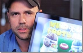 Not much written detail from Soma games this week. Come on John, the devs want to know how you did it! They do have a video and demo available though so are progressing quickly. In the video they talk about some of the improvements that have been made to the core game and the demo looks fluid and fun. Soma Games are doing parallel development on an iPad version so listen out for comments about the differences. I spotted a wobbly touchscreen in the video which made me think about long-term playability. The laptop-style hardware being used here isn’t optimal but do remember that convertible / removable screen Ultrabooks will have different ergonomics. The app is one of the most existing of the bunch for me but I’ll be more impressed if Soma reveal some development details that everyone can learn from. The Soma Games Week 2 update is here.
Sagar of the Althea team starts of with a bit of a rant about Metro apps not being able to access some special features of the Ultrabook. Rightly so although the compaint about AOAC not being available is invalid I believe as current Ultrabooks don’t conform to the AOAC requirements. Stay tuned to information on Haswell for a solution there (IMO.) This is important information for everyone though and I hope Intel and Microsoft take note. Althea will be testing the ambient light sensor for their video playback app which, as I sit out here in a bright garden, is something I wouldn’t mind having as the clouds go past! They’re promising a design ‘cut’ next week so expect to see some screenshots and maybe even a demo video. The Althea Week 2 post is available here.
Andreas is describing a first-time Metro user experience in his post this week and talks about his experience with demo code and links to some good resources. He’s working with HTML5 and Javascript in this app and I get the feeling it’s a simpler undertaking than the other projects in the competition. This could be good for HTML5 / Win 8 first-timers to watch. No mention of touch or sensors from Andreas so I hope he covers that in the Week 3 post. The Week 2 post is available here.
This weeks posts have provided us with some interesting insights into the methods used by the development teams. We’re seeing how important UI design is and getting information on the Windows Metro application creation process. Everyone seems to be progressing well although we all know that 80% of the time can often be spent on the last 20% of the product. A gold-star goes out from me to the Blue Innovations team for the huge amount of useful information they’ve provided. Thanks to all the teams for their updates and I look forward to Week 3 and of course, meeting you all at IDF next month where you can buy me beer!
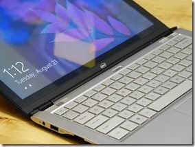
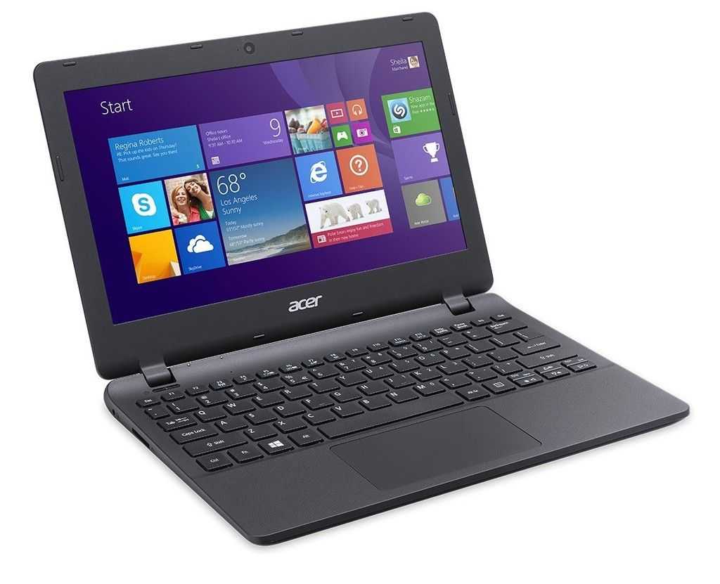
Preview of the Ultimate Coder Ultrabook hardware.
I received the same Ultrabook that the developers have yesterday and took the time to create a video about it. You can check it out below.
Full disclosure – We are being compensated for advertising related to the Ultimate Coder Ultrabook Challenge and to attend an Intel event. We have committed to posting at least once per week on this subject and judging the final applications. All posts are 100% written and edited by Ultrabooknews



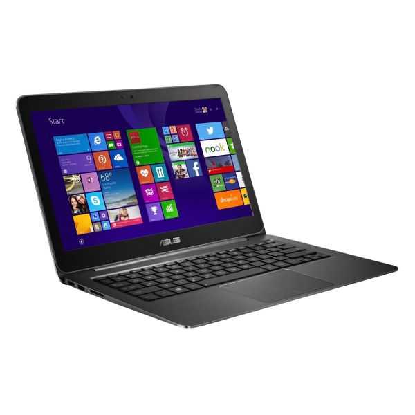
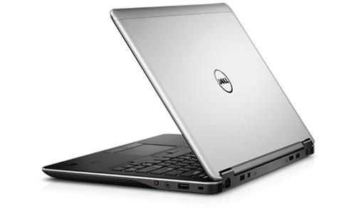

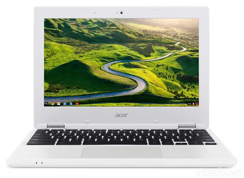
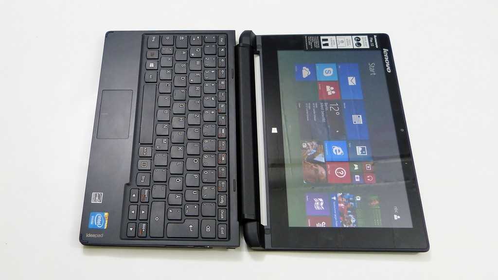
I like how George and Suresh aren’t forgetting non-touchscreen input and they’re striving for a UI that doesn’t force you to use either the touchscreen or mouse to get a better experience.
I know this challenge is about what new things a notebook app CAN do with these different input methods but it’s nice that some devs are acknowledging the reality of a non-standardized platform. They can choose to program for the lowest common denominator in order to get a larger user base or to the few who have touchscreens, GPS, accelerometers, constant internet access (WLAN and WWAN), etc.
Of course, they can go with what George and Suresh are doing and take the middle ground (and probably more work) by ensuring the same ease of control with either a mouse or touchscreen but they may forgo the use of other input. I remember reading somewhere about Microsoft saying that devs should design their UI with a touch first mentality and they’ll work out the rest. This was around when Metro was first introduced. I wonder how that will pan out.