Is it too early to be worrying about Windows 10 and how the changes will affect touch and mobile users? I don’t think so. The test and feedback program starts today (October 1st, see preview.windows.com) and as a touch-focused user that was very happy with the clear split between sandboxed, touch-friendly RT apps with sharing and always-on capability and the desktop as my productive, mains-powered space i’m now looking at a mash-up that could be more confusing than ever. In my eyes Microsoft has re-positioned touch and mobility back down the list of priorities and put a big question-mark over the future of touch-focused apps on Windows PCs.
A summary of the announcements from yesterday can be found in my summary here but in essence, all you need to know is that Microsoft are bringing back the single-desktop environment and allowing the RT apps (to be known as Universal apps) to float into it. Think about this…
Why develop Universal apps?
Skype will have a touch-friendly cut-down application and a desktop application that can run side-by-side on the desktop. One will be sandboxed and allowed to run when a PC is in Connected Standby/InstantGo and the other is the fully featured desktop app. Where will Skype go from here? Facebook will be fun too. You can choose the RT app, the IE desktop web site or the IE Metro web site. Evernote will have an app, a desktop app and a browser app. Not only is this confusing for users but it also brings up the question about future development of Universal apps. Why develop an RT/Universal app that will sit on a desktop and compete with the other app you’ve written?
Microsoft are going to have to promote Universal apps hard if they want the Store to work on Windows 10 PCs. The only place they can really start today is by encouraging developers to make Windows Phone apps (which will also be known as Windows 10) that are Universal apps that can run on the desktop but will those developers bother to consider a 2K screen layout? Microsoft will have to prove to developers that the economy for Windows Universal application development is going to improve drastically before the developers make any moves.
Universal apps ready for the desktop limelight?
Will floating RT apps onto the desktop make them more popular? If so, the economy for Universal apps changes for the better but if not, if users discover cut-down versions of their favorite apps and games, they might ignore Universal apps altogether even if they do bring better security, better sharing, better battery life and better touch user interfaces. Universal apps may not be fit for putting in front of desktop users. If they’re not good enough they’ll suffer, regardless of security advantages. In terms of software development for Windows, the financial planning just got a little harder. It’s very possible that Universal apps become 100% reliant on the Windows 10 phone market.
Microsoft’s message to developers today is nothing more than this: “The most important thing you should take from today’s announcements is that the best way to prepare for Windows 10 is to keep building universal Windows apps.” [Source.]
Touch second?
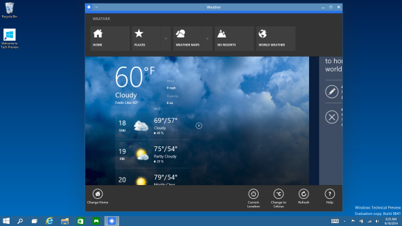
In the launch event yesterday Microsoft spoke primarily about desktop and business users. Microsoft did, however, mention a feature called Continuum. It’s not yet built into the preview version of Windows 10 and all it looks like is an auto-sensing UI feature. If you’ve got touch you’ll get a full-screen start page as you do now. Applications started from that screen will then float onto the desktop where you’ve got keyboard and mouse-focused controls. Is that a continuum, or a hybrid?
Snapping Windows together will definitely become a hybrid. Do I really want an old, non PPI sensing Windows dekstop app floating next to the Skype Universal application?
“We’re not talking about one UI to rule them all – we’re talking about one product family, with a tailored experience for each device.” [Source]
Continuum is where touch users will need to focus over the next 6-8 months but I suspect the first previews won’t really tell us much about the feature.
Windows 10 feedback
My first feedback to Microsoft would be this: Allow me to turn off desktop apps. Allow me to go into a Universal applications mode where the DAM (desktop activity moderator – as found on Windows systems with Connected Standby) hides and pauses all desktop activity leaving me with an efficient, secure, sandboxed, touch-friendly selection of apps. I don’t want a RT-style build with a desktop that is completely disabled though. I think the education market would appreciate this too – Chrome OS owes part of its success to sandboxing.
Respect to Microsoft for listening to customers feedback and offering up a preview program that will steer the final features and user-interface of Windows 10 but I worry that the 2-in-1, tablet and touch users are going to be under-represented. If you’re in that boat I encourage you to download the preview and give your feedback to Microsoft so that we can continue to have touch and mobility as first-class considerations in Windows 10.




“Is it too early to be worrying about Windows 10 and how the changes will affect touch and mobile users?”
Yes. If you have to ask, then the answer is yes. Microsoft was very clear that yesterday’s announcement was about their enterprise customers and that they would be focusing on a few basic features that address some of their concerns. They made it very clear that what they showed yesterday was not all of Windows 10 and they would be talking about other features of the OS, even mentioning touch specifically, later on. Windows 10 is one day since it’s official announcement and (maybe) one year away from its release. We simply don’t know enough to be concerned about this sort of nothing.
I meant “…this sort of thing.” Not “…this sort of nothing.”
Yes, agreed, this is just a early beta that focuses on the hardest sell for MS and that’s the desktop and Enterprise… Besides the consumer focused version is supposed to come out about February 2015…
This is an ongoing development, with monthly updates that can possibly be anything from the equivalent of SP releases to each being the equivalent to incremental OS updates… Like going from W8 to W8.1 but monthly instead of annually… compressing years worth of development into the next several months…
MS is also working on merging WP and RT, and the app stores are going to be merged as well… So I have to admit I’m surprised Chippy would write this kind of article given MS has long made it pretty clear they’re going for developing an adaptive OS platform that will cover just about the entire spectrum of devices from IoTs to desktops and even the XBOx One…
It’s not like the Threshold and other announcements that led to W10 were all that unclear or vague… and MS did specifically state this Technical Preview was just the first “Chapter” in the preview development and that they are focusing on the business users first…
But it’s not like he’s alone… a lot of people don’t seem to be keeping up with what’s actually going on right now and don’t seem to realize we’re a long way still from the final version of W10… though, to be fair, it’s not like MS has been very good getting their message across and educating the public properly on exactly what they’re doing…
I totally agree with you, I saw some screenshots and it looks like windows 7, I do like 8 and don’t find it confuse at all, but I have been using touch screen pcs for the past 8 years, I’m not going to put it on my Pro3 it feels like a big step back.
I am in the same boat with you. I really like the RT type sandbox apps and being able to switch to desktop mode to do some work. What I dont like in desktop mode on a touch device is that you have to manually bring up and hide the on screen keyboard.
I’m also worried about the future of touch in Win 10. But, what worries me even more: Modern UI apps lack so many features compared to its Android or iOS counterparts. One reason is the lack of APIs and OS features: live tiles are useless compared to widgets in android, no notification center, no third party keyboards, … MS must start to deliver, iOS and Android get new features more regularly than Windows despite the fact that Windows it the one that lacks behind…
For a sub 10″ screen without a keyboard and mouse, touch should be first. For things with a keyboard and mouse, touch should be dead last after trackballs.
I’m worried about having a productive desktop environment. I say get rid of the tiles and tile pages. Make separate software to run windows apps that we install AS AN OPTION for all the social networking airheads. Bring back the old start menu and don’t clutter it up with those ugly Playskool tiles. I need a computer in order to do real work, not a toy. If I wanted that I would get an android tablet or an iPad.
I want a real computer not a toy, and i like a start menu that uses my full 17″ screen, rather than the postage stamp size menu we had since xp. Tiles are useful at giving more info than a simple icon.
The start screen with its tiles is not a toy. It is a place where you can arrange and group 100 or so apps and links and be able to find them easily. That happens to be good for productivity.
I think the pursuit of one OS for all devices is a nice academic endeavor but may not have a real solution. So far, MS’ attempts make too many trade offs, resulting in sub-par experiences on all form factors. Windows 10 fixes some issues from 8 but adds others and ends up also giving sub-par experiences but in a different way.
If you think Windows 8 offersva sub par experience, I bet you don’t use it. It offers an excellent touch tablet experience and the same or better desktop experience. I use it everyday on every type of computer, and that is my experience. Yes, I am worried about whether a good mobile touch experience will continue.
No, I do use it. I have a Dell Latitude 10 with Windows 8. I also use it on notebooks that don’t run Linux mainly because of the better inherent security and low level performance enhancements over older Windows which will never/can’t be back ported to older versions.
I just ignore the UI issues. It’s definitely sub-par due to MS wanting both touch and desktop experiences in one OS.
The way I see it, no matter what they attempt, if they continue trying to create 1 OS for phones, tablets and notebooks/desktops then they’ll never create an excellent UI for all form factors.
It works for me ???? love windows 8, my SP3 is the best device I have ever use, I use both desktop and metro side
What don’t get is why the metro tiles look so bad and why they didn’t just integrate them to the desktop. Not saying that the desktop should be littered with tiles but geez an application is an application. Why not modernize the desktop and eliminate the start screen. Anyone who used a umpc prior to win8 easily tweaked the desktop for touch..why not include similar tweaking options and add the option to put tiles along side icons.
Ex: I’d like to use metro IE on my x15 but Firefox with speed dial is way better than a crippled metro IE.
The regular desktop with frames application or similar option to segregate and organize but less resource hungry would be better than what we see in win8.1. It would allow user to use metro versions of applications that have less functionality for cheap or for free along side full featured applications and have a task bar instead of what metro offers. Oh and having to search for apps wouldn’t be an issue cause you can organize them in a frame if you wish or find them in the old style start menu. My old viliv x70 lasted me till 2013 and was a pleasure to use despite the 7″ screen all because i tweaked the interface to my liking and it wasnt metro ugly cause of the wallpaper etc..
Its almost like they tacked a bad cell phone interface to the os.
Sorry if this comes across as a disjointed incoherent rant… having one of those days!