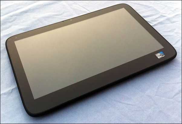
The Onkyo TW317 [tracking page] is a rare breed of soon-to-be-extinct computer known as a capacative touchscreen Windows 7 slate inch. What this means is that the TW317 lacks a real keyboard or mouse. Unlike some other slates which add accurate handwriting and mouse-hovering abilities with an active digitizer — which supplement the removal of the keyboard/mouse — the TW317 relies completely on its capacative touchscreen for finger-based input.
To put this into perspective, may I ask you if you’d like to purchase a car from me? I’ll give you a great deal, but there’s some caveats… the car doesn’t have a steering wheel or tries. Did I mention that you can find other, more powerful, versatile, and usable cars on the market for less?
Here’s what you need to understand before reading any further: removing the keyboard and mouse from a Windows computer, and not adding an active digitizer, makes it fundamentally harder to be productive (or to just use the computer for anything, really). While the parts of the computer itself may be perfectly well made and put together, you will run into annoying situations (frequently) where your controls on this computer are not conducive to what you actually want to accomplish. For further reading on this, see here.
In fact, you’ll find that some of the limitations of a mouseless and keyboardless Windows computer nearly prevented me from bringing you a large portion of this review…
With that fresh in your mind, let’s begin.
Tour
Here’s a quick look around the hardware as well as the specs:
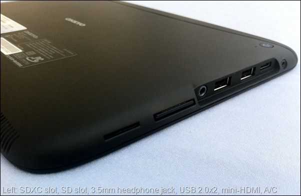
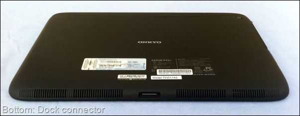
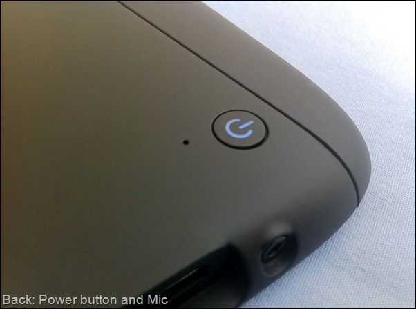
And that’s really all there is to it. Pretty simple, huh? Here’s a full spec breakdown:
- Windows 7 Home Premium
- 10.1 inch capacitive touchscreen @ 1366×768 (16:9)
- Intel Atom N450 CPU @ 1.66GHz
- 1GB of RAM
- Intel 3150 graphics
- 32GB SSD
- WiFi b/g/n & Bluetooth 2.1
- 0.3MP front-facing camera
- 1000gm
Hardware
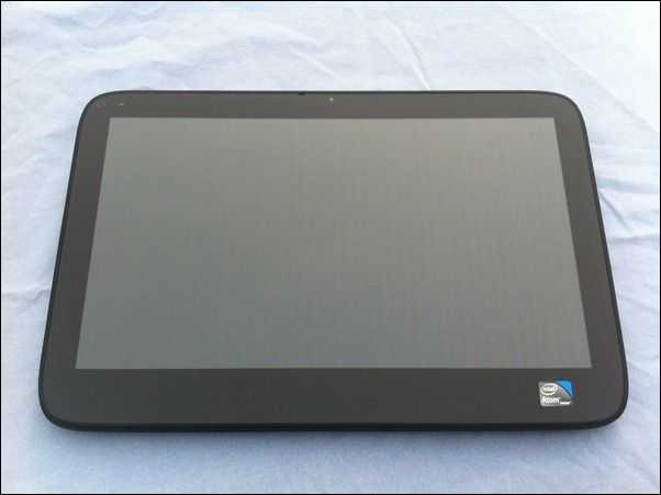
The Onkyo TW317 is actually quite impressive when it comes to hardware. Considering that we’ve got x86 internals inside the casing, Onkyo did a superb job at keeping it thin. The TW317 is only slightly thicker than many of the mobile-OS slates currently on the market.

There’s a small fan inside, but it runs quietly most of the time and vents out the top of the device which is good because your hands won’t usually be covering the port, and the heat won’t be venting directly into your lap. Though the back does get hot after continuous use.
When you pull the TW317 out of the box, you know it’s a well-built product. You can feel it all the way around. Shake the device and what do you hear? Nothing. It’s almost as if there are no moving parts (there are probably very few beside the fan).
Design
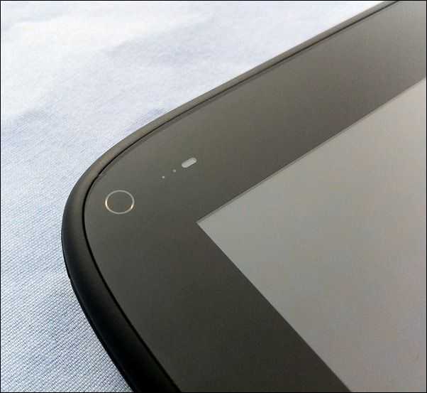
As a slate, there isn’t a lot you can do to make the device aesthetically interesting beyond the choice of casing material, but they at least attempted to keep the TW317 from being totally bland.
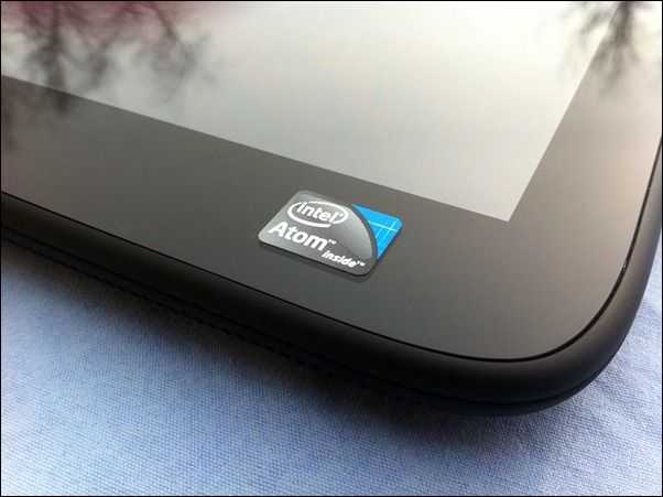
The glass on the front of the device extends over the bezel which keeps everything on the front on one plane (this is good). There isn’t much to look at on the front except a simple Intel Atom sicker. The black bezel is about 3/4 inch on the left, right, and top of the screen, while it’s more like 1 inch below the screen. Though a wide bezel is usually an undesirable trait, when it comes to slates, it’s necessary to be able to hold the device without accidentally pressing the screen.
The corners of the screen are square while the corners of the device itself are round. This creates an unsatisfying aesthetic that could have probably been avoided by making the corners of the device tighter, and then moving the corner of the screen to be aligned horizontally and vertically with the beginning of the curve of the device’s corner.
That being said, the TW317 is quite heavy and it’s also quite a bit longer than it is tall because of the 16:9 shape of the screen. This means that you’ll have a lot of leverage working against your wrist if you attempt to hold it in one hand from the side in landscape mode. Holding it in the center (using the large bezel space below the screen with your thumb) works pretty well, but only being able to use the slate with one hand really limits your ability to input text (which is already limited because the on-screen keyboard is not nearly as fast/responsive as a real keyboard, or other mobile OS OSKs {iOS, Android, etc}).
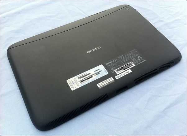
The back of the device is a rubberized plastic, a material that I tend to like as it won’t scratch easily like aluminum. There’s also a curved line toward the top of the back to make it a bit less boring. There’s almost no flex of the back, even in the center where support is usually the worst. This again attests to the device’s great build-quality.
The back rounds into the front which makes it easier to pick up with one hand than if it were completely flat. On certain surfaces like my desk, however, it’s almost impossible to pick the TW317 up with one hand from the top or bottom, as the static friction is overcome before you can apply enough force to get your fingers underneath the device. Grabbing from the right side of the device, or going for one of the port openings (the left side or bottom dock connector), makes it possible to pick up with one hand because it’s easier to get underneath.
The bezel hangs closely over the USB ports on the right side of the TW137, so if you have any particularly bulky USB plugs, don’t anticipate being able to plug them in without an extension/hub. For instance, the LG LV600 4G USB modem would never fit.
Screen
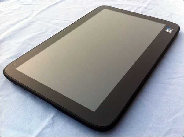
The TW317’s 10.1 inch capacitive touchscreen has a 16:9 resolution of 1366×768. The 16:9 ratio makes the tablet wider than it is tall which isn’t preferable with a slate as the center of gravity is further from the edges and there is potential for extra leverage on your hand. This means that holding sessions will become tiresome after short periods, and holding it above you while lying down is pretty much impractical as you’d need to put your palm over much of the screen in order to get enough support to resist the weight of the device.
The viewing angles are poor and you’ll see brightness reduce greatly at 20 degrees or so, with colors beginning to invert around +/- 45 degrees (in this case, looking directly at the screen is 0 degrees). Because the device is heavy, and is used most effectively with two hands, you’ll be prompted to set it in your lap. Unfortunately the viewing angles don’t jive with this as you will rarely be looking directly down at the tablet in your lap (otherwise you’ll be risking serious neck strain).
Tapping items on the screen is definitely a bit easier and more consistent than devices from the resistive-screen era, but if you are imagining the responsive and accurate touch input that we’ve become accustomed to with modern smartphones, don’t get your hopes up. You’re likely to experience a lot of frustrating near-misses when attempting to navigate around the OS. Grabbing windows to resize them, in particular, is a major pain.
One issue with the screen I found was that tapping in the very bottom-right corner was difficult at times. This could be a calibration or hardware issue.
Speakers
The stereo speakers on the bottom of the device actually weren’t as bad as I was expecting. They are completely lacking bass which isn’t unexpected, but they sound much less tinny than I was anticipating.
Software
If you’d like a good laugh, you should absolutely head to this page and watch the brief “Windows Touch inch video from Microsoft. The irony (and awful acting) contained within couldn’t be more hilarious. To be fair, they are talking about using a device that actually has a keyboard and mouse, most of the blame here should be placed on Onkyo and any other capacitive touchscreen slate manufacturer that thinks that keyboard and mouseless slates running Windows 7 are a good idea.
Remember how I was telling you at the beginning of this review that you’ll run into issues operating a Windows slate because it lacks a keyboard and mouse? Well it turns out that I’m currently experiencing this, and it nearly inhibited my ability to bring you much of this review.
It turns out that the BIOS has rudimentary cursor support with the touchscreen, which I wasn’t actually expecting. However, portions of the BIOS/pre-boot environment do not have any touchscreen support, which means that if you don’t have a USB keyboard on you, you won’t be able to use your computer. And as it turns out, I didn’t have a USB keyboard on me, so the Onkyo TW317 was an unusable paper-weight for quite some time. Fortunately I’ve managed to get one and was able to break out of the BIOS in order to continue reviewing the device.
This is just one of several examples of how a keyboardless/mouseless Windows computer is a total joke when it comes to usability. It’s not just the fact that entering text on the OSK is far slower than with a real keyboard, or that the inability to float the mouse renders plenty of programs hard or impossible to use, but could you imagine taking your Onkyo TW317 on an important business trip and having to tell your boss: “Sorry, I can’t send those vital reports because I forgot to pack a USB keyboard, and the computer is stuck in the BIOS”? That’s just insane; no normal user should have run into such a stupid situation because the computer lacks the basic tools necessary to interact with it.
Sumocat, resident tablet PC expert from Gottabemobile.com, has informed me that Microsoft had once-upon-a-time set up some slate-device guidelines which specified that slate devices such as the TW317 be fitted with D-pads to ensure that they are fully compatible with the OS and the BIOS. It’s not clear whether Microsoft is still publishing such guidelines, but what is clear is that Onkyo decided not to equip the device with a D-pad, and users will suffer because of it.
As with the Asus R50A of old, I found redundant built-in utilities. Two different utilities that would run automatically both wanted to control the brightness and wireless radios of the device.
Automatic rotation of the screen orientation absolutely would not work on the Onkyo TW317 even though it was supposed to. No amount of playing with the utility that had the auto-rotate option seemed to help. Not sure if this is a software or hardware problem, but you can at least manually change the orientation.
I’ve got a video that was taken a little while back that will give you a decent idea of what the touch experience is like on the TW317:
Keyboard

The keyboard brings new meaning to the phrase “hunt and peck. inch Each key-press must be very deliberately placed which is a real pain. There’s extremely rudimentary predictive-text, but in a world of great OSKs (on-screen-keyboards) being offered from Android, iOS, and even WP7, the OSK on the TW317 simply doesn’t stand up. This keyboard is hardly good for entering URLs, let alone writing notes. You’ll have to manually call the keyboard up, and usually dismiss it manually which is bothersome if you’re used to rarely having to think about the keyboard on modern smartphones.
In a select-few applications, a keyboard button will pop-up when you click inside a text field. Tapping the button will open the OSK. Unfortunately this box pops-up inconsistently even where it is supposed to. In the vast majority of applications, the box will not even appear automatically, so you’ll have to launch the keyboard manually from the button that hovers on the side of the screen. Inconsistency is a big no-no in interface design and this is a great example of what not to do; having to look in one of two places for where to launch the OSK is worse than simply relegating it to the side of the screen every time.
Aligning your cursor for editing text without a real mouse is awful and very frustrating. Sadly, this problem has already been solved on Android, iOS, and even Microsoft’s own WP7.
Scrolling & Snap
Scrolling and Snap are some of the only things found in Windows 7 that actually feel natural with the touchscreen. Scrolling within any explorer window can be done anywhere, rather than attempting to grab the tiny scroll bar. It’s got inertia and generally scrolls smoothly. There’s even a rubber-banding effect shown by the whole window to indicate when you’ve hit the top of the bottom of the list. It’s unfortunate that this great scrolling implementation doesn’t make its way into third-party applications.
“Snap inch is the term that Microsoft uses to describe the window size gestures that are done by grabbing the window’s title bar. If you grab the bar and push it to the top of the screen, the window will maximize. If you grab the bar and pull it away from the top, it’ll restore to a smaller size. You can also make the window occupy half of the screen by pushing the bar against the left of right sides of the screen (good for looking at two things at once). It’s very natural to do, and is way easier than trying to hit the relatively small buttons at the top-right that are normally reserved for maximizing/minimizing windows.
You can also use the “Peek inch function which involves shaking the window from the title bar which cases all other windows to be minimized. This works fine through touch but I don’t ever really use it.
Multitouch
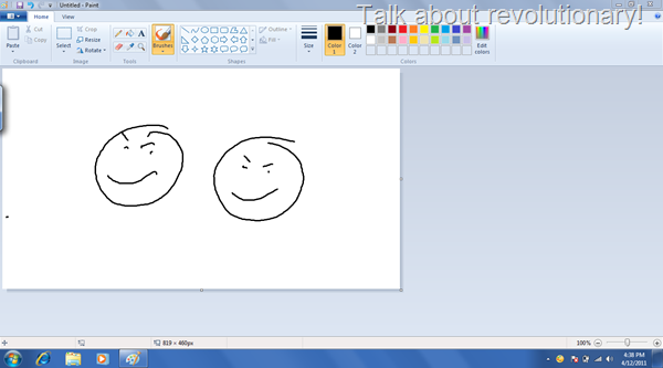
Multitouch in Windows 7 is currently (and for the foreseeable future) just a buzzword that Microsoft likes to toss around. The only place you’ll find multitouch implementations is in paint, Internet Explorer, and the default Windows Photo Viewer (and maybe a few obscure programs). It’s up to third-party application developers to add multitouch support to their applications, and pretty much no one is doing so.
This makes the multitouch capability of the device essentially useless. Unless of course you want to draw two things at the same time in paint:
Touch Pack
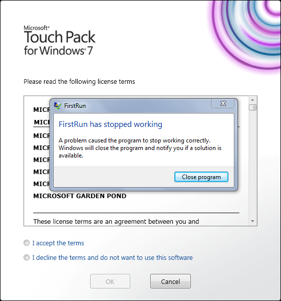
Touch Pack is a group of programs and games from Microsoft that are optimized for touchscreen use, presumably released because no one else is making them. I would have loved to have given it a try, but… well I’ll let this photo speak for itself:
Performance
“Painfully slow inch is the best way I can describe the overall performance of the Onkyo TW317. I will say that I was wholeheartedly impressed that the device handles 720p video from YouTube with no issue, if only because the performance in other parts of the device were in no way indicative that it would be able to play-back HD video.
Microsoft wants you to use Internet Explorer for your web touch-based web browsing as they’ve built in a lot of little optimizations for touch. Inertia scroll is there by default, so is multitouch zooming. Unfortunately, both perform horrendously. When attempting to browse a site like Engadget, I’d see regular lockups that would last for several seconds. Simply trying to scroll up and down the page to browse stories was incredibly sluggish and almost unusable. If you weren’t already using Chrome or Firefox, you will be shortly after using IE on the TW317.
Chrome helps keep the scrolling lock-ups at bay, but it’s by no means smooth. Part of this is hardware/performance based, and the other part is that scrolling in Windows is quantized, meaning that it has set increments in which it can jump, leading to unsmooth scrolling.
You’ll need to supplement the missing inertia-scrolling with addons/extensions in Firefox and Chrome.
Benchmarks
Flash
The Man in Blue flash bechmark runs more slowly on the TW317 than on the Motorola Xoom which is a bit sad considering the difference in price. You’ll see around 20-24 FPS on the TW317 and 28-30 FPS from the Xoom. For some context, my laptop (several years old) pushes around 50 FPS with several applications open.
CrystalMark
The TW317 scores worse in CrystalMark than one of the very first devices that I ever reviewed here on ultra mobile PC Portal, the Acer Aspire One.
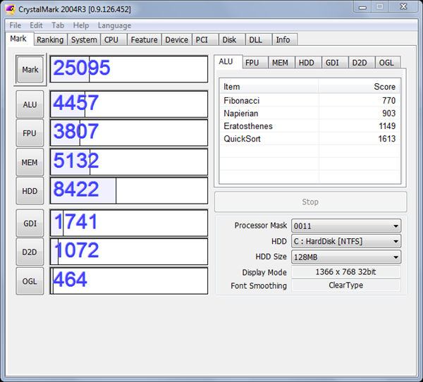
Back in 2008, the Acer Aspire One scored 27k, and it didn’t even have an SSD. The TW317, which gets a 2k bonus from the SSD, still only scored 25k in CrystalMark. This is only slightly better than my five year old Sony VAIO UX180 which scores around 23k.
Sunspider
The Sunspider javascript benchmark is very browser dependent, but it gives us a way to compare cross-platform performance. I ran Sunspider on the TW317 and found a score of 2122.4ms (using the latest public release of Chrome). It turns out that the Xoom outperforms the TW317 in Sunspider by scoring 2045.9ms in the default browser. I’m not sure if I should be impressed by the Xoom or ashamed of the TW317. For context, my Windows 7 laptop scores 567ms in Sunspider.
Video Playback
As mentioned, playback of 720p YouTube content actually worked with no issues. I was also happy to find that local 720p content played fine through VLC. I tested the same 720p content encoded with AVI, H264, and OGG. All of them played smoothly through VLC.
If you push the resolution up to 1080p with H264, you’ll actually find relatively smooth video with the occasional freeze. It’s not entirely unwatchable, but I would prefer smooth 720p over 1080p with occasional freezes.
Video encoded with OGG in 1080p tends to freeze much more often, while AVI/MPEG4 1080p actually sees better performance than H264 and plays with no lockups.
Battery Life
Battery life on the TW317 wasn’t all that bad, but the lack of removable battery makes power options on this slate less flexible than with other devices. Using the classic BatteryEater benchmark, which runs the computer at 100% CPU until the battery discharges, the device ran for 2 hours and 45 minutes. This figure indicates approximately the least amount of time that the slate can be run on battery power, so normal use would likely see around 4 or 5 hours of use. The discharge graph was very uniform so you can expect consistent battery run times.
Conclusion
Aside from some unexpectedly good video handling, the Onkyo TW317 is a joke. On paper, the device might not sound so bad, but when you remove vital components (mouse/keyboard) from a computer running an OS that is designed from the ground-up to take advantage of those components, you shouldn’t be surprised when things go wrong. There’s no way that I would ever recommend this device over a convertible tablet PC, or a slate with an active digitizer , or even a consumer tablet (iPad/Xoom, etc.). Sluggish web browsing, near-complete lack of finger-touch-optimized applications, and horrible end-user usability make my recommendation for this device an easy one: don’t buy one. Ever.
P.S. I’m fully aware that there will be at least one person out there who thinks that I’m out to give slates a bad name. This couldn’t be more wrong. If this was a product that worked well and was actually useful, I’d be happy to report that. Unfortunately I can only go on the true usability/practicality of the device, and that’s exactly what you’ve read above.
Edit: A little clarification in the comments —
I’m not dissing touch on Windows. I’m dissing slates WITHOUT keyboards or mice (active digitizer is an acceptable replacement for keyboard/mouse). I OWN a tablet PC and I love it. The different between a slate and a tablet PC is that slates do not have keyboards or mice, while tablets are convertible. I love the ink input. I even love the occasional touch input (it’s resistive however so I use it less commonly). The issue is that touch only works effectively for a SMALL portion of the overall Windows OS. This is why it makes sense to have a convertible which still has a keyboard and mouse so you can switch between the different input methods as needed. As soon as you remove those two components, you are forcing the user to use crippled input that Windows was not designed for. The fact that the user can get stuck in the BIOS without a USB keyboard, or the fact that some applications are rendered nearly unusable when you only have touch input clearly shows that touch-only is not a good experience and was not well thought out by the people who are creating slates.





It’s a reference design that also the WeTab and the ExoPC use – with the same problems and crappy screen.
So the case and maybe also the complete hardware is the same….
You will hate reading this — but I actually laughed out loud several times while reading this review. When you said you intended to devote your time to pro uses of tablets, I immediately knew this is the kind of thing you would run into — and BAM! You have. Instead of improving their OS for touch, MS went and spent over eight *billion* dollars for Skype. Imagine the OS for touch they *could* (well, it’s MS, so let’s be realistic and say *might*) have had for that money.
@MikeCane, cute comment, we all know microsoft is working on Windows 8. I suspect Microsoft will spend more than 8.5 billion creating and promoting Windows 8. But I’m sure no matter what MS does, the haters are going to continue hating.
Yeah, yeah, pointing out their OS is crap for touch is “hating.” Nice word twisting. Move on.
If you review a Windows tablet in the same way you review a media tablet then you missed the point of a windows tablet. Yes the UI isn’t perfect, but there are things a Windows tablet can do that these media tablets cannot. You could have shown how the tablet runs Office or how it can share resources with your desktop. The fact that you can run flash and silverlight. How about voice and handwriting recognition? how well do they work? You could have downloaded opera for windows tablets and gotten a media tablet like experience, complete with all the same stupid limitations, but hey it has smooth pinch to zoom, scrolling and a dummy down keyboard.
You never talked about the touch gestures in windows that allows you to go back in forward in ie9 and other places in the os by swiping left and right. Heck you could even configure the gestures to do different things.
Another missed opportunity to educate your readers on the good and the bad of these types of devices.
Here’s the point that you folks are missing:
I’m not dissing touch on Windows. I’m dissing slates WITHOUT keyboards or mice. I OWN a tablet PC and I love it. The different between a slate and a tablet PC is that slates do not have keyboards or mice, while tablets are convertible. I love the ink input. I even love the occasional touch input (it’s resistive however so I use it less commonly). All of the things you mentioned work just fine on the Onkyo, as you would expect. That’s not the issue. The issue is that touch only works effectively for a SMALL portion of the overall Windows OS. This is why it makes sense to have a convertible which still has a keyboard and mouse so you can switch between the different input methods as needed. As soon as you remove those two components, you are forcing the user to use crippled input that Windows was not designed for. The fact that the user can get stuck in the BIOS alone, or the fact that some applications are rendered nearly unusable when you only have touch input clearly shows that touch-only is not a good experience and was not well thought out by the people who are creating slates.
Congratulations on owning a Tablet PC. I’ve owned many myself, and as I’m now sick of saying, Windows 7 on the Motion Computing J3500 was the best computing experience, tablet, slate, portable, or otherwise, that I’ve ever had. I was never shy about handing it off to a stranger, especially somebody with a media tablet, and letting them have at it, and nobody walked away critical of the experience. However, I’ve ditched all of my Tablet PCs. I enjoy that computing paradigm, but I’ve found it more important to enjoy the benefits (and suffer the disadvantages) of community-supported Free Open Source Software then to make some marginal compromise in favor of one trinket or another.
“I’m not dissing touch on Windows.”
You are dissing touch on Windows, but you’re just being negligent. An active digitizer IS a form of touchscreen. A pressure sensitive passive digitizer IS a form of touch. You clumsily imply that touch means finger, as if every four sided object must also therefore be a rectangle and moreover a square. It’s just not a valid way of “rounding up†your logic. If you mean fingers then say that. If you mean touch, which includes fingers and also more, then say that. An active digitizer pre-empts most of your complaints, and that IS touch. If you think that a keyboard or mouse is so dang essential, then you obviously don’t think that an active digitizer is enough. That sounds like dissing touch.
“The different between a slate and a tablet PC is that slates do not have keyboards or mice, while tablets are convertible.â€
Oh no…. This is sentence represents what an editor friends of mine would be called “density with densityâ€. The happy dance between the terms “slateâ€, “tabletâ€, “convertible”, and “PC†that you’re offering here is confused. A slate has always been a form factor and nothing more. I don’t care if you want to pretend that a slate refers to something else or that what used to be called a slate is now called something else. A slate was called a slate long before anybody cared. A convertible is a device which features either a slate mode or clamshell (sometimes called “terminalâ€) mode. Some convertibles have a rotating hinge. Others have a swing hinge. A tablet is a device with the right combination of hardware and software to support a special type of computing. Windows 7 has more tablet functionality than any other operating system on the planet. However, your device doesn’t really offer hardware that supports tablet computing, so tablets don’t matter here. That term need not apply. Wacom sells several tablet computing peripherals. If you’d like to turn this into a tablet, then attach one of those. A PC is a personal computer. It differentiates itself not through being “owned personally†or “personally configured†bur rather it is useful without an operational and administrative infrastructure. If your media slate is a front-end to Google web services and “social†web services, then it’s simply a connected client and definitely not a Personal Computer. It would lose functionality without cooperation with those intervening operators, not to mention the wireless connectivity infrastructure on which that whole system of service also depends.
“This is why it makes sense to have a convertible which still has a keyboard and mouse so you can switch between the different input methods as needed.â€
Actually, that’s really annoying. I’ve only recently dumped all of my slate tablet PCs, but prior to acquiring those I dumped all of my convertible tablet PCs because I felt that the convertible represented a pretty terrible form factor. A convertible is a relatively poor clamshell and a relatively poor slate. It does both, but neither well. Pure slates have been available for a long time, but my own opinion is that Windows Vista was the first Microsoft OS that made a pure slate practicable. Windows 7 made it awesome. If you have an active digitizer under Windows 7, then finger touch is a feature but a hardware keyboard is a nuisance. As I’ve said before, Windows is far better at making use of touchscreens, all forms of touchscreens, then Android or iOS are at making use of keyboards, hardware or simulated. Go ahead and mock Windows and “touchâ€, but let’s see some article ridiculing how inept those devices are with keyboards. I have a tidy little clamshell style devices that’s crunching along with xmonad and uzbl as two of its primary running processes, and any iOS or Android slate would be better used as uncomfortable toilet paper rather than trying to imitate such a simple and productive approach to computing. In contrast, Windows 7 seems so useful that we take it for granted.
I LOL’d at your comment about getting stuck in BIOS. I’ve never, ever been trapped before, and perhaps that’s the sign of a poorly designed device rather than a criticism of Windows. How does Windows 7 manage the bios exactly? This is really a criticism of slate design. For over a decade there have been devices without keyboard for which a BIOS was completely manageable, and I’m just not sure how “lost in BIOS†compares with naturally handwriting input.
I think you’ve missed some important points here.
In case it wasn’t clear, the Onkyo TW317 doesn’t have an active digitizer, and that’s one of the reasons that it is a terrible experience to use. If this thing had an active digitizer, it would be way more useful than in it’s current state because you’ve have much more precise input, the ability to mouse-over without clicking, and you’d have much more viable input through inking.
The slate form factor can definitely work with an active digitizer. When they offer a slate that only has a captitive touchscreen, they remove those vital abilities that I described above. I would absolutely consider an active digitizer/stylus as a form of effective keyboard/mouse. The reason the Onkyo TW317 is awful is because it lacks a regular keyboard and mouse, and also lacks an active digitizer which would supplement that removal.
I’ve been using these devices for years. My definition of slate, tablet, and other words is well informed. Are you saying that the TW317 is not a slate, and that a slate doesn’t described a computer that lacks a traditional keyboard/mouse?
When lolling, you also must have missed my clarifications about these criticisms:
“Sumocat, resident tablet PC expert from Gottabemobile.com, has informed me that Microsoft had once-upon-a-time set up some slate-device guidelines which specified that slate devices such as the TW317 be fitted with D-pads to ensure that they are fully compatible with the OS and the BIOS. It’s not clear whether Microsoft is still publishing such guidelines, but what is clear is that ONKYO decided not to equip the device with a D-pad, and users will suffer because of it.”
“TO BE FAIR, they are talking about using a device that actually has a keyboard and mouse, most of the BLAME HERE SHOULD BE PLACED ON ONKYO and any other capacitive touchscreen slate manufacturer that thinks that keyboard and mouseless slates running Windows 7 are a good idea.”
And in case people are confused, I will got back to make some modifications to point out the distinction between a capacitive touchscreen slate and a slate with an active digitizer.
Mike, please explain what Skype has to do with touch screen capabilities of windows? If you read the news would understand that ” Slate” functionality, as our venerable reviewer calls it come to market with Windows 8 , later next year. Skype, on the other hand will be integrated in to Windows Phone OS, that is the main point for acquiring Skype, and we will see it already with Mango update. Besides, from my PERSONAL extensive experience, Windows Touch capabilities are not as bad as our author trying to make them look. I agree, it is not as fluid as, let’s say iPad, yes I have one of those, but overall functionality well compensate for such small inconvenience as delayed rotation. And frankly, I really enjoyed reviews made before by Chippy, very professional and very objective. This one looks like made by unsecured teenager, trying to prove himself, and making statements on something that he really don’t understand, but have heard, grown ips were saying.
Huh? Where did I ever bring up Skype?
Oh, OK. as in the *acquisition*, I brought it up. If you can’t see the point I was making — misplaced priorities — well, that’s your problem.
Yes, capacitive slates without some sort of alternative pointing device are very difficult – oka, nearly impossible – to use. The addition of a small optical mouse would have made this device potentially viable. Let’s not get carried away dissing slate-only Windows 7 machines, though. I find that a capacitive Windows 7 slate can work perfectly well *** if it also has an active pen digitizer ***
“Multitouch in Windows 7 is currently (and for the foreseeable future) just a buzzword that Microsoft likes to toss around. The only place you’ll find multitouch implementations is in paint, Internet Explorer, and the default Windows Photo Viewer (and maybe a few obscure programs).
Are you kidding? Have you ever looked into the numerous multi-touch gestures? For example pinching works almost anywhere and that is a multi-touch operation. Also you can use 2 finger for right button clicks and there’s list of 8 gestures in gestures control panel.
I don’t quite understand these reviews where it starts off this is one big useless device (and in this case predictably Windows so you’re done quickly with the evaluation). Chippy is more professional and objective in these reviews. It may not be for you but it may be for others.
Yes, I have looked into them. Right-click exists, though it’s already covered with tap and hold, nothing new there. I’ve tried a number of applications from Google Earth to Photo Editing applications. Multi-touch pincihg/zooming is almost nowhere in the OS.
You say my review isn’t objective, but it sounds like the only way you would find my review to be objective is if I didn’t conclude that this device is crap when it comes to usability. Is there any way that one could objectively review this device and say it is awful and you’d be happy about it?
Once again, it’s not touch with Windows that is at fault here. It’s SLATES with Windows. Touch is great for the small number of cases in which it is useful, but the keyboard and mouse should always be there to fall back on because, simply put, the OS is designed for use without those things. It’s like driving a car with no wheels. Sure, you can push it along the road with a great deal of effort, but you’d probably want wheels for most of the trip.
Not sure my reply went through since it’s timed out. So here’s summary:
1. Adobe Reader fully supports zoom in/out with pinch
2. FireFox fully supports zoom in/out
3. Windows file explorer has full support. You can flick up/down, zoom in/ou
4. Live Photo Gallery has also full support of course
5. As mentioned multi-touch flicks control panel you can fully customize it to any key
I’m not saying I prefer windows slates over tablet pc’s but to say it’s like car without wheels is clearly not objective.
Lucien, I’m sorry but you simply cannot list 5 applications and act as though this is evidence for a thoroughly supported multi-touch implementation (this is without even touching on whether or not multi-touch zooming even brings useful utility to Windows devices). For every program listed above, hundreds, perhaps thousands, of others do not support multi-touch, and many cannot even be used without a floating mouse and keyboard. I think a car without wheels analogy fits the bill pretty well.
No mention of battery life?
Was letting the test run overnight, just added the results. See the performance section.
The review also misses the huge library of Windows programs (not just apps), the incredible number of peripheral devices that can be attached to a Windows-based Slate (including printers — try that with an iPad), and an interface with which most people are already familiar.
Yes, there is a learning curve for anything new and the touch interface is included. However, with a little practice, a person can type quickly, hit icons and controls accurately, and acheive good productivity. Tablet computing doesn’t have to be just Angry Birds, Facebook, and media consumption.
I actually typed my name on a traditional keyboard, so you can see typing errors are not just relegated to on-screen keyboards.
All in all, mid-2011 and still using the slow N450 and a pathetic 1GB of RAM just doesn’t add up. Is this why Apple still has an edge with the iPad 2?
Sigh. Yet another article claiming Windows 7 touch support is lacking. I’m wondering if your problems aren’t because the Onkyo is just too slow because, I have to say, this is the complete opposite of my experience. I have an EXOPC slate (same design as this Onkyo but some improved internals) and I have been nothing but impressed with it. The keyboard, while a bit too cluttered for my liking is REALLY fast (I’m typing on it right now and its taken me basically as long as if I were using a regular keyboard). Inertia scrolling is everywhere and the customization options are endless (for starters, scrap IE in favor of firefox and you’ll be happier). I, unlike others here, do not believe that you’re simply not giving the full narrative (i.e. Windows slates are all about the number of programs you can run, the peripherals you can connect) but instead believe that you are absolutely incorrect on your assessment of the Windows 7 capacitive touch experience. I VERY RARELY find myself looking for a physical keyboard or mouse and have been nothing but surprised with the maturity of the experience (perhaps given all these poor reviews).
I’m a long term user of windows tablets and have tried out a similar win 7 slate as the one reviewed. I have to agree with Ben in his final conclusions that in the current form win 7 slates (without active digitizers and not in convertible form) just do not work for most people.
-Relatively terrible on screen keyboard
-Relatively terrible battery life (to be fixed by oak trail if it ever appears)
-Slow atom processors (yes the ep121 has a good processor but terrible battery life)
-Lack of touch games
Yes the article is full of a lot of really harsh, biased anti-win 7 touch sentiments as usual which is sad that it is still around. A lot of the touch issues mentioned can be fixed with software tweaks or just are not true. It is also true that there are many advantages to using win 7 like full office, easy to connect usb devices, much easier to print etc. So win 7 slates will fit some people… just not that many.
Most people who want a slate tend to have few computing requirements or will take along a laptop as well. The win 7 slate in its current form just is a bad middle ground that does neither the job of a slate nor the job of a laptop well enough.
Here is hoping windows 8 will bring something fresh to the market.
I think the touch experience is given such a bad review here because relatively speaking the android and ios devices just do it so much better. I don’t think the win 7 devices do it too badly … just others do it so much better!
Man, I understand your frustration it’s not related to windows 7, it’s about the hardware, I have owned a tablet with an atom processor and it was terrible.
I got the asus ep121 and that runs pretty smooth and it uses windows 7.
I can’t complain about using it with out a mouse or keyboard, it simply works great.
One thing that I don’t understand is why manufacturers still put win 7 on slow hardware, you need at least a core duo processor for get a decent performance :)
Let me just point out why you aren’t getting the on screen keyboard in certain apps like Chrome.
Their text entry boxes are not implementing the proper hooks to tell Windows that it is a textbox, it has focus, and Windows needs to put the touch keyboard button next to it.
This is the same reason why you still have to install an extension for Chrome/Firefox in order to be able to surf the page by dragging it around. Those applications coded their scroll window differently from the standard Windows methods (probably to cater for the cross OS developement)
When you write a program for Windows touch (yes, I am a developer in case you’re wondering) You can either directly tell Windows that your progarm wants to receive gesture input (pinch, drag, manipulate) and handle it yourself. Or use the standard Windows control systems and Windows will apply the touch enhancements where appropraite, example, drag to influence scrollable areas, allow the OSK button to appear beside a textbox.
Yes, consumers shouldn’t need to know all these issues. But developers aren’t making it easy for consumers when Microsoft actually has a pretty good set of APIs to allow their programs to work with touch properly and the developers not doing their jobs properly.
Of course, on the user end there is one big lesson that the user must learn before they can use a Windows slate properly and that is “Don’t try to do everything the same way you do with a keyboard and mouse” Because there are other ways to interact with Windows when you’re working with it via touch only.
Everyone keeps commenting that Windows 8 is gonna have a great tablet OS version, Windows 8 will have a great touch UI. It DOESN’T MATTER what kind of great UI comes in Windows 8, if you still want to use it to run an app that wasn’t written for touch specfically then you’ll need to learn how to interact with it.
I’m using an Asus T101MT myself and you can watch my Windows 7 touch experience here. http://www.marauderzstuff.com/CategoryView,category,TabletPC.aspx#a18a5bd00-2ced-44ca-a6bd-86c10db1da81