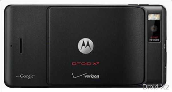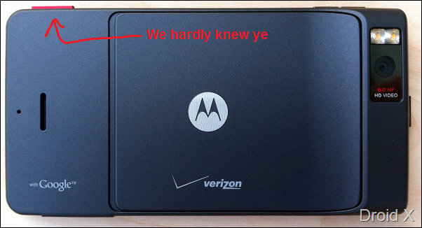

You may recall our post about the Droid X2 announcement from the other day. I was somewhat perplexed at the fact that the Droid X [tracking page] and Droid X2 [tracking page] were nearly identical on the outside, except for the fact that the dedicated camera button had been removed. I was wondering why exactly they did this so guess what I did? I asked. Crazy, I know.
Here’s what Motorola had to say about the matter:
Design decision was based on consumer and carrier feedback. Also, when combining the display shutter button and continuous autofocus, it allowed us to deliver much faster camera performance; the DROID X2’s shot-to-shot performance is 44% faster than DROID X.
As I mentioned in the prior post, it looks like Motorola was trying to avoid any major design changes from the Droid X. ‘Consumer feedback’ was likely complaints like mine in our Droid X review that called the camera button out as being wobbly and feeling scarcely attached to the phone. If they were making more significant design changes, I think we would have seen an improved camera button, but it would seem as though removing it was the easier route in this case.
Fortunately users are actually gaining some performance from the removal of the button so it’s not a lose-lose scenario. Increasing the speed in which you can take photos by nearly 50% is nothing to scoff at. And we also now know that the Droid X2 has continuous autofocus, that’s a plus!


