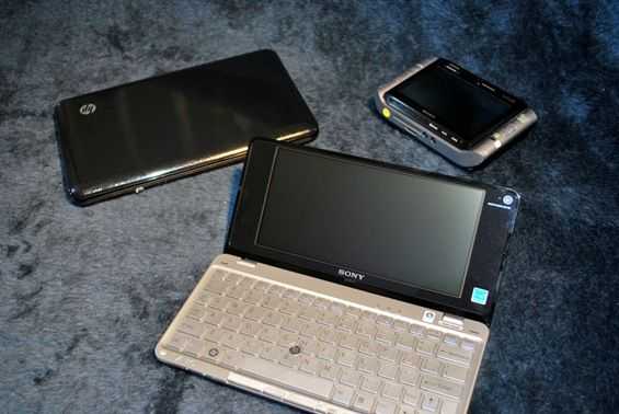
Not long ago, I theorized about the idea that the VAIO P could be a potential successor to the UX series. Both devices crammed premium hardware into a tiny space to make a true UMPC. It has been some time since Sony has updated the UX series, and they have yet to bring it into the Atom era; the release of the VAIO P seemed like it could be the re-embodiment of the UX series.
I recently had the please of chatting with two very nice guys from Sony US: Jon Piazza, Sr. Public Relations Strategist, and Eric Treski,Product Manager of the VAIO line, and specifically for the VAIO P series. Both were kind enough to answer some questions for me regarding the VAIO P and VAIO UX.
One of the first questions I proposed was the idea that the VAIO P is a sort of reincarnation of the VAIO UX line. Eric explained a bit about where the P and the UX came from.
The VAIO UX, which is a handheld ultra mobile PC was designed by Sony several years back, looked to put a tiny, but fully functional PC in someone’s hands. Eric told me however that Sony didn’t know exactly who would pick up the UX, but they knew they had something special. As for the VAIO P, Eric said that they put all of the history of the Sony ultra portables into the P, but this time they had a designated target customer. That customer is someone who wants to be connected all the time and is, as Sony calls it, “a style-conscious consumer”; that is to say: people who want to be seen with a sleek, expensive computer.
I asked about the unique aspect ratio of the screen, which is a somewhat odd 2.07:1 shape. Eric confirmed for me what I thought about the circumstances of the screen’s creation: I assumed that they created the smallest usable keyboard they could, and used that as the main footprint of the device. From that shape, the screen was designed to fit, which accounts for its uncommon aspect ratio. I asked for thoughts on the font being too small because of the high resolution and Eric said that the high resolution of the screen is somewhat a product of trying to stay away from netbook hardware. He explained that there were many netbook returns citing a lower resolution 1024×600 screen and Sony wanted to provide people with enough width to not have to scroll horizontally on web pages. The width is also just about wide enough to fit two windows side by side, which is why there is a hardware button dedicated to rearranging windows for the user. He also mentioned that many people might be unaware that they can adjust the DPI for a more favorable font size.
If you’ll recall in my first post about the VAIO P and the VAIO UX, I mentioned that there were two ways to ask the question in the title of the post (“Is the VAIO P supposed to be the successor of the UX series?“) The first of which was to ask Sony if the P was supposed to be a kind of UX successor and the second way was asking if the P replaced the UX in terms of actual usage. From my chat with Jon and Eric, it sounded like the P was not necessarily meant to succeed the UX. It sounds more like a new ultra portable, in a different form factor, and for a different demographic. As for the second way the question could be asked; I’m still evaluating the VAIO P and should have an answer soon.
I was also interested in the health of the VAIO UX line. Sony hasn’t done anything with it in quite some time, and it isn’t currently featured on their website. Eric conceded that it was hard to answer the question involving the continuation of the VAIO UX series because Sony is always looking at a lot of different things, but not all of it gets through. From my interpretation of the answer, it sounds like the UX series isn’t discontinued, but they aren’t actively developing anything new for it right this moment. Here is to hoping that Sony’s next look into the UX line leads to an all new Atom based device. I feel like Sony has some untapped potential in the UX series, and a more consumer oriented device would be a huge hit. If we start to see smartphones turning into MIDs, I think Sony will realize that they could make a great device in this field that would be a sort of combination of the UX, Mylo, and old Clie UX series.
Eric also talked quite a bit about the ‘Instant Mode’ capability of the VAIO P. He noted that they have had similar sub-OS software on several other lines of their computers, but they may not have been targeted just right. It isn’t always in the interest of a business laptop user to be able to quickly boot the computer into a mode capable of playing back media. This time around, the VAIO P had the right target user to have a media based sub-OS, and they expanded on their previous concepts by adding online connectivity which they haven’t had in the sub-OS before the VAIO P. I haven’t been using it for too long, but I think that the Instant Mode idea is quite promising and Eric seems to think so to. He tells me that they are definitely getting good feedback from users and will continue to expand on the Instant Mode concept and hopefully make it available on other products in the future.




I was reall impressed with their rationale for the screen design. They are probably right, and for making a small device you can compress height a lot more than width, and maintain most of the usability.
On the other hand the design is still not really pocketable. I guess we can’t have that and a full browsing experience until we get a foldable screen, which won’t happen until technologies like epaper mature. Then the keyboard will be small, the screen width will fold and the result will fit in a real pocket.
I was thinking of the Samsung SPH-P9000 which has a very usable keyboard which is hinged and therefore folds down to a “pocketable” format. All that is really needed is a foldable screen to go with the keyboard, also seen in prototype by Samsung, and we are sorted!
Anyone compared the size of the P and the UX by…VOLUME? :)
No – whats the result? I am guessing the UX is bigger. A while since a saw one but I thought it was pretty thick
Reading: VAIO P ~ VAIO UX? A chat with Sony | UMPCPortal – The Mobile Internet and Computing Reference Site – http://is.gd/mO5n
According to the data in the Products section, the UX is slightly smaller. (541500 cubic mm vs 583200 cubic mm.) The UX’s volume is actually 541500 cubic mm due to its shape. However, it is about twice the thickness of the P. (38 mm vs 20 mm)
I don’t think they’re aimed at the same customers at all though. They’re two very different machines.
Oops, dropped a word. The UX’s volume is actually smaller than 541500 cubic mm due to its shape. (i.e., 541500 cubic mm is the volume of the UX’s bounding box. However, the UX is not box shaped.)
Yeah I hadn’t done the math, just had a feeling it would be relatively close. Also it’s my perception that most (full OS capable) UMPCs, MIDs and/or Netbooks at the smallest are most of the time within a very close VOLUME size.
thanks a lot…
How to bootup the Sony VGN-UX400 to install Windows 7?
It is very difficult, but possible, I know!
Are you still looking for the answer?
emege saygı teşekkürler