At the beginning of the year, if you would have told me that, by the summer, there would be a dozen different Android tablets available for order from reliable, first tier manufacturers, I would have told you to get outta town. We were likely all desensitized to the constant stream of news that seemingly had the same message: “Company X announced the Y Tablet today. It features blah-blah-blah-blah-blah-blah-blah. No information was released on a launch date or pricing.” It had gotten to the point that I immediately went to the bottom of any announcement of a tablet-device, and if it had the standard blurb about no launch date or word on pricing, I did not read the article.
Read the full storyTag Archive | "Android"
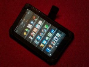
Amazon Kindle Fire: Owner’s Impressions and 13 Apps for Getting Things Done
Posted on 05 December 2011
I have only had my Amazon Kindle Fire for about four days. I have admittedly spent a lot of that time in my Amazon account on a PC setting up my account to access more services and content channels than I have been using in the past. I have also not had much time to put a lot of these apps through their paces on the Fire, but my initial checkouts indicate that they are as useful as they are on my other Android devices, so we wanted to make sure that other users or potential Kindle Fire buyers know that they are out there.
A bit of preamble as to why I have this thing in the first place. After a brief recovery, my iPad’s critical display fault resurfaced, rendering it useless. There are a few options out there for replacing it for $299 and up; mine is a 1st generation 64GB 3G + WiFi model. In order to replace it at the same level of capability, the options move to the higher end of the price spectrum. Truth is, I felt like right now was a bad time to replace it with either a refurbished 1st gen iPad or an iPad 2, with a potential iPad 3 within six months of announcement. Perhaps more importantly, as I surveyed the other gadgets at my disposal, I questioned whether I needed another 10″ tablet in any flavor of mobile OS. The Kindle Fire was an inexpensive choice, and I had already fallen in gadget-love with my Kindle 3 that I had picked up over the summer. At $199, the Kindle Fire is just outside the impulse buy window. Picking one up meant not giving up much in terms of any future purchase opportunities.
For initial setup, I used a method that I typically employ in using another device already in my mobile kit as a reference configuration. In this case, I used my Spring HTC Evo 3D, and spent a couple of night after work plumbing the Amazon App Market for all of my Android Apps or suitable substitutes. I could have tracked down the .apk’s for each app, but I do not know that doing so would have been any less time-consuming than searching for them on Amazon. And while side loading the apps would have been a good way to exercise my freedom, I wanted to at least make an attempt at using the device as Amazon envisioned. If I can use it with the vendors constraints, than general consumers should be fine with it, and enthusiasts can determine how much they will have to go over in order to tailor it to their needs.
I have 56 apps loaded on the Kindle Fire right now. Here the top productivity and utility apps that I felt were essential to have onboard. Where pricing information is indicated, it is always in reference to pricing on Amazon:
13 Kindle Fire Productivity Apps
AK NotePad [free] – AK NotePad does not do much other than act as a no-muss, no-fuss text editor. I do a lot of writing in this app, anywhere from starting my blog posts to simple notes on home maintenance projects and sysadmin projects. I use this app on every Android device that I own, and was quite happy to find it available on Amazon for the Kindle Fire.
Battery Percentage Status Icon Alert [$0.99] – I always insist on being able to see my battery percentage without having to drill all the way down into the Settings menu on an Android device. This app does not implement the status view as optimally as I would like. In my other Android apps, the percentage is visible in the alert area of the display. On the Kindle Fire, you have to open the Alerts menu in order to see it. Still, that is a single drill-down versus the 3-step process to get to it via the stock Android method.
CalenGoo [$2.99] – In the wake of making my decision to procure the Fire, I have been on a few boards and seen comments on debating the value of the Kindle Fire. One of the big ones is the Blackberry Playbook versus the Kindle Fire argument, and I have seen Fire proponents claim the Fire’s advantage of having native email, calendar, contacts, and notes. Well, for calendar and notes, I do not know what native apps were supposed to be on my Kindle Fire, but I did not find them before I decided to just get CalenGoo. The app syncs with my Google Calendar and even syncs with my Calendar Task list. It also displays both my personal calendar as well as the one my wife and I share. In fact, it has several display options that the stock Android Calendar apps (both the Gingerbread version and the Honeycomb version) do not provide. I will likely be switching all my Android devices over to this app for my Google Calendar needs.
Colornote [free] – I suspect that just about every Android user is familiar with this app, as it comes pre-installed on many Android devices. Of particular note is that the recent updates have added a calendar view for your notes so that you can make them specific to a date. The big advantage of that feature is to then make a date specific widget on your homepage, but, admittedly, the Kindle Fire does not allow widgets on the homescreen. Still, this is a great app for making checklists and taking general notes.
Documents-to-Go Full – There are a couple of reasons why you will need an office suite on your Kindle Fire if you are going to use it for document editing on the go. The main reason is, well, so that you can do document editing on the go, if you feel that is a use-case you need the Fire to fulfill. The other reason is because Google Docs and DropBox do not exist in the Amazon App Store. So I put Documents-to-Go Full on my Fire, as I do on every Android device. I needed it anyway to meet the first need I mentioned. But I also use it if I need to access my Google Docs from the device. (the Main App which only allows you view documents is free; $14.99 for the full version, and I could not find a way to use my registry key that I have for the license that I purchased from the Android Marketplace to use on the Kindle Fire, although I did not spend a lot of time trying and I reckon that there’s some way).
ES File Explorer [free] – Surprisingly, it is compatible with the Kindle Fire and appears to work the same as it would on any other Android device. I half expected that Amazon would not want you to have visibility on the Fire’s folder structures, but that is thankfully not the case. ES File Explorer is an essential utility if you want to store files in areas other than the defaults that other apps select for you.
Evernote [free] – I have not signed into my account on the Fire yet, but this app was available on Amazon, and indicates that it is compatible with the Fire. I tend to keep my online research notes in here, article ideas, thoughts on tech and any forum posts I write that I think might be good content for a later article.
Note Everything [free / $3.99 for Pro] – I do not know that we will ever see anything like the desktop version of Microsoft’s OneNote for Android, but in its absence, Note Everything does a decent job of allowing you to organize notes and encapsulate them in different folders to reduce your in-app clutter. (Free for the baseline app; $3.99 for the Pro version; I normally run the Pro version, but I am not certain what the differences are between it and the base version I am running on the Kindle Fire yet)
Office Calculator [free / $1.69 for Pro] – Another thing that the Fire is missing is a built-in Calculator. This one does the trick. (Free – I am running this version; $1.69 for the Pro version)
QuickOffice PRO [included / $9.99 for Pro] – The non-pro version comes per-installed on the Fire. The Pro version can be used to access your DropBox account. (Free or $9.99 for the Pro version)
Read It Later [$1.49] – A Kindle Fire client for accessing your Read it Later account.
SpringPad [free] – As important to me as Evernote; possibly more so. I primarily use this for some of the same duties that I mentioned I use Evernote for. But sometimes, Springpad is faster, and so there are some notes and files that I retain there.
The Weather Channel and AccuWeather – I counted this as one for purposes of the title, because I am pretty sure that one of them was pre-installed on the Fire when I bought it. There is nothing much to say about either of these apps, other than that they both do what they need to, which is admittedly not much!
So that is the quick and dirty…grab these apps if you plan on doing anything more on your Kindle Fire than just consuming content. I will admit that not being able to attach an external keyboard puts a dent in my gadget M.O. of trying to see how much productivity I can achieve out of any device. I will also admit that my current assessment is that the Kindle Fire, for me, will be an uber-eReader or uber-PDA, falling short of full tablet utility. Without being able to attach keyboards, mice, and external monitors, the Fire will be the center of my reading experience, but only short duration productivity stints. I would not take off on travel like I did for the Thanksgiving break carrying the Kindle Fire as my productivity device; the lowest end I will go to for that would be something like my Acer Iconia Tab A500, which is what I took along with a USB keyboard and wireless mouse. However, I am completely confident walking out of the house for a day trip or with a laptop stuffed in a bag knowing that I can work and read from the Kindle Fire while in transit and leave the laptop to rest until I get to my destination.
Addendum:
Let me close out with a few words on a couple of the controversies surrounding the Kindle Fire. On the debate of Kindle Fire versus the Nook Tablet, I was driven by my poor experiences with the Barnes and Noble website service layer and its linkages to the Nook, a component of that term that everyone keeps using…ecosystem. During the time that I owned my Nook, I was locked out of my account 3 times, and in each instance, I received no indication from the website that the reason I could not log in or make a purchase was because my account had been locked. When this happened for the third time (and when I was on travel to-boot) I lost my patience for it. It will be a long time before I am ready to tether myself back to my Barnes and Noble account and a corresponding device. On the choice between Playbook versus the Kindle Fire; I was very interested in the productivity I could get out of the Playbook. However, I was not confident in the level of app support and being able to find everything I needed. I was also not confident in the degree of support RIM will be able to provide at all. Spending an extra $100 to get a Playbook (my local stores are out of the 16GB for $199 model), that may or may not ever see the 2.0 OS update or BBX, was a sketchy proposition. As a long-term investment, I felt confident that Amazon was not going to cast aside the Kindle Fire and remove support for it any time soon.
For my other thoughts on other debates surrounding the Kindle Fire, I am attaching my comment post to a Boy Genius Report article that ran near the end of last week. The article reports on a study conducted by a market analysis firm, which tracked ad impression counts for the Kindle Fire during the weeks covering its launch through the week ending after the Thanksgiving holiday. Because the number of ad hits dropped off during the days following Thanksgiving, the firm drew the conclusion that most buyers of the tablet had become unenthusiastic about the device after the initial purchase window. The analyst further goes on to say that, because the Kindle Fire does not have all of the same features as the iPad, that it cannot compete in the tablet market, and that consumers want devices that have the same feature-set as Apple’s tablet. My response frames a lot of how I perceive the utility of the Kindle Fire, and what type of user I think the device is good for.
Comment Response to Amazon Kindle Fire already cooling off, study suggests:
“A very questionable study with conclusions drawn based on very limited data points. And what else besides price-point would “fall inline with consumer demand”? If it was features or specs, then it would seem that a lot more Android devices would be getting sold. I believe that tablet vendors have tried to compete with the iPad by going toe-to-toe on features and specs, or by even trying to clearly exceed the iPad on features and specs, and have encountered very little success. As one commenter indicated below, this a classic case of drawing a conclusion from a single metric and then extrapolating its relevance as if it was conclusive evidence of a definitive trend.
In the first few days with a Kindle Fire, I have spent all of my time in apps and pulling down content locally to the device and consuming it there. I have not spent anytime in the browser, yet I have essentially used no other mobile OS devices but the Kindle Fire. So I have expended many hours of usage, none of which would have contributed to this metric.
My belief is that users are employing the Kindle Fire as a device that receives all of its content through Amazon and in-app data streams. I believe users are more likely to buy digital magazines or newspapers than go to those publications’ websites via the Silk browser. This allows them to consume that content on the go, in an entirely encapsulated experience, without continuing dependency on connectivity once the download is complete. I also believe that Kindle Fire users are using the devices to do very specific things in very specific apps, and are not plunking down on a couch and engaging in general web surfing sessions for extended periods of time. A 7″ display would seem to lend itself to relatively brief surfing sessions of somewhat constrained and previously bookmarked websites.
I do not believe that ad impressions is the right metric to estimate Kindle Fire usage. It is designed to meet a different overall CONOP than other tablets. Just because it is in a slate form-factor does not mean that its degree of attraction to consumers can be measured using the same metrics and subjective assessments that can be applied to other slate form-factor devices. I do not believe that trying to compare the Kindle Fire to the iPad is an apples-to-apples comparison (no pun intended); a perspective that a surprisingly large portion of the tech analysis and tech media population seem to not be considering.
A more effective metric I think would be to look at the amount of content being purchased from Amazon either directly from Kindle Fire units, and/or the amount of sales growth in the Amazon App store, regardless of point-of-purchase (I have selected a lot of apps for the Kindle Fire via my PC, and then sync’d and installed those purchases to the Kindle Fire).
And I think the original analysts ending conclusion is just way off. Amazon is not trying to “truly compete in the tablet market”; at least not in the way it has been defined so far this year. And basing the win-lose assessment on what perceived consumer demand is…I do not know how anyone could assume to define this effectively. There was little to no concrete demand for a slate-style, media consumption device before the iPad’s arrival. There were a very small number of us who used TabletPCs and UMPCs, and the rest of the world who looked at us and the slate form-factor in general like we were crazy. Most consumers bought the iPad in droves without being able to effectively articulate how they were even planning on using it, or what use-cases they thought its capabilities would satisfy. What I think the Kindle Fire is trying to do is to provide a low-cost device, that has above crap-tablet level specs, and provides a 1-stop, integrated, homogeneous consumption channel for content. I can do pretty much everything that my Kindle Fire can do on my iPad, Xoom, Iconia A500, or ThinkPad Tablet. But in order to do it I have to have several different accounts, launch multiple apps from different vendors that get updated in different increments…you get the point…those experiences are very non-cohesive. And once I start moving, many of them become dependent on continuous connectivity.
I have an iPad, my wife has one, and our friends have them. But the way I use mine is vastly different than the minimal use-cases they employ theirs for. I believe that 80 – 90% of the use-cases that the average consumer would use an iPad for, can be met with a device like the Kindle Fire that provides that 1-stop shopping experience, that is highly reliable, and provides support and reach-back if you make a purchase and encounter problems, and can act as a single trusted-agent. Metrics that define those experiences are the ones that I think would be more relevant to look at than ad hits. You cannot make sweeping, broad, all encompassing assessments based off of singular data points.
I think if analysts are going to assess the indicators of Kindle Fire purchases and their impact, maybe one angle that needs to be looked at is how many consumers will see the $200 Kindle Fire as meeting their minimum need and preventing the need to step up to a $500 iPad? Certainly an argument can be made that the $500 iPad is more capable, but the more relevant question seems to be whether or not consumers perceive that they need that extra $300 worth of capability, or if the $200 package will be good enough. My regrets for voicing an opposing opinion.
– Vr/Zeuxidamas.”

Droidcon NL – A Week of Ice Cream
Posted on 21 November 2011

You don’t normally get Ice Cream Sandwiches in Europe but for this week in Amsterdam i’ll be taking in more Ice Cream Sandwich than you can shake Hagelslag at.
I’m on the train to Droidcon NL where I know ICS will be a hot topic. I’ll get my first hands-on with it and will definitely be meeting developers that have already worked on it.
Will the re-convergence of the two Android strains be enough to, finally, bring app development for tablets to the fore? Until now I don’t think anyone can say the Honeycomb was a huge success at doing that. HD apps exist in the market but what’s needed is for development teams to be looking at 200 million Android smartphones, tens of millions of Android tablets and see that momentum as a sign to take Ice Cream Sandwich and develop for Android first, not second.
I’ll be asking developers to voice their opinions about tablets, about new features in ICS, about hardware (including Intel), about the potential migration to smartbooks (like the Asus Transformer) and the threat from Ultrabooks in this area.
Keep an eye out this week on Carrypad.com and the Carrypad Twitter account and Facebook account (your choice!) for:
– News from Medion about their Android Tablet
– Hands on with the Galaxy Nexus
– Short podcasts with developers
– A summary of my thoughts on ICS in the tablet and smartbook/notebook/Ultrabook space.
– Lots more news as it happens
Thanks to the Droidcon NL organisation for allowing me access to report from Droidcon. If you’re at Droidcon and would like to tell me about you projects, software, ideas, ping me in the comments below, on Twitter @chippy or in person at the event. I’ll be wearing a Galaxy Tab and a Nokia N8!
You can follow Droidcon NL updates @Droidconnl (Twitter)
Posted from the Galaxy Tab at Droidcon NL.
HTC Rhyme Review — Will the Accessories Charm You, or Leave You Wanting More?
Posted on 14 November 2011
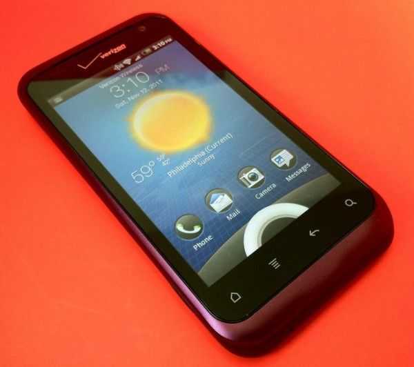
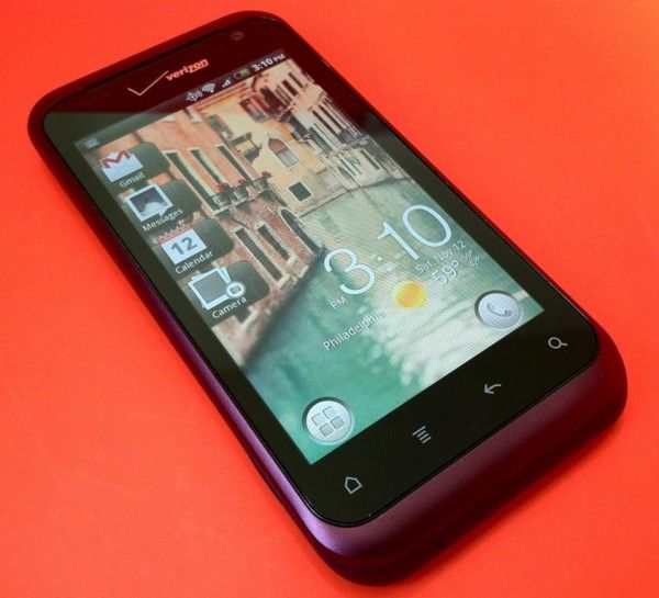
The HTC Rhyme is an attempt to incorporate a little feminine charm into a product that runs an operating system that is typically represented in products that are completely black, have sharp edges, and seem to shout, “THIS PHONE IS FOR GUYS!” Is a feminine touch enough to appeal to different demographics? Read on to find out.
Design
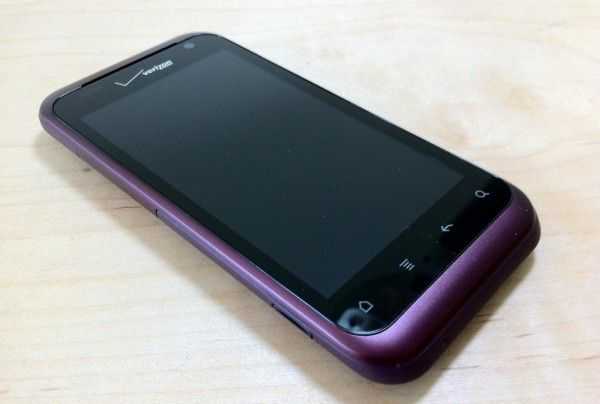
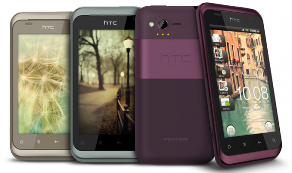
You’ve heard us say it before, and it’s about to be said again. HTC makes beautiful hardware. The Rhyme is no exception. Even though it is smooth and svelte, it’s also solid and lean. Materials feel high quality and the HTC Rhyme is nearly as thin as the iPhone 4S. The back of the phone is matte so you won’t often need to wipe it clean of fingerprints unlike some other glossy devices.
The back is indeed removable but the battery is not. Popping the trunk only offers you access to the MicroSD card slot which comes pre-installed with an 8GB card. The back casing of my review unit didn’t seem to go on quite right (you can see this in the first photo of the Hardware Tour), but I do believe this was a unit-specific issue.
The lock/power button could have a bit more click to it for my taste, but it is raised sufficiently so it’s easy to find. The volume-rocker actually has the opposite problem — it’s a bit flat so it can be hard to feel, but it clicks sufficiently.
For me, the size of the phone is very nice. The 3.7″ screen of the HTC Rhyme sits in the hand easily and can be operated sufficiently with just one hand without a bunch of shuffling, as required by many of the 4″+ screens on the market. Aside from the color, I wouldn’t say that there is anything outwardly “feminine” about the HTC Rhyme. The shape and design otherwise seems to be a perfectly neutral. Slap a different color on it, and I think plenty of men would be just as happy to use the phone as women. In fact, I did see some press photos of a champagne and light blue version of the Rhyme, but I’ve not seen those colors actually available for sale anywhere:
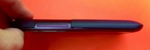
Hardware Tour
Right: Volume rocker
Top: 3.5mm headphone jack, mic, lock/power button
Left: MicroUSB slot (covered)
Bottom: Nada
Display
The HTC Rhyme’s 3.7″ screen is pleasantly vibrant and crisp. It’s rocking an 800×480 resolution, which doesn’t put it up there with some of the other insanely pixel-dense devices on the market, but the 3.7″ screen doesn’t quite necessitate it.
Viewing angles are top notch all the way around the screen, and auto-brightness does a good job of keeping the display at appropriate levels. Black-levels are typical for an LCD display, which means they’re pretty awful compared to AMOLED displays. Unless you regularly watch high quality movies on your phone, or you’re a photo buff, you probably won’t notice the poor black-levels.
Software
The HTC Rhyme comes installed with Android 2.3.4; HTC hasn’t yet said whether or not the phone will receive an update to Ice Cream Sandwich.
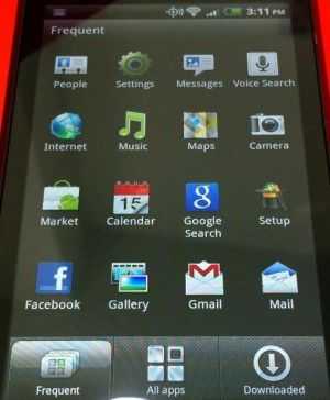
On top of Android is HTC Sense, a set of custom graphics and widgets that run throughout the system. Some people have grown fond of HTC Sense, but I’m sure there are an equal number of people who, like me, would rather not use Sense. Unfortunately, Sense cannot be disabled.
While Sense does add some widgets and other functionality to the HTC Rhyme, the proprietary nature of the skin means that you’ll end up waiting longer for Android updates, and might miss out on features until HTC decides to update Sense. For instance, let’s say that you like to go into your contacts page to see a friend’s Facebook status updates. Hypothetical: All is working well until one day Facebook adds some new feature that allows people to add short audio clips to their status updates — because that feature didn’t exist when your version of Sense shipped, the phone has no idea how to handle it, thus you cannot access the content (or post your own audio clips from Sense’s proprietary Facebook integration).
With the pace of updates and changes to our various social networks and other online services, trying to use software that is built into the firmware of the phone is just a pain, especially given the update track record of various Android phone manufacturers. Another example: even with the latest HTC Sense twitter client (which doesn’t exist as an app on your home screen but can be launched from a widget — totally confusing) still doesn’t support lists. Lists were added to twitter back in 2009.
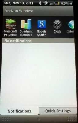
One of my biggest pet peeves for Android skins is when they waste space in the notification menu. When I pull down the notification menu, I want to be able to see as many of my notifications as possible, not scroll through them one by one. The more space wasted in the menu, the less notifications I can see without scrolling.
On the HTC Rhyme’s notification menu, there is the obligatory carrier branding at the very top which takes up at least one notification slot. Below that is a scrollable list of recently used applications which takes up at least one and a half notification slots; more annoying still because the user can pull up a list of recently used applications by simply holding the Home button. Why is redundant functionality wasting space in the notification menu? Further down, there are two tabs, one for notifications and one for “Quick Settings” which you can access to quickly toggle things like airplane mode, bluetooth, mobile hotspot, WiFi, and more (but annoyingly, not brightness). These tabs take up another half a notification slot, but at least they are useful.
After all that wasted space, you can only see four notifications instead of seven or so. I’d rather they trim all of this unnecessary fat from the notification menu and slap the Quick Settings options in the native recently-used applications menu (hold Home) which has ample free space.
Also, prepare to be badgered by your phone constantly as HTC Sense tries to link all of your contacts into unified contact cards. Any time you get a new Facebook, Twitter, or Email contact (and maybe a few other services), you’ll get a notification that HTC wants to link the service for that user to a contact card (this is done based on name matching apparently). So this way you can have one contact card for your friend John Smith and it’ll know what his Twitter and Facebook profiles are as well. The functionality would be appreciated by the power user, if implemented non-intrusively, but I can tell you that my father, brother, mother, sister, and the majority of my friends would absolutely not understand what all this “linking” business is, because HTC Sense does a terrible job of explaining exactly what it’s doing.
Even so, contact linking should happen in the background and be managed by the user when they see fit, rather than popping up a new notification every few days. As far as I’ve been able to find, there is no way to disable notifications about contact linking.
That’s not to say that Sense is all bad, there are a few nifty bits like the ability to see weather on your lock screen, but as far as I can tell, there is nothing added that couldn’t be added from the Android market; tying these ‘improvements’ to the firmware just brings along unnecessary disadvantages. The user should really not be locked into HTC Sense, the option to switch to vanilla Android would be a perfect compromise for both sides.
Performance
The HTC Rhyme’s 1GHz Qualcomm MSM8655 ought to be able to handle Android just fine, but Sense seems to bog the system down. List scrolling is surprisingly clunky and could definitely stand to be more smooth.
As with other HTC devices that I’ve tested, the HTC Rhyme’s Sense keyboard feels a bit bloated, but they have trimmed down on the space-wasting word suggestion pop-ups. More annoyingly, if you are a fast touchscreen typist, you can tap fast enough that the haptic feedback (vibration) won’t be able to keep up. From time to time you’ll get one vibration for two taps and it feels as though the keyboard isn’t keeping up when it actually is.
Minecraft Pocket Edition plays on the HTC Rhyme on fancy settings with no issues and no apparent lag.
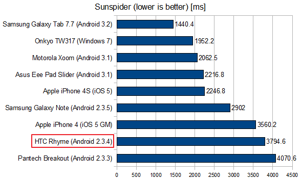
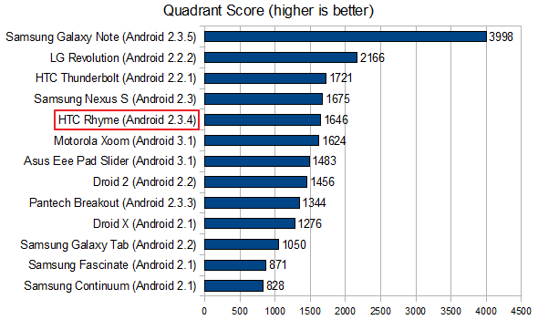
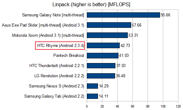
I’ve run the usual tests, and while the HTC Rhyme doesn’t appear to lag drastically behind similarly speced phones, I can tell you that it feels much slower because of how clunky Sense is. Between the browser and list scrolling (two things you are sure to be doing a lot of on a smartphone), there is much improvement to be desired.
Charm
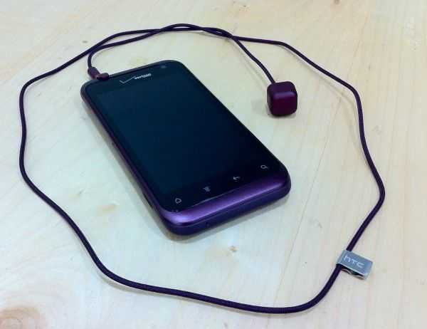
The ‘Charm’ that comes included with the HTC Rhyme is actually a very unique accessory. It is a little cube with an LED inside that lights up to give you alerts. The cube is about 1cm squared, plugs into the headphone jack, and glows purple.
Apparently, HTC sees women (or men, I suppose) dangling the charm out of their purse or handbag so that when their phone is buried deep inside they won’t miss calls or other events. While I don’t personally fancy a tote bag, I’ve spoken to two friends about the idea and they said they could absolutely see it being useful when it comes to wearing dresses without pockets and jeans that as so tight that they may as well not even have any.
Really neat idea, kudos to HTC for that, but the execution is poor. The only events that will make the cube glow are messages (SMS), incoming calls, and missed calls. Beyond this, the Charm may as well not exist.
Why they didn’t simply make the Charm an extension of the HTC Rhyme’s built-in notification LED, which can respond to a wider array of events (and is extendable), is beyond me. For this to be a seriously useful accessory, HTC needs to make the Charm’s triggers much more customizable. And why not offer some different options for how the Charm glows so that you can tell a missed phone call from a text message? Actually, saying that the charm ‘glows’ is misleading, it’s more of a sharp flash which is supposed to get your attention, but might get the attention of others as well.
Dock
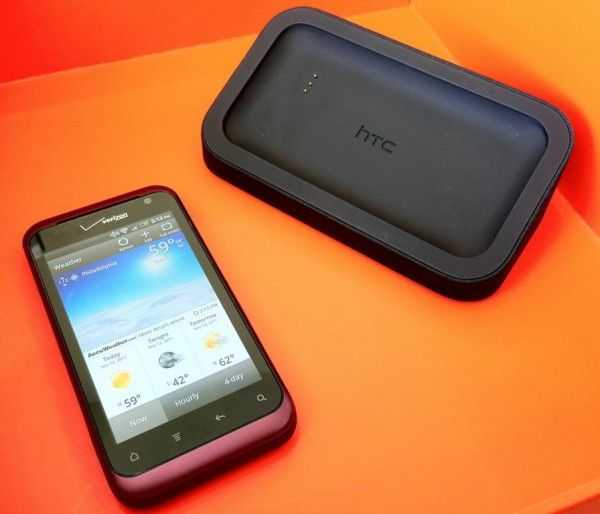
Also standard with the HTC Rhyme is a compact black dock. There are no ports on it except for a microUSB plug so that you can plug the unit into a charger. Once plugged in, you can drop in the HTC Rhyme to connect to the docks speakers, and there is some simple dock based functionality.
The dock will charge the phone thanks to three contact points that match up with those little circles on the back of the phone. The HTC Rhyme is held into the dock with magnets, but the process of actually putting the phone into the dock could be more satisfying. Instead of the magnets grabbing the phone and pulling it right into place, you have to put the phone down then slide it around to get it to fit in. If used as a simple charging dock at your bedside, the dock is a thoughtful inclusion.
However, HTC missed an opportunity by not kicking the dock up to the next level. First, the speakers are extremely weak. They aren’t much better than the HTC Rhyme’s built-in speakers; they are just a bit louder. If your only usage is an alarm, this shouldn’t be an issue, but for anyone who likes to listen to music as they sleep, or perhaps wake up to a podcast in the morning, a bit more oomph would have been appreciated.
Then there’s the actual software part of the dock’s functionality. When you put the HTC Rhyme in place, the dock will be detected, and you’ll get a simple ‘dock mode’, but the actual usefulness of the functions provided therein is very weak. You can see more detail about this in the video at the end of the review (start at 14:58 for dock functionality).
Camera
According to HTC, the 5MP camera on the HTC Rhyme is “best in class”; to some extent, I’m inclined to agree. I was impressed with its low-light performance. Most smartphone cameras tend to be lacking in the low-light-sensitivity department, so it is nice to see the HTC Rhyme perform about as well as the iPhone 4:
Macro shots were also quite impressive:

Despite the decent appearance of these photos, there’s an odd grainess to them as soon as you get up close (click to enlarge):
The grain is likely the result of aggressive photo optimization on the part of the phone. When snapping photos with the HTC Rhyme, you’ll notice that ‘what you see is what you get’. As soon as you press the capture button, the image will be captured exactly as it is on the screen. For a device that is destined to be used primarily as a point-and-shoot, this is exactly what you want, and it works well. For quick photos for social networks (even in somewhat low light), the HTC Rhyme’s camera should perform very well. However, due to the graininess, print quality photos these are not.
By default, the HTC Rhyme snaps photos with a 16:9 aspect ratio which is a bit weird considering that the standard is pretty much 4:3. Weirder still, this shape is achieved by reducing the resolution from 2592×1952 (4:3) to 2592×1552 (16:9). Why the default photos would be set to less than maximum resolution and a non-standard shape is, once again, beyond me.
Headphones
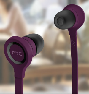
The HTC Rhyme comes with a pair of in-ear headphones that are designed to look like they might be of a similar quality to some other name-brand in-ear headphones (more on that in just a moment). The headphones have an inline control on their flat cable that lets you pause, fast forward, rewind, and change tracks. Despite the + and – icon on the buttons, I was unable to change the volume from the inline control.
These are truly in-ear headphones. Be sure to understand the difference between in-ear and earbud headphones. Earbud headphones (like those included with the iPhone) rest in the pinna (external) part of your ear. In-ear headphones stay in your ear by being crammed into your ear canal. Some people don’t seem to have issue with such headphones. Personally, I’ve never found in-ear headphones to be comfortable, nor do they seem to stay in my ears very well — with iPhone earbuds, I can quite literally dangle an attached iPhone from my ears with the headphones — with the headphones included with the HTC Rhyme, it seems like the slightest tug on the cord will pull the headphones free.
Three sizes of ear pieces are included with the headphones and I had to switch to the smallest pair get them to stay without falling out all together. Once the headphones are in, it seems hard to get them to both be in your ear an equal amount, which causes annoying uneven pressure on your ears. Just imagine stuffing ear plugs into your ears, it’s just like that.
In terms of quality, these are some of the worst headphones I’ve used. Don’t get me wrong, there are probably plenty of other horrible headphones out there that cost $0.99 to manufacturer that are far worse, but if we’re talking about headphones that are actually intended to be used for honest to goodness music listening, this pair is pretty bad. One of the problems with small headphones (earbuds and in-ear) is that it’s hard to create bass with such small speakers. HTC seems to have completely overcompensated for this — the headphones are actually quite bassy, but this comes at the cost of quality.
To my ears, it sounds like much of the midtones are unfaithfully recreated, and are instead throw into the bass spectrum. You might be able to toy with an equalizer to get them to sound better, but it seems like all the sounds are getting lumped toward the treble or bass end of the tonal spectrum, with little fidelity on the remaining mid tones. I found the same issue through both my computer and the HTC Rhyme itself. Even though Apple earbuds have significantly less bass, I would prefer them over the Rhyme’s headphones because they do a better job of representing all of the audio information. If you aren’t an audio person, let me use a metaphor: this is like the difference between being able to see your favorite painting with very vivid reds and violets, but all the colors in between are black and white, or being able to see the painting with all of the colors in tact, even if slightly less vibrant.
Conclusion
As seems to be the case with all HTC phones, the HTC Rhyme has impressive build-quality. The phone is sturdy and sleek. Unfortunately, coloring a phone purple and including a few neat but flawed accessories does not cut it if HTC is really hoping to attract a more feminine demographic. The issue actually lies less with the color or the accessories, but more with the phone’s software.
The changes HTC has made with Sense don’t make the phone any easier to use — just different. Not to say that there aren’t tech savvy women out there, but I think we can agree that they are less common than tech savvy men. If HTC really wants to appeal to that demographic, the phone is going to need to offer a smoother and easier user experience — something non-techies from both genders would benefit from.
Unboxing and Overview Video

Nokia: More Relevant in the US Than Ever (Maybe)
Posted on 04 November 2011
 Nokia has only been relevant for me once in my smartphone life, and that was when I was overseas. Since returning stateside, I have not given Nokia news more than a miniscule glance as I pore over the day’s tech reports. In fact, I have not honestly cared about a Nokia phone release since the mid-90s, when they were one of the top name brands in the US. Until this year that is. Nokia has become relevant again, although not quite in the way that you might think. And while their partnership with Microsoft may be doing a little-bit to correct their sky-diving financial position, I question whether Redmond is doing the best thing overall for increased adoption of Windows Phone.
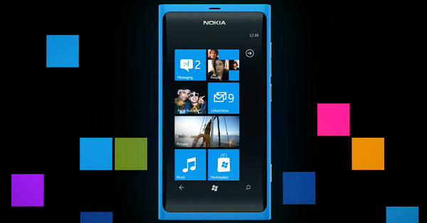 Before we continue on with the editorial, let’s hit some of the facts of the last week’s announcements. At Nokia World 2011, Nokia introduced two phones that are expected to eventually make their way to US carriers. They are the Nokia Lumia 800 and 710. The latter has a 3.7 inch display with a resolution of 480×800, a 5MP camera that can shoot 720p video, weighs in at 4.4 ounces, has 8GB of flash storage, 512MB of RAM, runs on the Qualcomm MSM8255 chip, which is a 1.4GHz single-core CPU, and communicates on GSM bands.
The Lumia 800 also has a 3.7 inch display, a high resolution 8MP camera, weighs in at 5 ounces, has the same 480×800 resolution on an AMOLED display with Gorilla Glass, 16GB of storage and 512MB of RAM, and an identical processor…in fact, much between the two phones is identical.
Back to the editorial. There are a few things I see as positive about Nokia-Soft’s announcements. Kudos to them for getting the product out on time. We did not need another smartphone-delay storyline to track across months of PR apologies. And the big thing? People are talking about Nokia again, and not only in negative terms. At least not entirely.
Nokia needed to hit one of the park last week at Nokia World, but there are a few areas where these announcements fall well short of that. The announcement of these two phones, to me, is more like a “we’re still hanging in there inch level of effort. It feels very analogous to the Palm Pre release, which offered some compelling potential. But from the announcement of the Pre through the first several months up to release, I felt like I was watching a once great boxer taking jabs in the ring, wobbling, unable to put his hands up and protect himself, but still able to remain standing and even dodging a jab from time to time. But I knew that the other guy was eventually going to land a haymaker that the former champ would just not be able to take.
I get the same sense from the Nokia announcements last week. Maybe the better analogy would be watching a once great boxer through the last few bouts of their career. They keep losing, but in each bout there is a round or a few moments when you think they are on the road back, before they finally succumb each time. While the Lumia product line shows promise, and seems to offer a steady, work-horse level device, neither of the two devices are game-changers. Nokia is in the same position that Android tablet-makers are. They cannot afford to bring a device or devices that are within arm’s reach of the current benchmark products, and offer them at the same price. While there is no pricing information on either of the Lumia devices, I cannot see them being offered at less than $199 and $149 price points for the 800 and the 710 respectively. I believe this based on the pricing of Nokia’s handsets in the past within North America, and the fact that, for some reason, they have struggled to land on carriers with subsidized prices. The Nokia Astound debuted back in April on T-Mobile at one of the most affordable release prices for a Nokia smartphone in North America ever — $79.99. But I do not see Nokia being able to match that pricing for either one of these phones. If they come out at or near the same $199 price point as many premium Android handsets or the $199 iPhone 4S model, when the Nokia phones do not have front-facing cameras or equally high resolution screens, their ability to compete will be sorely lacking.
If Nokia can get the Lumia 710 down to a $99 price point, and slug it out against low-end Android phones, then maybe this maneuver has a chance of gaining traction. As for the Lumia 800, I expect it to come out at $199, and likely on T-Mobile as I do not see AT&T having a lot of interest in this device. So it will go to the smallest of the big four US carriers. But it will also be on the one carrier that does not have the iPhone, so for its current customers who enter the market for a new phone, it could very well be a viable choice. I was on an HTC HD7 on T-Mobile at the beginning of the year and was very happy with that selection. But right now, the only thing Microsoft seems to be touting as the differentiating, breakout feature of Windows Phone is Xbox Live integration [ed. note: that integration is majorly lacking and painfully bolted-on]. This was a nice hook at the beginning of the year, but the Xbox is six years old now, and even as a gaming platform, its pre-eminence as being a new place to go is not as shiny as it once was. As for hardware, Nokia phones have always been appealing to photo buffs for their excellent cameras. But great photos and Xbox Live are not enough to bring Nokia back to relevance in the US.
Overall, this does not feel like the mass offensive that it needed to be. Nothing out of this announcement was anything that was not entirely predictable. At the end of the day, it feels like less than what Nokia needed to do to right its burning platform. These are not devices that will save Nokia’s bacon. Nor is it indicative of a strategy that shows a glimmer of things to come that will make sweeping changes in Nokia’s business position within the market. Nokia seems to have generated much more buzz about their one-off Meego phone, the Nokia N9, than their just-announced Lumina series (though it may still be too early to call).
While falling short of what is needed, I also felt like Microsoft and Nokia weakened Microsoft’s position with its other hardware partners. If I were HTC or Samsung, I would have had sharp words the following day over the use of statements that proclaimed the Lumia line as the “first real Windows Phone(s)”. The hardware manufacturers that stepped out with Microsoft for the launch of Windows Phone, at very high risk to their own earnings, should not have suffered the suggestion that their efforts and their hardware designs were of little value. While not all CEO’s make decisions out of spite, I think the Microsoft and Nokia statements would have at least caused me to ask my CFO for the most recent accounting statements on my Windows Phone product line to evaluate how much value-adding it was really providing.
Microsoft took a risk when it migrated its smartphone strategy away from an Enterprise-focus to a consumer-centric one. Without the old corporate in-roads to lean on, they now have to compete in the same arena with the same rule-set as the iPhone and Android products. I do not see the Lumia has being a huge crowbar in that battle. I like Windows Phone, and would not have a problem selecting it as one my next devices. But I still do not see the operating system, the ecosystem, or the new Nokia devices as converging recommendations that I would give to non-techy customers looking for advice on their next smartphone, or first-time smartphone buyers. It is not clear to me where Microsoft and Nokia are heading in terms of starting an offensive that will lead to all of this increased market-share that so many analysts are claiming Windows Phone will achieve in 2014/2015.
The Lumia devices appear to be beautiful hardware, and I thoroughly enjoy Windows Phone 7 when I use it. But this is about what Microsoft and Nokia are doing to convince the consumer population that is not already on their side that the Nokia devices are viable and competitive alternatives to the iPhone and premium Android devices. Based on last week’s event, I am having a hard time convincing myself that the two companies have done enough. This smells very much like the Palm Pre launch (except for fact that Nokia’s phones appear to be arriving on time as promised). Microsoft and Nokia will need to come in at lower price points than the competition, and quickly get to offering compelling, differentiated features and offer unique service partnerships to compete against Apple and Google. Seeing as how it appears that they have missed those targets within this window of opportunity, I am not sure when they can pull this trifecta off before suffering that aforementioned haymaker that could be in the works. An iPhone 5 announcement in the spring, or arrival en masse of Ice Cream Sandwich phones could quickly push Nokia off the stage of relevance if they and Microsoft cannot push some major offensive in the interim. Oh, yeah, and after scoffing at everyone else’s Windows Phone devices, I would not expect help to arrive from the camps of HTC and Samsung anytime soon.
Huawei MediaPad 7" Honeycomb Tablet Hands-on
Posted on 21 October 2011
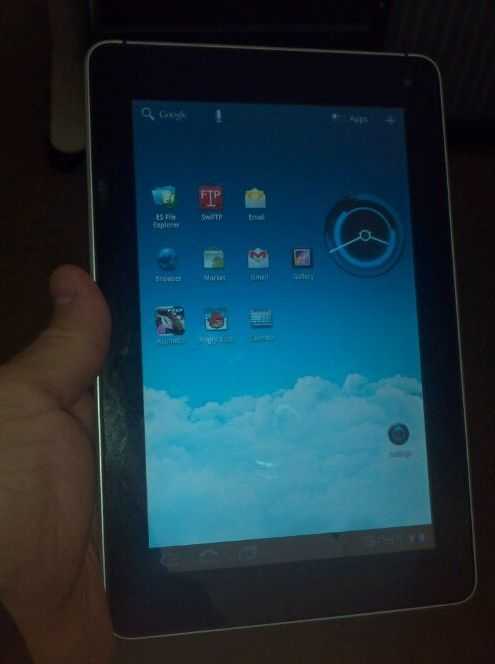
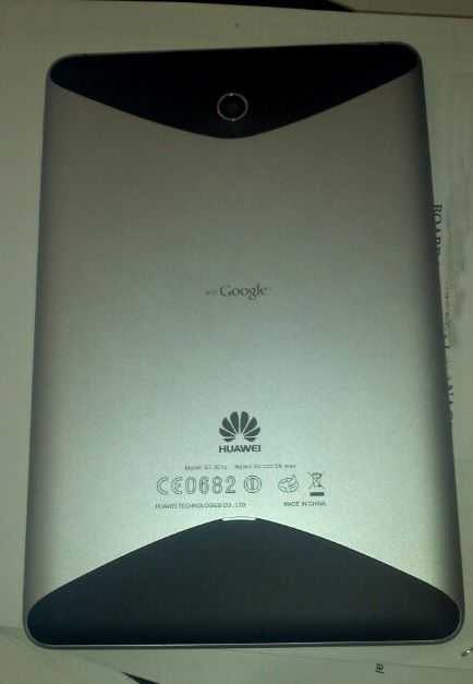
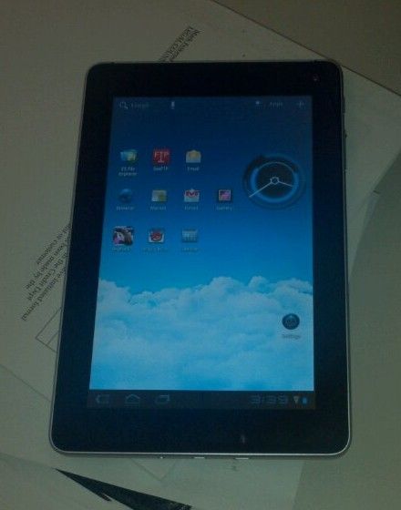
I managed to get a Huawei Mediapad for a few weeks to trial. I only managed to get a few hours in with the device today and snap off a couple of low res pictures from my phone but I’ll follow up with an in-depth overview and some high quality photos in a few days. In the meantime if you have any tests you want me to run on the Huawei MediaPad leave a comment and I’ll see what I can do.
Before I give you a few quick thoughts, you can find full specs at the Huawei MediaPad tracking page in our mobile device database.
I compared it to an iPad 2 and like the Galaxy Tab found it to be roughly half the size of the Apple unit. The unit is pocketable, just, but cargo pant-pocketable none the less.
The screen is great — sharp, bright, and very responsive. The device itself is nicely built and feels solid in the hand. The Huawei MediaPad is heavier than the Galaxy Tab but it feels like the same form factor so if you are happy with the size and feel of the Galaxy Tab you’ll likely be happy with the MediaPad too.
I don’t have a lot of apps installed yet and not a lot of media on it to slow it down but I was pleasantly surprised by how fast it is. Everything is snappy and very responsive. Apps open fast, media plays almost instantly and overall the processor doesn’t seem to struggle with anything.
If the pricing comes in at the right level, I think this device will sell very well.
Chippy is also looking forward to the Huawei MediaPad, and is actually considering trading up his much-used and loved Galaxy Tab for it. Though the tab has treated him well for over a year, Chippy says that he’s overdue for the benefits of Honeycomb in a 7″ form-factor. The upcoming dual-core Galaxy Tab Plus is likely to be a potent competitor to the Huawei MediaPad, especially when it comes to availability.

Huawei MediaPad 7″ Honeycomb Tablet Hands-on
Posted on 21 October 2011
I managed to get a Huawei Mediapad for a few weeks to trial. I only managed to get a few hours in with the device today and snap off a couple of low res pictures from my phone but I’ll follow up with an in-depth overview and some high quality photos in a few days. In the meantime if you have any tests you want me to run on the Huawei MediaPad leave a comment and I’ll see what I can do.
Before I give you a few quick thoughts, you can find full specs at the Huawei MediaPad tracking page in our mobile device database.
I compared it to an iPad 2 and like the Galaxy Tab found it to be roughly half the size of the Apple unit. The unit is pocketable, just, but cargo pant-pocketable none the less.
The screen is great — sharp, bright, and very responsive. The device itself is nicely built and feels solid in the hand. The Huawei MediaPad is heavier than the Galaxy Tab but it feels like the same form factor so if you are happy with the size and feel of the Galaxy Tab you’ll likely be happy with the MediaPad too.
I don’t have a lot of apps installed yet and not a lot of media on it to slow it down but I was pleasantly surprised by how fast it is. Everything is snappy and very responsive. Apps open fast, media plays almost instantly and overall the processor doesn’t seem to struggle with anything.
If the pricing comes in at the right level, I think this device will sell very well.

How Apple’s Siri Just Stole Voice Control From Android
Posted on 05 October 2011
 No doubt you’ve already heard of Siri, the voice control software that Apple is launching with the iPhone 4S. If you are late to the part, recap here.
Apple is billing Siri not as “voice-control” but as a personal assistant that will perform tasks for you. The press is already lauding its impressive functionality. But how has Apple managed to make such a big splash over a feature that Android has had for some time now?
To start, marketing has a lot to do with it. While Android bills voice-control (VC)l as just that — a way to control your phone with your voice — Apple promotes Siri as an entity that will help you get things done. Apple has given their iOS voice control a person’s name. Simply by calling it “Siri” (notice how Apple — and thus the press — always spell it as though it’s a proper noun), Apple has immediately made it more personal and more human — you’ll see the word ‘assistant’ thrown around a lot in stories about Siri (not excluding this one). Even if the abilities of Siri and Android’s VC were identical, Siri would become the colloquialism for voice-control on a phone, the same way that mainstreamers, who don’t know the difference, call any digital audio player an iPod.
That’s if the abilities of Siri and Android’s VC were the same. At a base level, there’s no fundamental difference between Siri and Android VC, both convert sound into meaning and perform some function based on what you’ve said. But Siri feels more human because of the breadth of its understanding. [See there I go, talking about Siri as if it were an entity and not a thing. Touché, Apple]. Siri will see high usage because the user doesn’t need to look through a list of things they are allowed to say, or pay attention to the order that they need to be said. Apple has ensured that Siri can understand such a range of input that there’s no need to think first about what you are asking it. Again, this makes Siri far more human than Android VC; you speak to Siri like a person, with no need to pause to formulate your question in a special computer-readable way. This means that there is a highly likelyhood that anyone who hasn’t used Siri before could ask it a question and get a good response, making it inherently more intuitive than Android VC. That’s the goal anyway.
Once Apple frees Siri from it’s iPhone 4S jail (either on to older, or newer devices), expect it to become a household name, and expect lots of existing voice-control software to be ‘reborn’ with human names.
 |
| |||
 |
| |||
 |
| |||
 |
| |||
 |
| |||
 |
| |||
 |
| |||
 |
| |||
 |
| |||
 |
|


