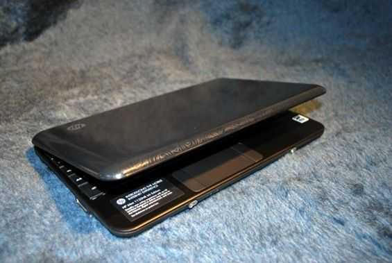
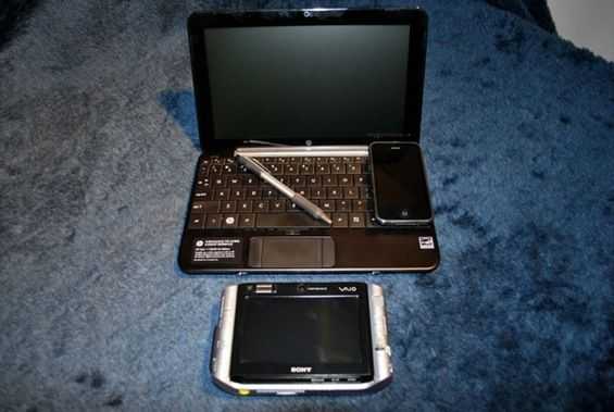
I’ve been using the HP Mini for several days now and I wanted to give my initial impressions of the custom Ubuntu interface that HP is calling the Mobile Internet Experience. As I explained in another post HP designed the interface with the idea that less tech savvy consumers want to do three main tasks on their computer: browsing, communication, and entertainment. What I’m going to call the ‘home screen’ of the Mini 1000 MIE is really like the desktop of a machine running XP. You can’t minimize or close this area, it is the base level of the interface.
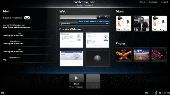
The interface is split in to three distinct regions. One for email (communication), one for internet (browsing), and one for music and photos (entertainment). Have a look at the home screen below:

The interface is visually appealing, there is good graphic design here. But how does it function? Well I guess you could say it is easy enough to reach these three functions, but if this isn’t how you want your home screen set up, that is too bad. The only customization options you really have is to change the four Favorite Websites which are just shortcuts to, you guessed it, your favorite websites. Right-click on one of these four boxes to adjust them. I wish that there were titles above each website thumbnail. If you enlarge the picture you can probably see that the Google Calendar and Google Reader thumbnails look very similar; it is hard to tell them apart from the thumbnail alone.
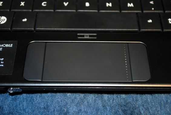
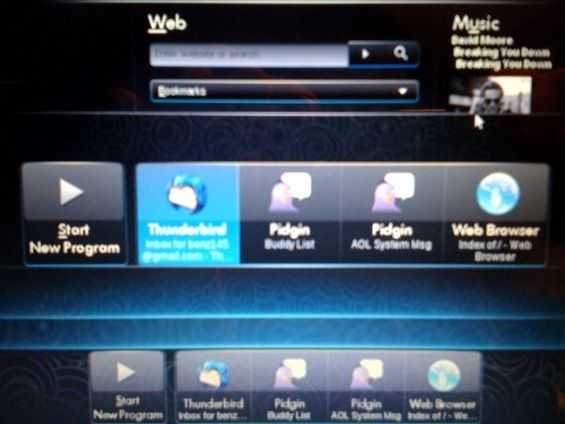
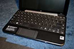
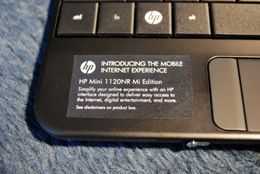
There is some good use of the buttons that normally consist of a Windows logo on most keyboards. The left key has an HP logo, and pressing it will take you right back to the home screen. The right logo key has a square of arrows, pressing this key will bring up an alt+tab style app switcher, which you can also use to get to the new app launcher. Both of these are beneficial when it comes to navigating around the computer’s interface, and I use them frequently, unlike the Windows logo key on Windows machines.

Sorry for the low res picture here; screenshot utility on the Mini 1000 MIE wouldn’t let me take a shot while the app switcher was up.
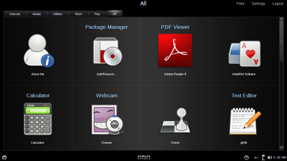
This isn’t all that the computer lets you do though. Hit the Start New Program button toward the bottom center of the screen to open a launcher that will let you peruse the rest of the applications on the computer.

I’m going to list all of the applications for you here because HP only lets you install programs from a list that they approve. So if you aren’t familiar with Linux, this is likely all you’ll be able to get on the Mini 1000 MIE. Not to imply that there isn’t a pretty good selection of applications here however. When I talked to HP they mentioned that they limited apps like this so that the less tech savvy consumer couldn’t accidentally install software that might cause issues on their computer (like crashing, or errors). Which means that they want to keep the quality of the computing experience high. I’m also leaving this here as a reference for people who might be searching online for which applications come with the computer. Note: I installed all the apps available to me by through the Package Manager program. The left column is the main name of the app, and the right is the descriptor underneath. For those that didn’t have a descriptor, I left the space blank. I listed the programs as they appear under sections in the launcher.
Internet —
| Internet |
Firefox |
| E-mail |
Thunderbird |
| Instant Messenger |
Pidgin |
| Video Calling |
Skype |
Media —
| Photos, Music, & Video |
HP MediaStyle (Powered by Elisa) |
| Webcam |
Cheese |
| Sound Recorder |
|
| Photo Viewer |
Eye of Gnome |
| Photo Manager |
F-Spot Photo Manager |
| Disc Burning Application |
Brasero Disc Burning |
| DVD Player |
LinDVD |
| Snap Fish |
|
Utilities —
| Calculator |
|
| Text Editor |
gEdit |
| File Manager |
Nautilus |
| Info |
About Me |
| Package Manager |
Add/Remove |
| Time Utility |
Time and Date |
| Software Updates |
Update Manager |
| Prince Management |
HP Device Manager |
Work —
| Word Processory |
OpenOffice Writer |
| Spreadsheet |
OpenOffice Calc |
| Presentations |
OpenOffice Impress |
| Drawing |
OpenOffice Draw |
| Calendar |
Sunbird |
| PDF Viewer |
Adobe Reader 8 |
| E-Book Reader |
FBReader |
Play —
| AisleRiot Solitar |
| Blackjack |
| Chess |
| Five or More |
| Four-in-a-Row |
| FreeCell Solitar |
| Gnometris |
| Iagno |
| Klotski |
| Mahjongg |
| Mines |
| Nibbles |
| Robots |
| Sudoku |
Luckily HP was smart enough to make sure that the OpenOffice suite was in there which means people can do serious office productivity work without having to use a Windows machine, but at the same time they can ensure compatibility with other operating systems. OpenOffice, for those of you who don’t know, is a free, open source, multi-platform office suite, which can be used to create and edit many common productivity files, like those from Microsoft Office (think Word, Excel, PowerPoint) etc.). Without a powerful suite like this to help boost productivity of some of the most basic computing tasks, the Mini 1000 MIE couldn’t be a serious productivity tool.
While the interface does look good while it is standing still, I’m actually not very impressed with it when things are actually happening on-screen. There are some rendering issues. Very frequently I will click to launch an app, or pull up a dialogue window, and I will see the frame of the window load first, quickly followed by the contents. The opposite will occur while closing some windows. The content will disappear and then the main window space will disappear a moment later. In action, it doesn’t look very clean, and it seems unfinished. It seems like there is lots of popping of windows and borders which does not appeal to the eye. Though this probably isn’t an indicator of performance, it does have the effect of making it look like the computer is running more slowly. There are a few things that could be causing this. It could be a hardware issue or the OS itself.
That’s all I will share with you for my initial impressions, but stay tuned to hear about my hardware impressions, and to eventually see what I think about both after an extended testing period.
See the HP Mini 1000 MIE coverage roadmap.


