umpcportal home

Tag Archive | "Opinion"

Microsoft, Make These Changes to WP7, and I'll Switch from iOS and Recommend That Others Follow


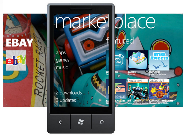
I’ve spent the last several days with the HTC Titan, a WP7 phone with a zippy 1.5GHz CPU and a huge 4.7″ screen. I’ve been keeping a running list of areas where WP7 is lacking, or places where they could push it to really excel. If these things were fixed, I would switch from iOS (which I’ve chosen to use for my last 3 phones) to Windows Phone 7 and recommend that others follow. And just so it is clear, all information in this article pertains to Windows Phone 7.5, AKA Mango.

To start, I want to point out that I’m extremely impressed with WP7. This is one of Microsoft’s biggest consumer facing undertakings in the last few years, and I see massive potential in the OS. WP7 is beautiful and unique. I’d call it the best looking OS on the market today, hands down. It makes Android and iOS feel like they were designed in a veritable stone age of mobile OS design.

dosage for flagyl

Most unfortunately, it’s lacking in a number of vital areas. A friend asked me what I thought of WP7 the other day. Because he isn’t a tech-geek like myself, I used a metaphor. I told him to imagine the most attractive sports car he’d ever seen. With the car come a few caveats: the steering wheel sucks and it doesn’t have any tires. Although my choice of steering wheel and tires weren’t supposed to represent specific issues with the iOS (but rather say: it’s missing stuff), looking back now perhaps mentioning the tires was a good choice, after all, the OS is lacking traction.

If I didn’t think WP7 had tremendous potential, I wouldn’t be wasting my time or yours with this article. But I truthfully think that WP7 has something special going for it. Microsoft just needs to hone it and push it hard. My hope is that this list gives them a good place to start:

The List

  • Core Social Applications — Facebook, Twitter, and Google Plus, are necessary to offer the majority of users access to their preferred social networks. Even more if you hope to include everyone. Official Facebook and Twitter applications exist,  and while they look nice, the functionality is quite weak. Facebook has hardly any native support for the things that users actually do within it. You’ll find that you are constantly getting kicked out of the app and into the browser to a mobile site, and half the time you’ll be met with a frustrating error message once you arrive there. Both Facebook and Twitter suffer greatly from the fact that notifications in WP7 are poorly implemented. Google Plus doesn’t exist as an app on the app Marketplace, and the browser doesn’t support the most modern version of the Google Plus web app, instead dropping you back to a version that would likely still be supported by my Palm OS running Sony Clie UX50.
  • Multi-calendar Support through Gmail — This is simply frustrating. You have the option to configure a Google account directly in WP7, and you can select if you want to sync calendars, contacts, and email when you create it. This makes the user believe that all of these things are fully supported, but there is no indication that there is no support for sub-calendars in Google calendar. If you are a serious Google Calendar user, you likely have a number of sub-calendars under your main calendar for better organization. Unfortunately, only the main calendar will sync over, so if rely on sub-calendars, you are out of luck.
  • Notification System — It is claimed that WP7 has notifications. Evidence of these notifications, however, are completely absent. I’ve spent nearly a week very close to WP7 with Facebook, Twitter, and Email accounts configured on the device, and I’ve not seen one single notification unless I explicitly look at the Me hub (more on that below). I actually had my iPhone sitting next to the HTC Titan and was using the iPhone as a notification system to decide when to check the Titan; this was almost comical!
  • Expand the ‘Me’ Section — The ‘Me’ section of WP7 would be the notification center of the OS, if notifications actually existed. This brings together your notifications into one place and let’s you interact with them. Between iOS, Android, and WP7, the Me hub is the only native system that I would actually consider using, but it needs a lot of work and it will require maintenance. The promise of the Me section is to bring your life into one place. The Me hub is unique beyond Apple’s Notification Center and Android’s Notification Menu because instead of dishing you out to other apps, you can interact directly with the notifications. For twitter mentions, you can send a reply, and for Facebook posts, you can comment, like, etc.. This is really awesome, but it needs deep support if people are actually going to use it. At the moment, it really only consists of Twitter and Facebook. Why email isn’t included is beyond me. When I wake up in the morning, I grab my phone to see what I’ve missed. Usually there are a few texts, emails, and some social network notifications. These should all go into the Me section so I can see everything at a glance, and respond to them if needed, without jumping out to other apps and becoming distracted by noise within. In order for the Me section to prosper, it needs support for a greater number of social networks, needs to (optionally) wrap in email, and it needs to be on it’s toes about updates. I will always use a first-party or third-party app over OS=level implementations if the OS level implementation lacks support for the stuff that I actually want to do (like posting to a Facebook group, or including a photo in a tweet). When new social network features come about, users are not going to wait 6 months or a year for the OS to be updated to support them, instead they are going to leave for a readily available app. Keeping the Me section on its toes could be done in two ways: 1) having an internal team dedicated to making sure that every way that a user might want to interact with a notification is covered. This will require the ability to do automatic OTA delta-updates. 2) alternatively, make the Me hub completely developer driven by allowing applications to push info into it. This way, you’ll never end up with broken or missing functionality, because once the app gets updated, its interaction with the Me hub will be updated as well. The Me hub also needs to alert the user that there are new notifications from the lock screen. Currently, an unread email count is the only info you get on the lock screen with regards to notifications.
  • Skype — Microsoft owns Skype and yet it is on every major mobile OS (yes even WebOS) except for WP7. Do I need to say any more?
  • Quick Jump to Top and Bottom of Start Screen — Because of the design of the Start screen can cause it to get rather long, there needs to be a way to quickly jump to the bottom. Currently, you can tap the Start button while on the Start screen to jump to the top of the list, but there is no way to quickly get to the bottom. If you are at the very top of the Start screen, the Start button should send you to the bottom of the screen and vice-versa.
  • Next/Last Input Field Navigation — When entering text into a text field in the web browser, it can sometimes be difficult to select the next input field because it has the tendency to get cut off by the keyboard (which has a hit-zone that expands beyond where the keyboard stops visually). This means that you see a sliver of the next text box and try to tap it, but end up pressing a key instead. Having buttons to navigate between input fields (like on iOS) would be very useful.
  • Faster Access to Tabs in Web Browser — I don’t think any serious computer user has used Android and asked, “Why is it so annoying to manage browser tabs?”. WP7 is making the same mistake. Getting to the tab menu in the browser requires that you pull up the URL bar, tap the tab button, then make another input to close, select, or create a new tab. This is too many taps to get to tabs and the result is that tabs become underused and the person using the browser uses it less efficiently than they should be able to. Improving interaction with tabs in the browser quickly and easily increases the productivity of those using it; they will thank you.
  • Better Standards Support in Browser — It seems that Internet Explorer will never be able to shake free from the chains of its past. Yes, I said it: standards support in IE on WP7 sucks, and that’s not surprising to anyone. Between WebOS, Android, iOS, and WP7, I bet you can guess which one scores the lowest on the HTML5 test. Having weak standards support means that when you don’t have native apps (and let’s be honest, this is a problem for WP7 right now), at least users can fall back to modern web apps which are usually a decent replacement. Unfortunately, because of the lack of standards support and a useragent that no one seems to care about, users get stuck with simplistic web offerings. Having a browser that works as expected is also tied to the confidence you have when using it. If I want to buy concert tickets through some no-name website through iOS, I’d put my money on it working with no problem. With IE on WP7, I’d bet against the process going smoothly. I want to have confidence that I can do anything on my mobile browser (within reason) that I’d be able to do on my desktop browser. IE on WP7 does not give me that confidence. Just for reference, here’s the current HTML5 test tally for modern mobile browsers:
  • Open in Background Tab — In addition to making tab interaction faster, there really needs to be a way to open a link in a background tab. Unless you have the attention span of a hyperactive child, you probably choose to read information online while opening relevant links in the background to check through after you finish the current material. Opening in the foreground is just distracting and forces the user to navigate back to the original tab.
  • Global Landscape Support — Windows Phone 7 has the most responsive and best looking transition from landscape to portrait of any mobile OS. Show it off! Landscape support is a scarcity throughout the OS. At very least, the multitasking menu needs landscape support so that when you pull it up from one of the few apps that do support landscape, it is oriented the right way.
  • Deeper Live Tile Functionality — I think Live Tiles are a great idea, but they aren’t being used often by developers. Where they are used is often for eye-candy rather than functionality (like the People hub which flips through a bunch of photos that are too small to really see). Talk to developers and find out what tools they need to best use Live Tiles, and encourage them to make use of this unique functionality!
  • Expand Pin to Start and XBL Friends List— Pin to start is another great idea. On iOS, there are specific albums that I love to listen to, but every time I want to play them, I have to launch the Music app and navigate through some menus to find them. In WP7, I can ‘pin’ these directly to the home screen and play them with a single tap, which is awesome. I want to see more of this. Specifically, you need to allow Xbox Live users to pin their friends list to the start screen, and then, using Live Tiles, you should be able to see how many friends are online. Invites, messages, and friend requests from XBL friends should probably end up in the Me hub, but I think a case could be made for leaving them in the XBL hub.
  • Change Accent Color Automatically — The accent color (configurable in the Settings app) is a cool way to spice up your phone, but it’s bothersome to change manually. There should be an option to have the accent color change by the day, week, or month. This way, instead of finally deciding, “I’m bored with this color,” and then finally changing it manually, you can be surprised by a new color on a new day, week, etc.
  • Use LED Light for Notifications — The HTC Titan has an LED on it which does nothing more than indicate charge status. This should be tied into the Notification System, should one ever actually exist.
  • Quick-scroll to Top of Page — Some webpages are long (like Wikipedia articles), this is a fact of life. Please find a way to allow the user to jump to the top of the page quickly because that’s where most websites’ navigational elements are found.
  • Folders — I understand that ‘folders’ might feel outdated; call them Magnets if you must make them sound as trendy as the rest of the OS looks, but they are necessary on the start screen regardless. I know the folks responsible for WP7 can think of a beautiful way to display folders to the user on the Start screen. Make it happen, otherwise my Start screen is going to end up being 5 miles long. Additionally, newly installed apps should be highlighted on the app list, instead of making you hunt them down through their alphabetic sorting. Offer pin-to-start at app install so that the user can skip the step of installing, finding in the list, then pinning.
  • Hire the people From Lazy Worm to Make Your YouTube app — or license their existing app and include it with all windows phone 7 devices. This is the one dev I’ve seen that’s making full use of Live Tiles and Pin to Start functionality, check out this video demo of his upcoming Metrotube app which lets you pin your favorite YouTube subscriptions and see when they are updated through the Live Tile.
  • Faster way to Return to Root of App — When you are 5 menus deep within an app, it’s annoying to press the back button 5 times in order to return to the top level of the app. There needs to be a way to jump to the top level in just one press or gesture. Pressing at the heading of the app might be an option, or perhaps a pull down gesture might do the trick.

And that’s what I’ve compiled over just several days of using Windows Phone 7.5 Mango, there will certainly be more to come. I submit this as an earnest list of what I hope Microsoft can fix and improve with WP7. The OS has massive potential, and I would like to be able to call myself a WP7 convert, and confidently tell others to follow me, but there is work to be done by Microsoft before that will happen.
Have anything to add to the list? Please drop a comment!

Vote for Your Favorite Ultrabook


imageimageimageimageimage

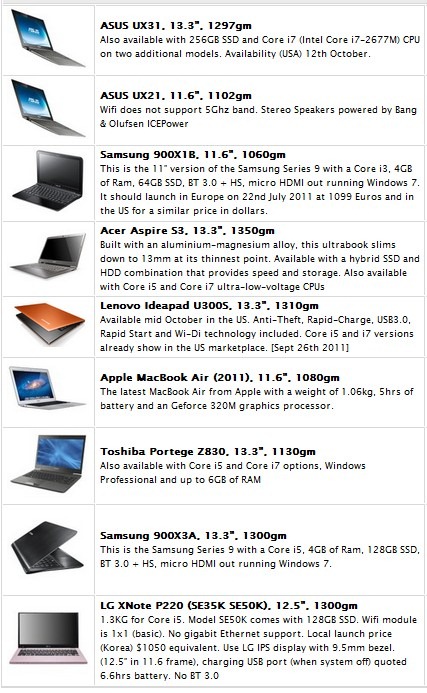
From left-to-right click for information on the
Acer Aspire S3, Lenovo U300S, Toshiba Z830, Asus UX21, Asus UX31.


Update: Now that the HP Folio is in the running, this poll has been closed. Results are below.

Over the last week there’s been an excellent discussion going on here at Ultrabooknews. We’ve talked about the argument against Ultrabook, the argument for buying an Ultrabook, discussed some specific solutions and issues and we’ve even seen some of you pushing the button on a purchase. Finally, the first review of the last of the first round of Ultrabooks is in so there are now independent reference points for all of them. I want to thank you all for your input in the comments so far. Keep it going!

On the right-hand column here on the desktop version of Ultrabooknews.com (scroll down a bit!) you’ll see a list of Ultrabooks. [If you’re viewing the mobile site, view the list here.] From day one I’ve been tracking views of the pages and each day the list gets re-ordered with the most popular device (over the last 7 days) showing at the top. It gives you an idea about what devices are most popular but for a second data point, I think it’s a good time to take a poll.


Poll : Which is your favorite Ultrabook?

Feel free to add comments below and let others get the benefit from your thoughts – whatever they are.

[poll id=”2″]

For more information on all of the Ultrabooks (and some of the alternatives) see the product database. Specification also available via the images above.

Discussion: Which Ultrabook? Why?


image

I’ve just pushed the button on a Toshiba Z830 Ultrabook which might be here next week (although I suspect the 7th Nov delivery date is not going to be honoured.) I went for the Toshiba Z830 because I think it’s going to be the best for me. It’s very light, has the full size SD card slot I require for my photo and video work, a promising battery life and upgradeable SSD and memory. I’ve ordered a 4GB Core i5 model, the Z830-10J, for €999 in Germany.

Continued below. . .

Read the full story

Nokia: More Relevant in the US Than Ever (Maybe)


Nokia has only been relevant for me once in my smartphone life, and that was when I was overseas. Since returning stateside, I have not given Nokia news more than a miniscule glance as I pore over the day’s tech reports. In fact, I have not honestly cared about a Nokia phone release since the mid-90s, when they were one of the top name brands in the US. Until this year that is. Nokia has become relevant again, although not quite in the way that you might think. And while their partnership with Microsoft may be doing a little-bit to correct their sky-diving financial position, I question whether Redmond is doing the best thing overall for increased adoption of Windows Phone.

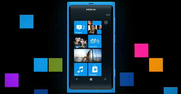
Before we continue on with the editorial, let’s hit some of the facts of the last week’s announcements. At Nokia World 2011, Nokia introduced two phones that are expected to eventually make their way to US carriers. They are the Nokia Lumia 800 and 710. The latter has a 3.7 inch display with a resolution of 480×800, a 5MP camera that can shoot 720p video, weighs in at 4.4 ounces, has 8GB of flash storage, 512MB of RAM, runs on the Qualcomm MSM8255 chip, which is a 1.4GHz single-core CPU, and communicates on GSM bands.

The Lumia 800 also has a 3.7 inch display, a high resolution 8MP camera, weighs in at 5 ounces, has the same 480×800 resolution on an AMOLED display with Gorilla Glass, 16GB of storage and 512MB of RAM, and an identical processor…in fact, much between the two phones is identical.

Back to the editorial. There are a few things I see as positive about Nokia-Soft’s announcements. Kudos to them for getting the product out on time. We did not need another smartphone-delay storyline to track across months of PR apologies. And the big thing? People are talking about Nokia again, and not only in negative terms. At least not entirely.

Nokia needed to hit one of the park last week at Nokia World, but there are a few areas where these announcements fall well short of that. The announcement of these two phones, to me, is more like a “we’re still hanging in there inch level of effort. It feels very analogous to the Palm Pre release, which offered some compelling potential. But from the announcement of the Pre through the first several months up to release, I felt like I was watching a once great boxer taking jabs in the ring, wobbling, unable to put his hands up and protect himself, but still able to remain standing and even dodging a jab from time to time. But I knew that the other guy was eventually going to land a haymaker that the former champ would just not be able to take.

I get the same sense from the Nokia announcements last week. Maybe the better analogy would be watching a once great boxer through the last few bouts of their career. They keep losing, but in each bout there is a round or a few moments when you think they are on the road back, before they finally succumb each time. While the Lumia product line shows promise, and seems to offer a steady, work-horse level device, neither of the two devices are game-changers. Nokia is in the same position that Android tablet-makers are. They cannot afford to bring a device or devices that are within arm’s reach of the current benchmark products, and offer them at the same price. While there is no pricing information on either of the Lumia devices, I cannot see them being offered at less than $199 and $149 price points for the 800 and the 710 respectively. I believe this based on the pricing of Nokia’s handsets in the past within North America, and the fact that, for some reason, they have struggled to land on carriers with subsidized prices. The Nokia Astound debuted back in April on T-Mobile at one of the most affordable release prices for a Nokia smartphone in North America ever — $79.99. But I do not see Nokia being able to match that pricing for either one of these phones. If they come out at or near the same $199 price point as many premium Android handsets or the $199 iPhone 4S model, when the Nokia phones do not have front-facing cameras or equally high resolution screens, their ability to compete will be sorely lacking.

If Nokia can get the Lumia 710 down to a $99 price point, and slug it out against low-end Android phones, then maybe this maneuver has a chance of gaining traction. As for the Lumia 800, I expect it to come out at $199, and likely on T-Mobile as I do not see AT&T having a lot of interest in this device. So it will go to the smallest of the big four US carriers. But it will also be on the one carrier that does not have the iPhone, so for its current customers who enter the market for a new phone, it could very well be a viable choice. I was on an HTC HD7 on T-Mobile at the beginning of the year and was very happy with that selection. But right now, the only thing Microsoft seems to be touting as the differentiating, breakout feature of Windows Phone is Xbox Live integration [ed. note: that integration is majorly lacking and painfully bolted-on]. This was a nice hook at the beginning of the year, but the Xbox is six years old now, and even as a gaming platform, its pre-eminence as being a new place to go is not as shiny as it once was. As for hardware, Nokia phones have always been appealing to photo buffs for their excellent cameras. But great photos and Xbox Live are not enough to bring Nokia back to relevance in the US.

Overall, this does not feel like the mass offensive that it needed to be. Nothing out of this announcement was anything that was not entirely predictable. At the end of the day, it feels like less than what Nokia needed to do to right its burning platform. These are not devices that will save Nokia’s bacon. Nor is it indicative of a strategy that shows a glimmer of things to come that will make sweeping changes in Nokia’s business position within the market. Nokia seems to have generated much more buzz about their one-off Meego phone, the Nokia N9, than their just-announced Lumina series (though it may still be too early to call).

While falling short of what is needed, I also felt like Microsoft and Nokia weakened Microsoft’s position with its other hardware partners. If I were HTC or Samsung, I would have had sharp words the following day over the use of statements that proclaimed the Lumia line as the “first real Windows Phone(s)”. The hardware manufacturers that stepped out with Microsoft for the launch of Windows Phone, at very high risk to their own earnings, should not have suffered the suggestion that their efforts and their hardware designs were of little value. While not all CEO’s make decisions out of spite, I think the Microsoft and Nokia statements would have at least caused me to ask my CFO for the most recent accounting statements on my Windows Phone product line to evaluate how much value-adding it was really providing.

Microsoft took a risk when it migrated its smartphone strategy away from an Enterprise-focus to a consumer-centric one. Without the old corporate in-roads to lean on, they now have to compete in the same arena with the same rule-set as the iPhone and Android products. I do not see the Lumia has being a huge crowbar in that battle. I like Windows Phone, and would not have a problem selecting it as one my next devices. But I still do not see the operating system, the ecosystem, or the new Nokia devices as converging recommendations that I would give to non-techy customers looking for advice on their next smartphone, or first-time smartphone buyers. It is not clear to me where Microsoft and Nokia are heading in terms of starting an offensive that will lead to all of this increased market-share that so many analysts are claiming Windows Phone will achieve in 2014/2015.

The Lumia devices appear to be beautiful hardware, and I thoroughly enjoy Windows Phone 7 when I use it. But this is about what Microsoft and Nokia are doing to convince the consumer population that is not already on their side that the Nokia devices are viable and competitive alternatives to the iPhone and premium Android devices. Based on last week’s event, I am having a hard time convincing myself that the two companies have done enough. This smells very much like the Palm Pre launch (except for fact that Nokia’s phones appear to be arriving on time as promised). Microsoft and Nokia will need to come in at lower price points than the competition, and quickly get to offering compelling, differentiated features and offer unique service partnerships to compete against Apple and Google. Seeing as how it appears that they have missed those targets within this window of opportunity, I am not sure when they can pull this trifecta off before suffering that aforementioned haymaker that could be in the works. An iPhone 5 announcement in the spring, or arrival en masse of Ice Cream Sandwich phones could quickly push Nokia off the stage of relevance if they and Microsoft cannot push some major offensive in the interim. Oh, yeah, and after scoffing at everyone else’s Windows Phone devices, I would not expect help to arrive from the camps of HTC and Samsung anytime soon.

Ocosmos OCS9 With Windows 8 and Dock Could Make an Excellent Hybrid Device


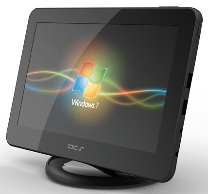
The Ocosmos OCS9 is launching in the US on November 30th thanks to Dynamism, and while it comes pre-isntalled with Windows 7, I’m eager to see how it will handle Windows 8. There is an optional dock available which looks pretty slick (it has some USB ports and HDMI-out), and could provide some interesting hybrid usage.

Windows 8 can easily go from your familiar Windows desktop to the touchscreen friendly Metro interface, making it useful even without a mouse and physical keyboard (one of my biggest gripes about Windows on slates).

We’ll have the Ocosmos OCS9 on hand for testing in the coming weeks, and the hybrid functionality that may be afforded by Windows 8 is of particular interest to me. With a dock/port replicator, you could have a full keyboard, mouse, and secondary monitor hooked up for your typical desktop use. The Intel Atom Z670 (Oak Trail) CPU, which runs at 1.GHz, doesn’t have quite the oomph that most of us would like for serious desktop work (photo/video processing, heavy 3D applications, etc), but it ought to get us by with more simple tasks like web browsing, music playback, and perhaps video playback.

The cool part, which is coming thanks to Windows 8, is the ability to pull the computer from the dock and go into Metro mode. This means that the Ocosmos OCS9 could work the desk and the couch shift. iOS or Android tablets have been filling the ‘coffee table device’ niche for the last few years, but users of these devices often have a productivity computer proper, whether it be a Windows or OSX powered desktop or laptop.

For those making use of tablets as coffee table devices, content has to be managed between the main computer and the tablet. The biggest advantage to hybrid computing may be keeping all of your content on one device and not having to manage it between a main productivity computer and the coffee table device.

Of course, even if the Ocosmos OCS9 has good battery life by Windows on X86 standards, it’ll still lag behind in run-time and standby when compared to the iPad and various Android tablets. This is a challenge for hybrid computing at the moment, but something that will hopefully improve as we move forward. Battery life is challenging, but assuming that these devices are staying primarily inside the home, it becomes less of an issue. If the user’s use-case involves out of the house usage, other solutions might make more sense (if we’re only considering present devices).

Windows 8 makes this desk to couch transition much easier thanks to Metro, which seems like Microsoft’s first legitimate attempt at making the Windows OS into a touch-optimized system. However, not unfamiliar to any of you who visit us at ultra mobile PC Portal, hybrid computing has been around for quite some time.

I’ve owned Sony’s VAIO UX180 UMPC for some 5 years now. The device has a portable form-factor and runs a desktop OS. Thanks to an included dock, I used the UX180 for years as a hybrid desktop/mobile device. At home (five years ago), the UX180 was powerful enough to accomplish my ‘desktop’ tasks. Through the dock, I hooked up a keyboard, mouse, monitor, and speakers. When I left the house, I pulled the unit out of the dock and it went right into my pocket. All of my data was with me, no content management required. This was really great, but admittedly, it had gaps (like user-friendliness) that meant it wasn’t ready for the mainstream.

I’m looking forward to returning to a (hopefully even better) hybrid computing experience with devices like the Ococmos OCS9, but the battery-life:performance ratio is a continuous challenge which worries me. 1.5GHz from the Atom Z670 isn’t going to be tremendously faster than my UX180 which had a 1.2GHz Core Solo CPU. A few years ago I was forced to trade up from the UX180 to a laptop to efficiently accomplish my desktop productivity work. I’m afraid that the current crop of potential hybrid devices that will run Windows 8 won’t have the power to do serious productivity work as demanded by the majority of customers. Some people will be able to compromise slower work for the advantages of hybrid computing, but others won’t have that convenience and will hold off on considering a hybrid system until it becomes powerful enough for their work.

When I get my hands on the Ocosmos OCS9, I’ll be reporting here at Carrypad about how it works as a hybrid device. Stay tuned!

Chippy has done a lot of thinking about this topic which he calls “High Dynamic Range Computing”, and if you’re interested in the topic, I definitely encourage you to read his analysis on HDR computing from April over at ultra mobile PC Portal.

Looking Forward to the Transformer Prime as an Original Transformer Owner


transformer prime

Engadget has a story about the new Transformer 2 or Eee Pad Transformer Prime as it’s now been announced. Asus CEO Jonney Shih has shown off the tablet to Walt Mossberg at the All Things Digital AsiaD show.

Ben posted some info yesterday after we started to see teaser advertising.  We now know that it’ll ship with a quad-core NVIDIA chip (Kal-El), 10-inch display, mini-HDMI port, a claimed 14.5-hour battery (which I assume is measured attached to the dock), and an SD card slot (although this may be on the dock too). I’m also assuming that they won’t be stepping backwards and removing features form the original Transformer so it will have to have a USB slot and a micro SD card slot as well (on the dock).

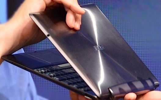
The back of the tablet looks sleek in a brushed style aluminium that looks like the lids of the new Asus Zenbook line of laptops. It’s 8.3mm thin and lighter than the current transformer which sounds very good to me.

I use my Transformer (the original) all day everyday, but find that I don’t use the dock as much as I thought I would. I now have a stylus — with Evernote, the onscreen keyboard, and the stylus, I get by in 90% of cases. The Transformer itself lacks a USB port, and I do find that pretty constraining. That means I have to connect to the dock to get USB capability and that means adding weight and size.

Since I’m yet to run into a scenario where I need the extra (massive!) battery life that the dock gives me, I do get annoyed at having to add the dock to the device to get a USB port. Sure, an adapter for the Transformer would solve that issue, but it costs a whopping $70 by the time it’s shipped, and I can’t pay that much for a tiny bit of plastic.

What I’m really looking forward to, as I read about the Prime, is the reduction in weight with the dock, or a dream come true: the addition of a full sized USB port on the Transformer itself. I’m not going to kid myself that we’ll get a USB port, but if the unit is slimmer and lighter as expected, then I may not mind leaving the dock attached, and that would mean that the USB port on the dock would suffice.

Yesterday I played with the Eee Pad Slider, and while a bit heavier than the Transformer, it’s lighter than the Transformer with dock, and I was seriously considering purchasing the slider until the announcement of the Transformer Prime. I think I’ll wait until final figures around weight and size come in before making a decision.

Jonney Shih also said to Walt that he expects Ice Cream Sandwich to hit tablets by the end of the year and it’ll be interesting to see what OEM’s push it out first (if at all). Keep an eye out for Transformer Prime publicity on November 9th which is the official launch date.

ThinkPad Tablet Productivity Apps and Digital Inking video


Heads up: this article spends some time talking through the use of tablets as productivity devices in general, and then some time discussing the features and functions of the ink apps that I use on a daily basis at work. For demos of the apps and discussion of how the Lenovo Thinkpad Tablet actually handles the apps, hit the videos at the end. Thanks.

This is my personal crusade. I take extreme umbrage to most of the media’s commentary that tablet’s are media consumption devices only and cannot be used effectively for productivity. Balderdash. This is commentary being championed by a community whose typical workflow does not mirror the vast majority of the rest of corporate America. As a tech journalist, yes, I agree, I cannot effectively use a tablet for the finishing work required to post an article. It is difficult for me to manage images and video and effectively upload those to the various content management systems (CMS) that I have to work in. Of course, that’s not to say it can’t be done; Chippy has figured a lot of that out and is somehow able to get a lot of his work on Carrypad and UMPCPortal done from his Galaxy Tab.

However, while images and video represent perhaps the most compelling components of our content, the fact remains that most of our content, and arguably the most valuable part, is the written word that we post. And for that, a tablet is certainly capable of handling that workload. In fact, I am starting this article on my ThinkPad Tablet, hooked up to a CP Technologies 4-port USB 2.0 hub, and a small form-factor keyboard and Gigaware USB mouse.

In my day job as an IT Project Manager and Systems Engineering Manager (doing double duty these days), I am able to do a great deal of my work on a tablet. Despite all of my opening bluster, I will admit that most of this is work that I do in Office applications. Drafting Software Development CONOPS, employee performance evaluations and notes, and just keeping track of my tasklists are some of the work objects that I easily juggle on a tablet.

As a PM, a lot of what I need to do is track everything that is going on on my projects, keep records of every design decision that I make with the various teams, and maintain technical journals of the progress of a given program’s design. I am also able to draft the initial versions of my Integrated Master Schedules using MS Project-like apps. In the technical realm, I am able to draft versions of initial software and systems architectures using mindmapping software that I use to replicate the intended SysML/UML structures and Functional Architectures that I design for the various systems and software applications. Pseduocode in text is also possible for framing my desires in initial design frameworks to hand-off to the programmers to then write the actual executable code.

There are a couple of things that doing this work offline on a tablet does that I count as big productivity advantages for me. One, it allows me to work off of my work-issued laptop and stay away from the distraction of emails coming in every minute. I realize that I could just close Outlook, which I do a lot when I am working on my work PC, but I will admit that my combination OCD/ADD keeps me from being as disciplined as I would like. Working offline on a separate machine just works better for me. Secondly, it allows me to work within my own personal information architecture, organizing specific topics, projects, and data types in specific applications.

One thing I hate about working on a pen-and-ink notebook is that when I flip open a notebook, the specific information I am looking for does not immediately jump out at me. I need color, tabs, folder structures, and so forth, that allow me to look at a page and immediately tab to what I need or want. Is working on a tablet a necessity? Not necessarily, although I will contend that in order for me to perform at my best, I must be on either a Windows TabletPC or a mobile OS tablet after ten years of working within this paradigm. Is my work tablet a toy? Absolutely not. I am not handing my ThinkPad Tablet (or any tablet other than may be my lowest-end, soon to be replaced tablet) over to my kid for anything. My ThinkPad Tablet is, at this point, an essential companion that is the focal point of my workflow. I do not go to a meeting without it, and if anyone walks into my office to start discussing something, I immediately reach for it to take notes.

My productivity apps break down into a set of keyboard apps and digital-ink apps. I will go over some of the keyboard apps in a later post where I will cover all areas of my productivity activities in both Android and iOS. Today’s focus is on the ink apps that I use on the Lenovo ThinkPad Tablet. As you likely know already if you have kept up with the first three entries in this series, the ThinkPad Tablet is one of just a few existing mobile OS tablets that sport an active digitizer. This allows digital ink input from the ThinkPad stylus, which can be purchased separately or as a bundled with all three models of the ThinkPad Tablet.

While some ink apps available from the Android Market specifically feature palm-rejection, it seems like this is an innate ability built into the ThinkPad Tablet. Whenever I use any app capable of ink, the only input that is picked up is the input from the stylus, for the most part. This feature does not function 100% perfectly all of the time; in the fraction of a second that my pen lifts from the screen, in some apps, my palm might get picked up. At its most benign, this results in a dot of ink that winds up somewhere I do not want it. In these cases, I typically just write over the dot when I get to that area of the page. Not an issue. In one app, the result is an angled line that chops across the page in the vicinity of my palm. These marks erase easily, and do not have a big enough impact that I am really slowed down to any significant degree. Again, it’s not perfect, but it is so much better than anything that I have seen on tablets while using a capacitive stylus that it is an acceptable trade-off.

Let me make one other mention. In Android in general, if you are going to use a tablet for business use, you have to be very selective about which apps you use and where you are going to entrust recording data. Apps will definitely flake-out and become unstable. This is even more prevalent in digital ink entry. Instead of starting off covering the apps that work well, let me highlight the apps you want to skip for digital ink.

First is the app I am writing in now using keyboard entry, Note Everything. While Note Everything has the capacity for supporting Paint Notes, and initial ink entry works well, storing and recalling the artifact is a roll of the dice. I was happy with the results, but when I went back to recall the notes, the middle of the ink page was justified all the way to the left, cutting off any ink that was written to the left of that point. Rotating the screen to landscape yielded the same results. Note Everything also does particularly poorly if you rotate in the middle of taking a Paint Note. Obviously you can understand why I would not want to entrust notes from an hour-long meeting to this app. The same is true in terms of reliability when using Extensive Notes. Ink notes will frequently be recalled as completely black images with no ink visible.

In addition to these two apps, there are several apps that render ink too thickly with little to no options to reduce the thickness of the ink line. A lot of them only allow you to write within a very constrained window where you can fit one or two words before the app wants to append those words to a separate image of the notes that it renders in a window above the writing area. Furthermore, there are several ink apps that are rendered for small-screen devices, so when the ink is displayed it is too small to be useful when you want to read the note.

Now on to the goodies:

AntiPaper Notes HD

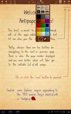
AntiPaper Notes HD: this app is the closest thing I have found to Penultimate, which is the best, and arguably the only, effective app I have been able to find for digital inking on iOS. You can create specific notebooks, and append titles and descriptions to the notebooks. They are displayed in a gallery from which you can select which one to work in. The app only renders in portrait view, which is a little annoying when I am working on a keyboard in landscape mode and just want to read my notes. Due to the overall performance of the app, I have accepted this trade-off as I typically ink in portrait anyway. There is a Pro version of the app supposedly under development, so there is a minimum of feature variety offered in the current version.

With AntiPaper Notes HD, you can ink in either red or black ink, and you can white out sections or erase them. You can create multiple pages in a notebook. There are four different paper options including Plain, Lined, Graph Paper, and Note, the latter of which provides 5 lines, then blank space, then 5 lines, and so on down the page, like a music style sheet. If I was still composing, I could see using this app to twiddle draft measures before I sat down on a keyboard. The notes can then be exported via the email function to a Bluetooth recipient, Google Docs, Dropbox, attached to an email as a JPEG, Evernote, Gmail, Note Everything, Picasa, PrinterShare, Springpad, or Twitter. Most of these options just allow you to send the page as an image. However, Evernote apparently has a plug-in called Skitch that appears to allow you to pick up inking within Evernote; I have not had a chance to experiment with this functionality. I am also not sure if this is a capability provided by Evernote or something special that Lenovo coordinated with Evernote. Sending the ink note to Note Everything gives you the option of embedding the image as a note, or appending a link to a page in a note. AntiPaper Notes HD tends to be my go-to app for taking notes in regularly scheduled meetings. I also scribble notes into a running tasklist notebook from emails, and, when I only have time to ink my daily schedule (I usually enter my daily meeting schedule into Jorte), I place it in a dedicated notebook in this app.

Notes Mobile: I should have mentioned at the outset a reminder that digital inkers tend to break down into two groups – those who must have handwriting recognition and those for whom it is a nicety. In the latter group, there is another sect for whom handwriting recognition does not mean a thing. Perhaps unfortunately for some readers, I am in this last group. I never use handwriting recognition, mainly because my penmanship is so poor. So for me, Notes Mobile is a completely serviceable app. It is a little sluggish opening notebooks, but other than that, it performs well.

Hopefully, this is something Lenovo can address in a software update as this is one of the pre-installed apps they provide with ThinkPad, sourced from a developer that only releases it to OEMs. If you need handwriting recognition, your mileage may vary. I have seen some other reviewers indicate that it works well. For me it works poorly, but then, my chicken scratch is barely recognizable to me, much less a computer. A lot of disinformation has gotten out on this app because most early reviewers did not understand that you can go into a mode that just lets you write or draw, without the app trying to convert your ink to text. This is the mode I always work in.

You can set up discrete notebooks, and you can just write the notebook name on the cover, or have your writing converted to text on the cover as well. The notebook covers can be set to different colors. The app has its own Palm Rejection setting, which zeroes out the few palm pick-ups that I experience in other apps. The Palm Rejection can even be set for those who are left-handed. It has a few options for font settings for converted text, and a few for setting the ink thickness. A little more variety is offered for ink color, where there are 9 options. This is another app that I sometimes use for meeting notes, but less than I use Antipaper Notes HD. I also enter my notes on personnel matters into this app for my employees. Notes Mobile is another tool that only renders in portrait orientation.

RepliGo Reader

RepliGo Reader: This is an app that I have spent very little time with, so I cannot comment on it much. It is a PDF annotation app that allows you to write digital ink, append stickies, and other comments and notes to PDF documents. I frequently export web pages and Microsoft OneNote pages to PDF docs, dump them to my SD card that I use in the ThinkPad Tablet, and then open them up in RepliGo Reader to mark them up with notes in digital ink. I have not used it much because I just came up with this solution for marking up design notes that I originally create in MS OneNote and then need in meetings for discussion. As my teams work through a given problem, I mark up my OneNote artifacts in RepliGo. If I need to, I transfer them back to OneNote on my PC for further work back at my desk. Most of the time, leaving them in RepliGo is good enough. The small amount of experience I have had with the apps gives me a good deal of confidence in it as a long-term solution. RepliGo renders in both portrait and landscape orientation.

TabNotes: I love TabNotes. I tried it out on my Acer Iconia Tab A500 when I was using it for work and it did not engender itself to me using capacitive ink entry. But the app shines on the ThinkPad Tablet. It is very esoteric, and so figuring it out is a lot of trial and error. For the longest time I thought it was one of those apps that only allowed you to ink in an entry box, but it does allow you write freehand directly on the page, once you figure out which button across the top enables that mode. One of the big advantages is that you can both view and ink in the app in both portrait and landscape orientation. It is a bit slow to open and exit notebooks, more so than Notes Mobile.

You can create new notebooks with eleven different notebook covers. The cover and pages are rendered in a deck of cards that slightly overlap each other. You cannot swipe between pages; if you want to go to another previously created page, you have to go back to the notebook view, and then enter the other page — a small annoyance. Once on the page, you can resize it using two fingers. There are 8 different pen colors, 6 different ink thicknesses, and eighteen different paper styles. Enough variety to keep my random mind from being bored. It only has hooks to export the pages to either a PDF document or a JPEG. It also has a line straightener if you are drawing shapes so that you can draw a line, hit the straightener, and it converts your line or multiple lines into a straight-edged shape. You can only freehand draw in this app; there are no options for entering text. I keep a lot of my time management notes in this app, as far as what tasks I want or need to spend time on in a given day or night.

Whiteboard Pro

Whiteboard Pro: This is another one of my favorites because you can append multiple whiteboards as widgets to your homescreens. I keep a homepage that has four Whiteboard Notes in each quadrant of the screen. This app will do both portrait and landscape, but you have to pick one or the other at any given time; you are then locked in that orientation unless you enter the Configure dialog and change it. It has several pre-defined colors for markers, as well as colors for the individual boards. You can also select the color and thickness of the board borders.

Stability is a mixed bag. If you jump out of a new note that you have started, you might lose the first few lines. This app works best if you open up a marker note and ink in it for a while before you try task-switching to another app. It also has a bug where you may not see your ink note rendered when you get out and go back to the home screen initially. I frequently go back to a blank widget, with the ink rendering on the widget a few seconds later or after I swipe to another homescreen and back again. Still, its utility is in surfacing notes directly on your homescreen without having to go into the app. It takes a little time to get accustomed to the understanding that it is not a persistent app like some of the notebook-oriented apps. Each instance of a Whiteboard is its own object that runs independently, so when you enter a Whiteboard space, you only have access to that Whiteboard until you exit and then select another Whiteboard widget.


WritePad Stylus

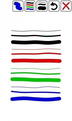
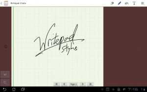
WritePad Stylus: Another close favorite. This is the app I reach for when people walk in and start an unannounced pop quiz. Individual note pads are available on the main screen, and each notepad has its own pages. I tend not to use this as a subject oriented app as it does not feel intuitively like a notebook app to me. I tend to scribble instance, no-notice topics in here that I expect to be short lived. You can title each notepad individually from the home page, which resembles a cork board. There are 3 ink colors, 3 ink thicknesses, and four types of paper. You can turn a note into a read-only note. You can import images for markup, as well as web pages. You can share the page with the same apps as you can with Antipaper Notes HD, or export the entire notepad, although I did experience a lockup after trying this a few times. As far as I could tell before experiencing the lockup, the options for exporting the whole notebook are fewer than just exporting the page itself. There is a separate option for exporting the page as a PDF.

My time with the Lenovo ThinkPad Tablet has been a joy, and I expect it be my work companion device for a long time to come. Unfortunately, it is not as stable as the Acer Iconia Tab A500. I keep the Manage Applications widget on my homescreen so that I can kill nasty apps that get stubborn, and digital inking seems to raise the frequency of these events. It helps that the recent apps menu in the lower left-corner of the Honeycomb screen also allows you to kill apps directly from there. I have seen other reviews where the ThinkPad Tablet has benched better than the Samsung Galaxy Tab 10.1, but real-world perception counts for more than any benchmark, and I feel like the ThinkPad Tablet is not as fast as the Motorola Xoom or the Acer Iconia Tab A500. But I also do far more on my ThinkPad Tablet than on either of those devices. And the speed of digital inking over keyboard entry is a strong pillar of my personal workflow.

I know I spent a lot of time on the functions and features of my personal app set of ink apps. For some insight into how the apps perform, please take a look at the videos below. They are long, but I wanted to ensure that I spent enough time demonstrating the apps so you could get a feel for how they work.

Note: the original video I shot had the tablet off-camera, so I recorded this shorter version. The longer version of the video is being uploaded now and will be available later today. It highlights some additional points that I did not have time to cover in the shorter version.

One Year with the Galaxy Tab 7, What Next? Huawei Mediapad?


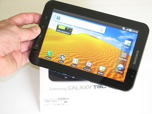
One year ago I was lucky enough to be one of the first people in the world to get a retail version of the Samsung Galaxy Tab 7. The unboxing video has been one of the most viewed videos I’ve ever done. A quarter of a million views was largely due to early excitement but even today, the video regularly gets 300-500 views per day. The Galaxy Tab 7 was a success not just for me though because sales figures and charts tell the same story. It proves beyond any doubt that there is a market in the 7 inch space.

The fact that the follow-up Samsung Galaxy Tab 7.7 was launched at IFA (video, article here) and that the Galaxy Tab 7 Plus is also on its way proves it too which is good for me and for many ultra-mobile fans because it means we have an upgrade choice; and it’s about time to start thinking about those choices.

paroxetine hcl 20 mg

The Galaxy Tab 7 is still my most used daily device (yes, more than my phone) but next to newer Android Honeycomb / Tegra devices it’s feeling slow and clumsy. I want my browser to sync. I want my widgets to be resizeable and I want better processing power. Honeycomb 3.2 is mature enough to recommend now and from this point on I won’t be recommending the Galaxy Tab as a new choice unless you find a great deal somewhere and just want to use it in a casual fashion.

Upgrade Time!

(There’s an active discussion happening on Google Plus right now too.)

It’s fun looking for upgrades and when I tested the Galaxy Tab 7.7 at IFA this year, I was almost sure it would be my next device. That was until the Apple patent issues had it taken off the table, literally. Since then though we’ve seen the Galaxy Tab 7 Plus which solves 2 out of the 3 problems I have with the Galaxy Tab.

The CPU is improved to a dual-core 1.2Ghz part and the OS will be Honeycomb 3.2. The third issue, that I don’t believe it does solve, is the screen. I’m happy with 1024×600 but I’m not happy with the outdoor or even bright daylight use. The glass seems milky and it limits the ease of use in many situations when I’m out and about.

In Europe we’re expecting the 7 Plus with 3G and 32GB for €499 at the end of this month. Definitely something to think about! There are other options though.

The Acer Iconia Tab A101 is available in Europe today for around 400 Euro. The specs  and price look great but personally, I have two issues. I have the Acer Iconia Tab A500 and I’ve learnt that Acer may not have the best Android OS team. Early firmware for the A500 wasn’t good at all and it makes me hold back from going further with Acer Android tablets. The second issue is the screen on the A100/101. It isn’t an IPS screen which means in portrait mode it has un-equal viewing angles. See this video for a demo and an an explanation.

There’s the Archos 80 (G9) although I find that a little big for my use (I need to be able to slip the tablet into a back pocket to free up two hands)

I’ve had the HTC Flyer too and while it’s at a better price now, it’s still an Android 2.x device. Having said that, it’s supposed to be updated to Honeycomb eventually. The screen is better than the Galaxy Tab, build quality and battery life are top quality but do I want to pay 500 Euros for a device that I already had once, and then sold? Even though the price has improved, the 3G, 32GB version is still a rather expensive 550 Euros.

There’s one more device that I’m looking at though and it’s rising to the top of my list very quickly. The specs are right, the price is right and, as a blogger there’s nothing better than getting a device on the day it launches. The Huawei MediaPad with 8GB and 3G, dual-core 1.2Ghz Qualcomm CPU, a 1280×800 IPS display and Honeycomb 3.2 is going to be available in about 2 weeks for 399 Euros. That’s a deal worth taking a closer look at.   Given that someone needs to give this baby a damn good test, it makes sense for me to test it out so I’ve decided to go ahead and buy the Mediapad as soon as it’s available later this month. Unless I hear some bad news between now and then you can expect some decent reports from me, here on Carrypad.

The Mediapad is in the database.

Follow Chippy on  TwitterFollow Chippy on  YouTube

Popular mobile computers on UMPCPortal

Acer C740
11.6" Intel Celeron 3205U
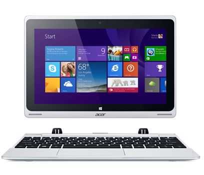
Acer Aspire Switch 10
10.1" Intel Atom Z3745
HP Elitebook 820 G2
12.5" Intel Core i5 5300U
Acer Aspire E11 ES1
11.6" Intel Celeron N2840
Acer C720 Chromebook
11.6" Intel Celeron 2955U
ASUS Zenbook UX305
13.3" Intel Core M 5Y10a
Dell Latitude E7440
14" Intel Core i5-4200U
Lenovo Thinkpad X220
12.5" Intel Core i5
Acer Chromebook 11 CB3-131
11.6" Intel Celeron N2807
Lenovo Ideapad Flex 10
10.1" Intel Celeron N2806

Find ultra mobile PCs, Ultrabooks, Netbooks and UMPCs quickly using the following links: